Announcement Items Widget
Purpose
Displays announcement news articles in a listed format.

Features
-
- Displays the Announcement Title, Summary text and creation date
-
- Lists the latest items in reverse chronological order by creation date
-
- Provides the ability to set the maximum number of items to display
-
- Includes both start and expiration dates to automatically expose and remove content from site
-
- Items displayed are security trimmed based on specific site user’s SharePoint permissions
-
- Mobile-ready via Responsive Web Design
Details
-
- Widget Name: AnnouncementItemsWidget
- Available with: Version 4.1 and Above
- Content App Type: AkuminaNews
- Content Type: AkuminaNews
- Content App Name: N/A
- List Name: N/A
- Recommended Images Sizes: N/A
- Dependencies: SharePoint
Content
| Title | Title that will display in the Content App list |
| Body | Rich text that will make up the body of the list item |
| Expires | Date and time when the Announcement News item will become inactive and no longer display |
| StaticUrl | URL that will be used to display the Announcement detail page |
| Image | Image that will used for the list item |
| Category | Metadata category assigned to the list item for tagging |
| PublishedBy | Name of user who is getting credit for the list item |
| JobTitle | One line of text that will be used for the publisher’s Job title |
| Add Attachment: | File that will be attached to the list item |
Properties
| Selected list columns |
|
||
| List Name |
|
||
| Displayed Title | If a value is entered, then the title will appear on the header of the App. | ||
| Icon | Selects the icon that is displayed to the left of the widget title. | ||
| # of Items to Display | This controls how many total items to display on a single page. If paging is enabled, then each “page” will have this number of items. | ||
| Enable Paging | If checked (true) – then paging will be enabled. | ||
| Additional selected list columns | Additional data fields (columns) from the SharePoint list that the widget should retrieve for use in this instance outside of the fields specific to this widget’s content type.
For this example, the additionalselectfields = ID,AnnouncementTitle,Image,Start_x0020_Date,Body,Expires |
||
| Function to call before binding the UI events | OOTB -Blank (used for widget expansion): Name of the function called after the UI has been rendered to the screen | ||
| Function to call after fetching data |
|
||
| Cache Interval | Sets the time, in minutes, that the data should be saved in the local browser cache of the current user.
· 0 = Do not cache the data for this widget · -1 = Use the default caching strategy set via Site Creator Whole Number = Cache for specific time, in minutes |
Views
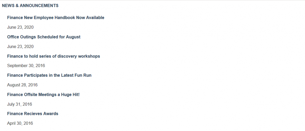
View Name: NewsList
View Description: Displays items in a vertical list, complete with title, date, and summary.
View Preview:
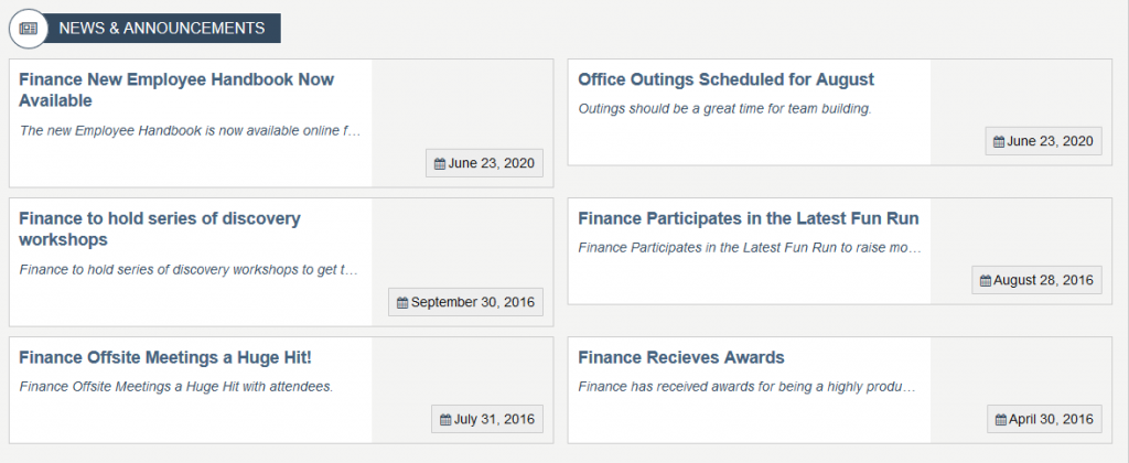
View Name: Announcements – Modern
View Description: Displays items stylish grid view, complete with title, date, and summary.
View Preview: