The purpose of this document is to review the Akumina widget framework, and describe how widgets can be used to quickly and easily add functionality to a site.
Key to this new approach is the separation of the widget’s functionality and the presentation or display of widget data. 
It starts with the base widget definition. There are many base widget definitions included with AppManager, and developers can easily add more. The base definition really determines what data will be made available by the widget, as well as any manipulation of the data that may be done.
Next is the “View“. The view is an html template developed by the designer (or by a developer). The key is that the view is separate and distinct from the base widget, but uses the data the base widget provides. Combining the base widget and the view provides the functionality and presentation for the site.
By separating the widget’s base functionality and the “view” that is used to display its data on the site, a single widget can serve many purposes by merely changing the “view” of the data. Each widget, whether it’s an image gallery, quick list or calendar widget, can have multiple “views” that control the display of the content.
This saves developer’s time from having to create new widgets to simply display content in different contexts, and leaves designers free to create new views using the available data without having to deal with editing the widget core code.
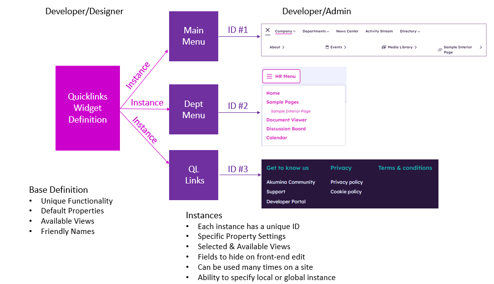
Each time a base widget definition and one of its views is used on a site it is called an “instance“. As in the example below, from one Quicklinks base widget you can create three instances for the site: one for the main menu, one for the department menu, and one for the convenience links listing. Each of these have their own property values, and each can use their own view.
The following sections cover how to create instances, create and map views, and then add widget instances to your site. Development of new base widget definitions is covered in the Developers Guide.
Using the Widget Manager
The Widget Manager is used for three primary functions
- For developers to add new widget definitions (see the Developer Wiki for more information).
- For designers to add new “views” to widgets
- For site admins to create new “instances” of widgets to be used on their site
For this guide, we will cover items 2 and 3.
There are two ways to access the Widget Manager, via AppManager or the Akumina Tray.
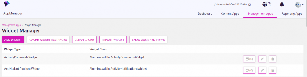
From the AppManager , go to AppManager > Management Apps > Widget Manager.
Central site
Delivery site
A list of all available “widget definitions” is displayed when entering the Widget Manager.
The widget manager screen on the central site, enables a user to the following:
- New widgets can be added to the site
- New widgets can be “imported” for use on the site
- New instances can be created for a widget
- New Views can be added to a widget definition
- Clean Cache which clears all widget instances of the widgets on that site
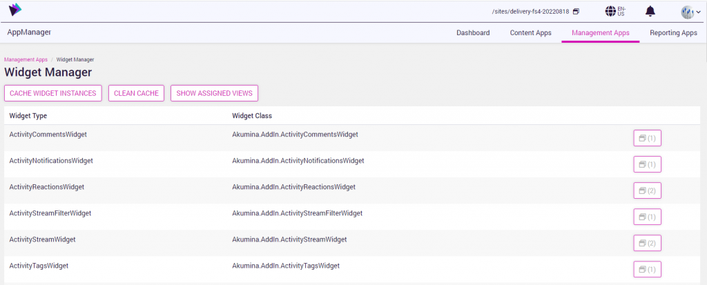
The widget manager screen on the delivery site, enables a user to the following:
- New widgets can be “imported” for use on the site
- New instances can be created for a widget
- New Views can be added to a widget definition
- Clean Cache which clears all widget instances of the widgets on that site
With Release 5.0 and above, the Widget Manager can also be accessed using the gear icon from the Akumina tray on the front end.

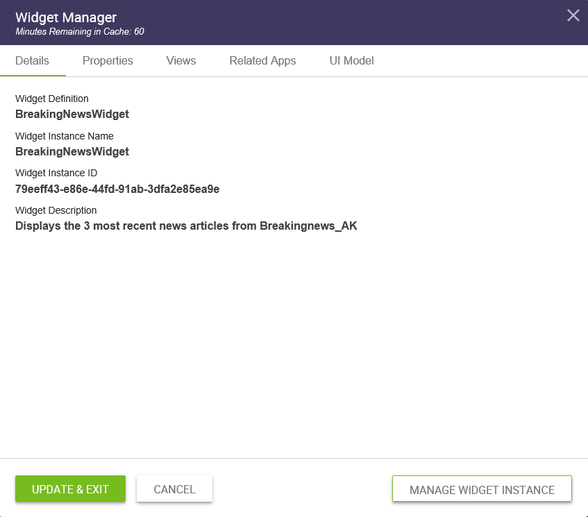
With the latest release, the widget details are displayed on the front-end side panel for this widget manager instance.
Prior releases will provide information for the selected widget on DWP including widget details, properties, available views, related content apps and UI model, if applicable.
Creating a Widget Instance
Each unique appearance of a widget on a site needs to have an “instance” defined. The instance specifies the property values and view that will be used in rendering the contents of the widget.
In this example, let’s create an instance of the “Events” widget to use on a site page.
To create the instance:
- Access the Widget Manager and click on the “View Widget Instances” button associated with the Events widget definition. Here you will see any existing instances of the widget.
- Click on the “ADD WIDGET INSTANCE” button at the top of the page.
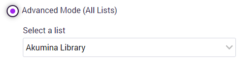
- Since the Events widget uses list data, it has a Content Type associated with it (Events). When a new instance is added, a wizard modal is displayed to define the supporting list. The options are:
- Select an existing list to use that has the same Content Type
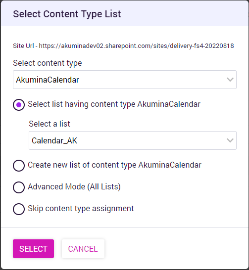
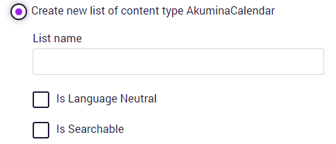
- Create a new list automatically with the specified name and define if the list is language neutral and is searchable.
- Select an existing list from the library, with a different content type.
- Skip creating or mapping a list and just create the instance.
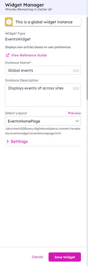
Once the wizard is completed, or if a new instance is being created of a widget that DOES NOT use a Content Type, the widget properties page will be displayed.
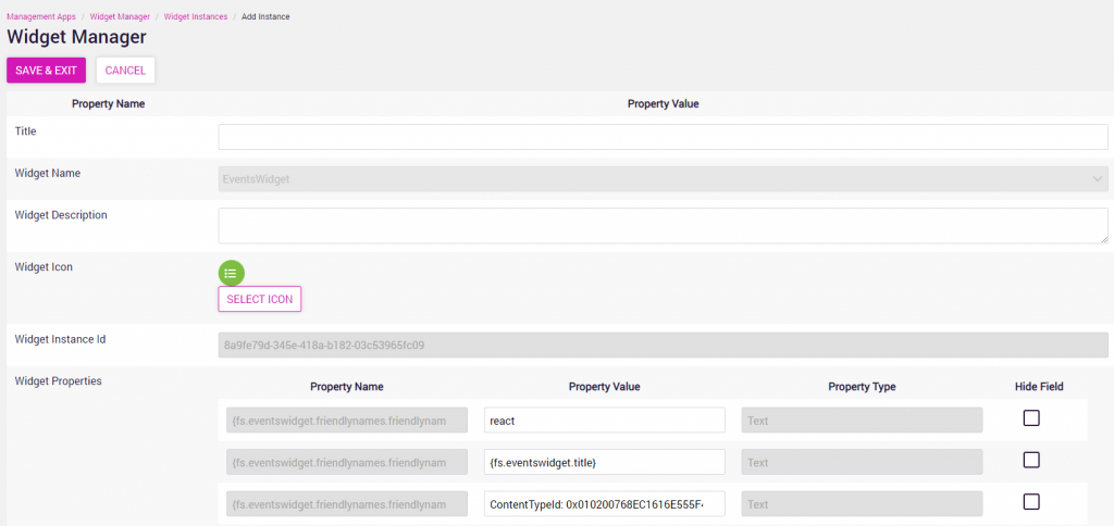
- Give a unique title as well as a description to this new instance.
- Set the property values for this instance of the widget. Don’t worry, you can update them anytime as needed from either the front-end widget editor or by coming back to the Widget Manager.
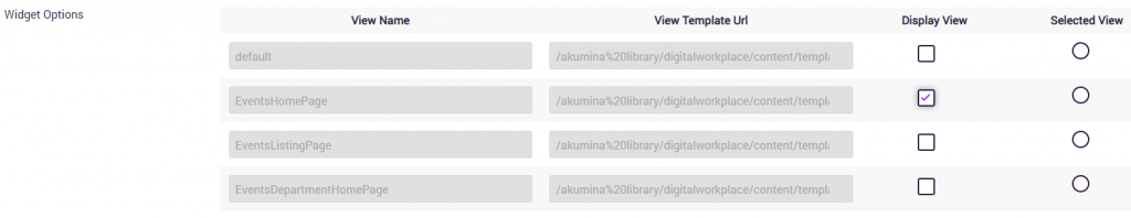
- Finally, select the view(s) that you want to use for this instance. If there are multiple views available for the widget definition, you can select
- The views available for this instance (for the front-end editing)
- The default selected view
Adding Widgets to Pages
Adding a Widget to a Virtual Page
A widget can dynamically be added to a virtual page using the Experience Builder (Please refer to Working with Experience Builder for additional details on how to create virtual pages).
Example: Adding Widgets to a Virtual page
Widgets can be added to existing pages or newly created pages using the VXC tray and selecting a cell to edit to “customize” the widgets on the page.
- To add widgets to the page layout, select toggle widget editing from the VXC tray.

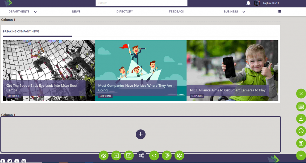
- When a cell is selected
 , a pop up panel “Add a Widget” will be displayed to choose a widget instance for the cell. After clicking the button, the widget will be displayed in the cell on the page. If there are multiple widget instances in the cell, the added widget will be appended to the end of widgets already in the cell.
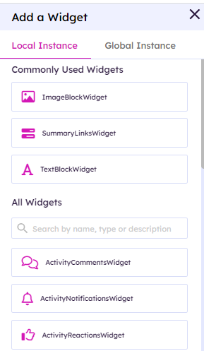
Continue to add widget instances for each cell on the page layout to create the desired user experience.
Once you enter the edit mode, you will see the list of available widgets for adding to the Dashboard. First, we want to add the “My Team” widget. Either search for “Team” in the widget search or scroll down the list of widgets and clickon the “My Team” entry. This will add the widget to the page at the top of the left drop zone.
Finally, to remove an existing widget, simply click on the “x” on the widget.
Editing Widget Instance Properties
There are two ways to edit the properties for an instance of a widget.
Editing Widget Instance Properties from the Widget Manager
As was discussed when creating the instance, you can always go the Widget Manager, access the widget instance and edit the properties.

Editing Widget Instance Properties from the Front-End Site
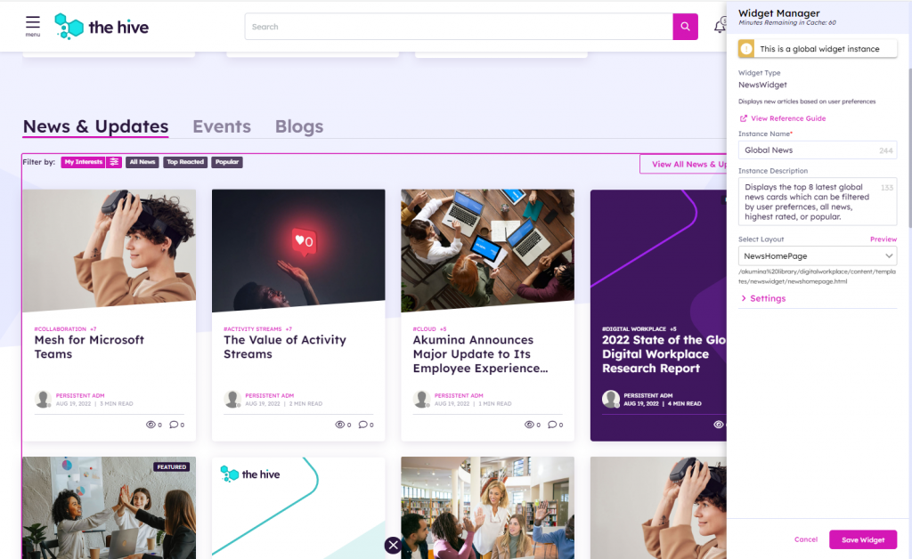
Widget Instance Properties can also be accessed from the front-end site on which the instance appears.
- Access the “Edit Widget Properties on the Page” by clicking on the gear icon from the Akumina tray.

- Mouse over the widget you wish to edit until it is highlighted with an outline. Then click the gear in the upper left corner on the widget.
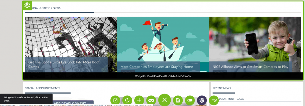
- The widget edit panel will open for the instance. It will display the properties including the views which can be modified for the widget (some properties may be hidden by the settings in the Widget Manager)
- In addition to editing the displayed properties, from the widget edit panel you can also
- Jump directly to the widget instance in the AppManager using the “Manage Widget Instance” button
- Access and Edit the View(s) associated with the instance using the Views tab
- Jump to the Content App which is associated with this instance of the widget (if there is a content app mapped) using the Related Apps tab
- Once the property changes are complete, clicking on the “Update” button will close the widget edit panel and instantly update the widget instance.
Managing Widget Views
Views can be added to Widgets to change how the data is displayed for that widget.
To add or edit a “view” for a widget, a combination of the View Manager, Widget Manager management apps and Widget Edit Panel are used.
Adding a View using View Manager
The View Manager app is targeted at the designer (or developer) to provide them a tool to manage the views (html templates) that are available for all the widgets in the system.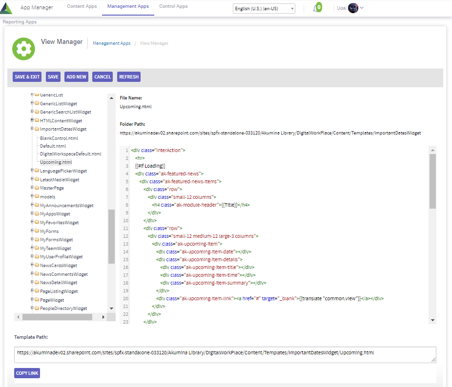
To make a new view available in the system:
- From the View Manager, select the folder to which you want to add the new view
- Click on the “ADD NEW” button which will display an upload file dialog. Select the html file associated with the new view to upload. NOTE: If there is also custom css that is required to support the new view, that css file must be added separately to the Style Library. It can then be mapped using the Widget Manager
- The new view will be available to add to the widget definition (see next section)
Mapping the Views to a Widget Definition
Views are added to the base Widget Definition to make them available for selection in the widget instances.
To add a new view to a Widget Definition:
- Access the Widget Manager
- Click on the “EDIT WIDGET” button on the Widget Definition to which you want to add the new view
- In the WidgetViews section, click on the “+” sign to add a new row for the view
- Enter the View Name (which will appear in the selection list for the view)
- Enter the path to the new view template. You can use the “VIEW PICKER” button which will open the same folder tree structure you saw in the View Manager to select your view and fill in the path automatically.
- If there is custom css that is associated with the view, you can also specify the css file that the widget will use in the WidgetCSS section. This css file will need to have been placed in the Style Library in SharePoint by the designer.
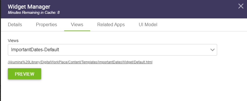
Editing Views Directly From the Front-end Site
You can also edit a view directly from the front-end widget properties panel.
- Select the view in the views drop-down that you want to edit
- You can “Preview” the view right in place
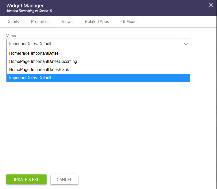
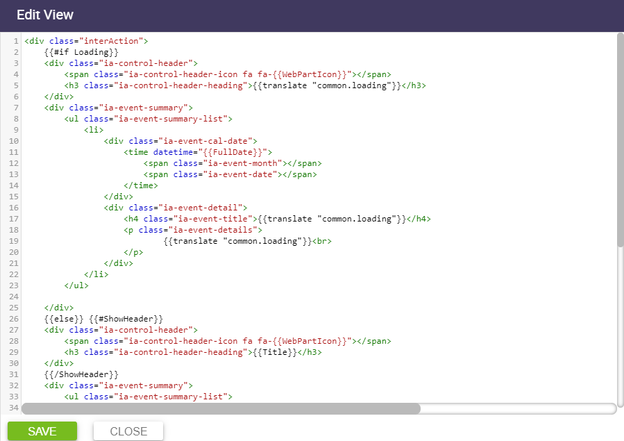
- Click on the URL displayed for the view to edit the view
- An edit panel will open with fully highlighted html where you can make your edits, save, and immediately see the effect of the changes!
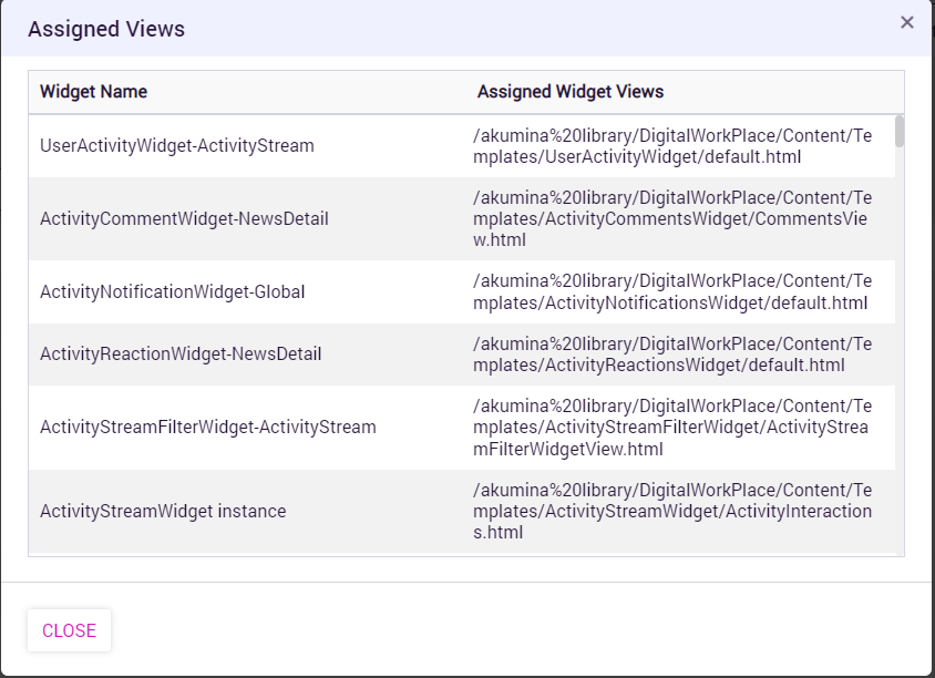
Which Views are being used?
From the Widget Manager, you can use the “SHOW ASSIGNED VIEWS” button to get a list of the views that are currently selected for each of the widget instances on the current site.