Creating/Modifying Content Apps
AppManager Content Apps can easily be created or modified within the AppManager based on an existing SharePoint list or by creating a new SharePoint list as the source for the Content App.
The Content App creation modal allows for more than one Content App to be associated with a single SharePoint list. As an example, this could be used to generate two different Content Apps, one of which had access to set the “Start Date” and “End Date” for an article, and another which could only edit the heading and body content. These apps could be assigned to different content editors based on what you wanted each to have access to.
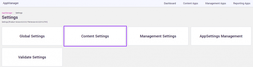
To create a new content app in AppManager, click the +ADD NEW button. To change the settings for an existing content app, click the EDIT pencil icon for Content Apps on the AppManager Settings page.
A list of the existing Content Apps on the current site will be displayed.
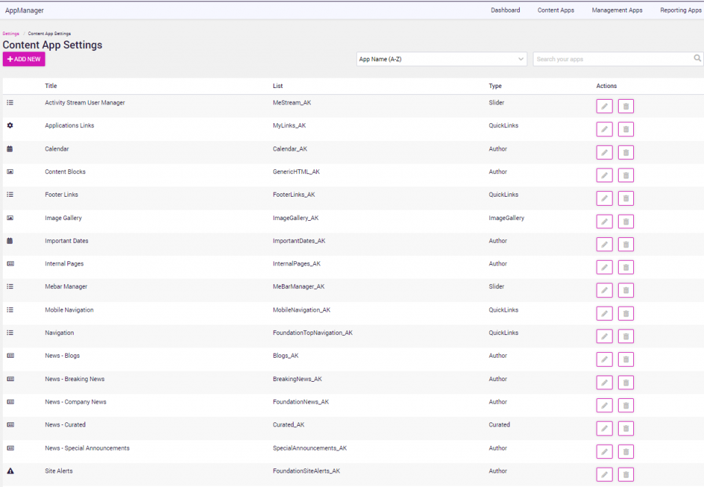
To add a new Content App, click on the “+ Add New” button. A modal window will open with the Content App info screen to begin the process.
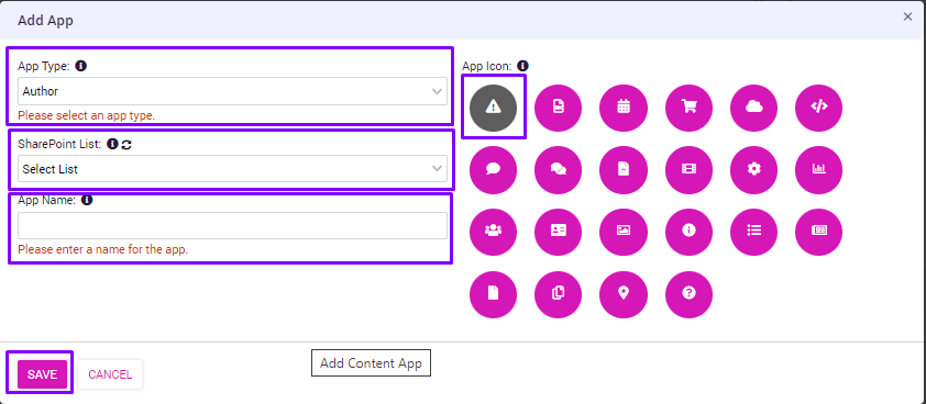
Complete the Content App info screen using the following information:
| Field | Value |
|---|---|
| App Type |
Supported App Types in Voice:App Type sets what list the content app will point to.
For additional information, please reference Voice Structured Content Module. |
| SharePoint list | This is the name of the SharePoint list which has the content to be managed. |
| App Name | This is the title which will display as part of the Content App icon in AppManager. It does not affect the original SharePoint list title. |
| App Icon | Select the icon you want to use for the App. |
Click on the “Save” button and the Content App settings screen will display for the new app to complete the configuration.
Configure (or update) the settings for the new Content App using the following table as reference:
| Field | Value |
|---|---|
| App Name and Edit | Clicking on edit will invoke the Content App Info Screen to update the information for app type, sharepoint list, app name, and app icon. |
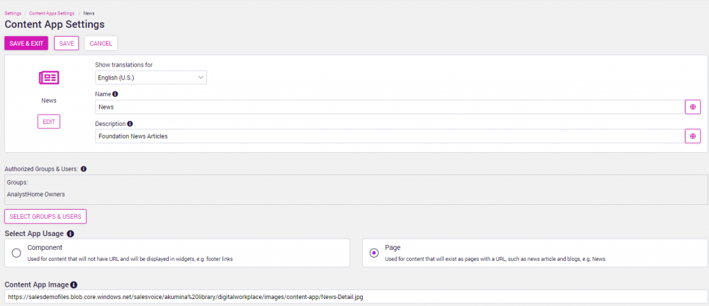
| Show Translations For | Displays the drop down list of languages enabled on the site. This displays when multilingual is enabled on the site.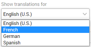
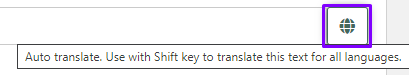
The name and description for the Content App can be translated based on the language. Select the language and then click on the globe icon to auto-translate the name and description or type the updates in the fields for the selected language.
|
| Name | Name to be displayed for the Content App in the specified language. Clicking the globe icon will auto translate the name to the language selected. |
| Description | Description to be displayed for the Content App in the specified language. Clicking the globe icon will auto translate the description to the language selected. |
| Authorized Groups & Users | Select one or more SharePoint groups who will have access to this Content App. Click on “Select Groups & Users” to display the list of available groups. |
| Select App Usage | Select the app usage for the content of this app – Component or Page.
Select Component for general content items that display in widgets (e.g., content blocks, site alerts, etc.) or select Pages for content that exist as pages with a friendly URL (e.g., News, Events, Blogs, etc.) |
| Content App Image | Full URL path for associated content app image to be displayed with the content app. Images can be associated with each App from the library specified. |
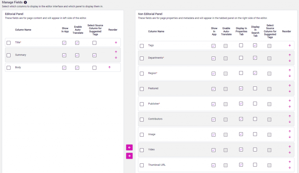
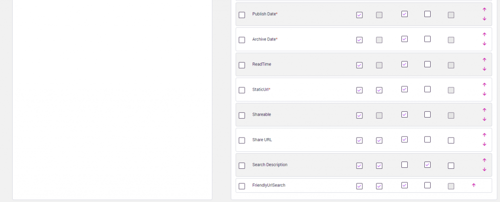
| Managed Fields | Editorial Panel: Select the fields to be displayed in the Editorial Panel on the left side of the screen for authoring page content.
Non-Editorial Panel: Select the fields to be displayed in the Non-Editorial Panel on the right side of the screen for page properties and metadata properties to appear in the tabbed panel. Content can be moved between the panels by clicking the arrows.
Select the checkboxes associated with each column to define the properties for the content. See column name descriptions below for more details. |
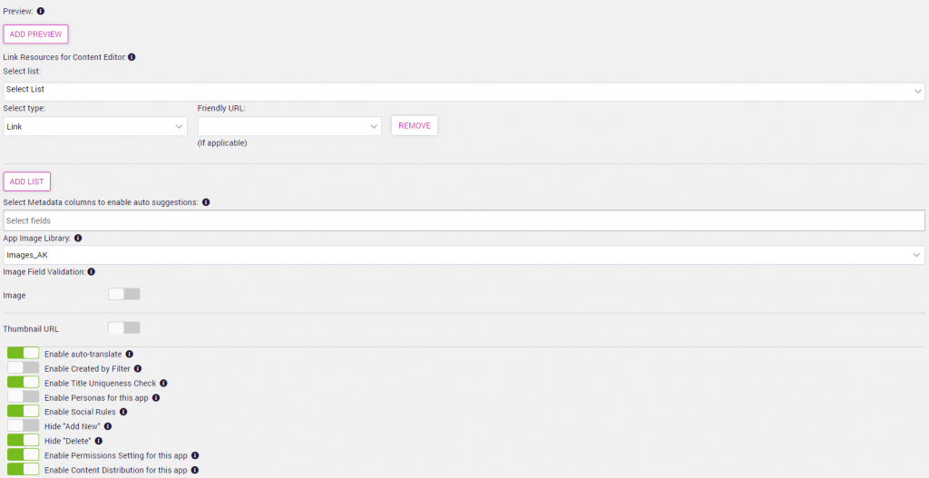
| Preview | If preview is enabled for this app, the pages which will be available are entered here. The Preview Name is what will appear in the preview menu in the Content App. The “Page URL” must be the fully qualified URL for the target page. Multiple preview pages can be defined. See Enabling Preview for the steps to enable the Preview function.
If you would like to PREVIEW a dynamic page such as a News Detail or Interior page or any list with a “FriendlyUrl” column in it then the value for the “Page URL” should be: https://{RootSharePointSiteURL}{{FriendlyUrl}} example: https://example.sharepoint.com{{FriendlyUrl}} This is assuming the FriendlyURL column in the associated Content App SharePoint list is a calculated field which includes the site path. |
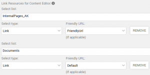
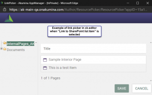
| Link Resources for Content Editor | Allows a content editor, using the AppManager rich text editor (ckeditor), to use a friendly link picker to select a set of items, and associate a link to that item be inserted into text within the ckeditor.
The link picker, when “Link to SharePoint list item” is selected, will allow the content editor to select from SharePoint lists (with FriendlyUrl)/libraries, configured for this content app via the “Link resources for content editor” definition in the ckeditor ribbon. Links should be configured to use a FriendlyUrl (used to link to lists with dynamic content) or default (to be used when pointing to a document library. Example:
|
| Select Metadata Columns to enable Auto Suggestions | Select any manage metadata field where you want to enable auto suggestions of tags based on azure text analytics. |
| App Image Library | This is the asset library which will be displayed if a user chooses to add an image to the content from the content editor. Consider creating and setting a new Image library for a content app, or creating folders within the library to organize the images for a Content App, creating a folder for each content app that this image library supports. |
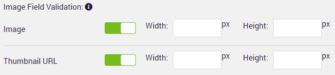
| Image Field Validation
Thumbnail URL Validation |
Image Field Validation can be enabled for images and/or thumbnail URL.
When validation is enabled, it validates the image size is the correct size as specified for the width and height in pixels for image and thumbnail url image fields.
|
| SORT Field | Not shown in the image above. This field displays when configuring a Quicklinks or Slider App Type. Clicking on “Select” will display the list columns so that the column that contains the order to display items (DisplayOrder) can be selected. |
| Column Names
|
“Show in App” determines the specified fields to display in the content app. A list may contain multiple fields that are not required for the business user to view.
“Enable Auto-Translate” defines which fields in the list are allowed to be auto translated when multilingual is enabled. “Select Source Column for Suggested Tags” defines which fields in the list are used to suggest tags when auto tagging is enabled. “Display in Properties Tab” defines which fields in the list are displayed in the non-editorial tab on the right hand panel. “Display in Search Tab” defines which fields in the list are used when searching for content. “Re-order” defines the display order for the content app selected. Allows columns to be moved up/down to change the field order display. |
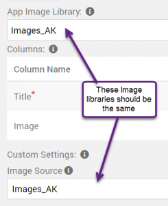
| Custom Settings > Image Source | Only the App Type “Image Gallery”, uses the custom settings area. This field is used to define the source library for the supporting Image Gallery list, example ImageGallery_AK. This the library where the list ImageGallery_AK, will look for the selected images. A Library can be created just to support your Image Gallery. This library should be the same library set for the input field “App Image Library” (which is used to upload images). Example for AppType = ImageGallery:
|
| Enable auto-translate | If using the multilingual capability in the AppManager (Product Feature Key required), this option enables the auto-translate feature for the application. |
| Enable Created by Filter | Turning this on will cause the content listing for the Content App to only display items created by the current logged in user. Regardless of the filtering they choose on the listing page, the results will always be from the set they created. |
| Enable Title Uniqueness Check | This option (normally on) will enforce the title of each content item added in the app to be unique. Since there are circumstances where the title field DOES NOT have to be unique (as can be set in the SharePoint list), setting this to “Off” disables the check in AppManager and allows for duplicate item titles. |
| Enable Personas for this app | Turning this on enables the persona feature to be set for access control based on personas.
When enabled, the Personas tab will be displayed. |
| Enable Social Rules | Turning this on enables which reactions are available and who should be notified for comments and/or reactions associated with this item.
When enabled, the Engagement tab will be displayed. |
| Is Persona required for this app | Turning this on enables the persona settings will be mandatory when publishing items for this item. |
| Hide “Add New” | This option is only available for the Author App Type. Turning this on hides the “Add New” button from the Content App content list, preventing any new content from being created (existing content can still be edited). This is typically used for the Content Block application where only one content item is mapped to the Content Block, so creating a new one without changing the content block control would have no effect. |
| Hide “Delete” | Turning this “ON” hides the “Delete” button from the current app. This is the default setting when creating a new content app of type Author, Slider or File. Turning to “OFF” will display the delete button in the app. |
| Enable Permissions Setting for this app | Turning this on allows read/edit permissions to be set for this app.
When enabled, the Permissions tab will be displayed. |
| Enable Content Distribution for this app | Turning this on allows user to push content from portal to market in the app. |
Click SAVE & EXIT when complete.
The Content Apps list will display with the new app added.
At any time, click on the “Edit” pencil icon for the Content App to access and update the settings.
Click on the “Remove” trash can icon to remove an app.
Enabling Content App Permissioning with Save, Publish and Preview Functions
The Save, Publish, Preview and Submit buttons displayed to the user on the content app screen are dependent on the users editing permissions, content workflow settings, and the version settings established for the content app.