Quick Links Widget
Purpose
Surface important information your users can quickly digest and navigate to.
Features
-
- Features top level links and categories with fly-out menus to display second level items
- Allows for an unlimited number of top level links and categories
- Links can be set to open in the same window (site links) or a new window (external links)
- In most views, supports two levels of categorization. In the “FoundationFooterLink” and “FoundationItemTemplateSubSite” views only one category level is supported.
- Supports both a list of links and menu controls
- Easily managed via an AppManager Content App using a drag/drop, tree style UI for adding categories and links
- Automatically adjusts the size of the main level and fly-outs to support list lengths
- Personas can be applied to categories and links
- Mobile-ready via Responsive Web Design
Details
-
- Widget Name: QuickLinksWidget
- Available With: Release 4.0 and above
- Content App Type: QuickLinks
- Content Type: AkuminaQuicklinks
- Content App Name: Quicklinks
- List Name: QuickLinks_AK
- Recommended Images Sizes: N/A
- Dependencies: SharePoint
Content
| Root Node Title | Using view “DepartmentMaster”, this is the site title and value displayed on the hamburger menu. When you deploy a department site in FS’20 this is populated with “Department Name”, it is meant to be updated by the Business user. Multilingual management of the department name happens on the language version of the content by updating the “Root Node Title”, in the language version of the quicklink. In all other view cases this is the title of the root of the quicklinks and not displayed on the front end. |
| Category – Link Label | Title that displays for this category. |
| Category – Link | Categories can link, if set this is the url the user will navigate to when selecting the category |
| Category – Is Akumina Page | Checked by default, uncheck this when you want to link to a modern SharePoint site page outside to of the Akumina environment. |
| Category – Active | If checked then the category is active and displays on the front end. |
| Category – Open With | When the category is selected, the link can be configured to open in the Same Window or New Window. |
| Category – Icon | Icon to display along with the category title. |
| Link – Link Label | Link Text to appear under the links icon or image |
| Link – Link | URL – When the icon is selected the user will navigate to this link |
| Link – Is Akumina Page | Checked by default, uncheck this when you want to link to a modern SharePoint site page outside to of the Akumina environment. |
| Link – Active | If checked then this link will appear on the widget |
| Link – Open With | Choices – Same Window or New Window, determines if the link opens in a new browser tab or not |
| Link – Icon | Icon to display along with the link label |
| Link – Spalink | N/A |
| Form – Form Link Label | Title to appear under the form links icon or image |
| Form – Active | If checked then this form link will appear on the widget |
| Form – Link | Using the “Browser Form” modal a link to the selected form. |
| Form – Icon | Icon to display along with the form link label |
| Form – Spalink | N/A |
Properties
| List Name | Name of the SharePoint list that contains the data to be displayed for this widget instance. |
| List is on Root Site | When checked, the widget references the list on the root site. |
| Featured | Name of the SharePoint list that contains the data to be displayed for the featured menu items (defaults to FeaturedContent_AK) and the menu item will randomly display on each level one node. If this is blank then the featured menu item will not display. (5.5 Hive Install) |
| Incorporate Teams widget | This is the widget instance ID for the teams widget to display in the Teams tab. If this is blank then the Team tab will not display. |
| List Name | Name of the SharePoint list (MyLinks_AK) used to manage the Applications tab title and links. |
| Display Title | If a value is entered, then the title will appear on the header of the widget depending on the view (see below). |
| Icon | The selected icon that is displayed to the left of the widget title |
| Additional selected list columns | Quicklink requires certain columns that must be pulled in for them to work, those columns are not exposed on this widget property. This field allows the developer to expand the widget to pull in additional columns into the widget. |
| Featured list selected columns | Columns required for the featured list. |
| Open on click of menu button | Default set to false, will load the fully visible menu instead of the hamburger menu button.
Set to true, will display the hamburger menu button to be clicked to display menu. |
| Friendly name lazy load | Default set to true. Displays first level menu items and on click of arrow displays second level items.
Set to false, displays second level items on hover of menu item. |
| Function to call before binding the UI events | OOTB -Blank (used for widget expansion): Name of the function called before the UI has been rendered to the screen |
| Function to call after fetching data | OOTB -Blank (used for widget expansion): Name of the function called after data has been fetched by the widget. |
Views
Below are the Views that are supported by the Quicklinks standalone widget. There are other views that exist on this widget such as the “MyLink” view that is utilized for the quicklinks when the widget exist in another widget such as the MyLinksWidget.
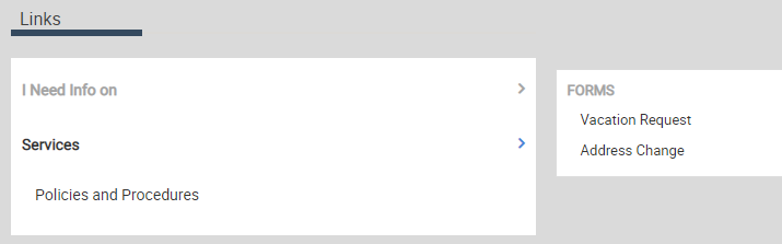
View Name: FoundationQuickLinks
View Description: Displays a vertical set of links, complete with expandable category headers with links inside each category or standalone links. The title of the links comes from the widget property “display Title”.
View Preview:
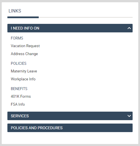
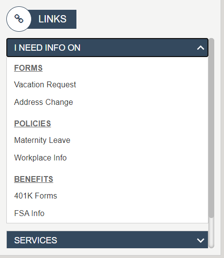
View Name: Department Side Links
View Description: Displays a vertical set of links, complete with expandable category headers with links inside each category or standalone links. This view remains in a card format and adds a scroll bar to view through additional categories and links. The title of the links comes from the widget property “display Title”.
View Preview:
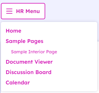
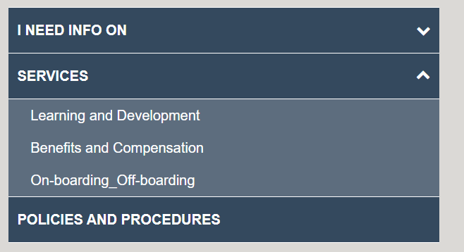
View Name: DeptMenu
View Description: Displays a hamburger expandable set of categories and links, where the title of the Hamburger comes from the display title on the widget property
View Preview:
View Name: FoundationDeptMenu
View Description: The FS2 Department Navigation view used to display a horizontal set of links, complete with expandable category headers with links. The title of the menu comes from the widgets property “display title”.
View Preview:
View Name: FoundationFooterLinks
View Description: Horizontally display a set of links and categories. Categories are supported at one level deep. An example of this view can be found on the footer of the FS ’20 site.
View Preview:

View Name: Department Rail Navigation
View Description: Vertical set of links, complete with expandable category header with links inside each category. This view supports only one category deep. There is not title displayed on this quicklink view.
View Preview:
View Name: DepartmentMaster
View Description: Hamburger expandable set of categories and links. This view supports one level of categories. The title of the Hamburger comes the associated quicklinks column “Root Node Title”. This title is also used as the displayed site title. When the OOTB department site deployer is used, this title will initially be set to “Department Name”, allows a business user to manage their preferred title for the site. For multilingual, the site title will be updated on the language version of the quicklink content in the AppManager in this case content app “Department Menu”.
View Preview:
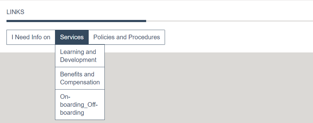
View Name: QuickLinks
View Description: This is a FS2 supported view. Vertical set of links, complete with flyout category cards that display links inside each card and standalone links. The title of the links comes from the widget property “display Title”.
View Preview: