The Voice Structured Content Module provides a central location for viewing and editing the site content defined for the pages and components.
Structured Content – Pages and Components
There are two types of structured content; Pages and Components.
- Pages are full site pages that have a friendly url
- Freeform pages – page defining layout with rows and columns
- Structured pages – focused on content, layout defined in standard template
- Components are general pieces of content, usually used within a widget
The left side of the Structured Content Module screen contains the following:
- Listing of Content Apps organized in pages and components tabs with a count of the number of items in the list. The count of the number of items in the list displays the total count of ALL multi-lingual language versions.
- Content Apps are created in AppManager, to create a new content app, or change the settings for an existing content app, please refer to AppManager Content App Settings.
- A search box is provided to search for content app types.
- A sort order to change the alphabetical listing to ascending/descending.
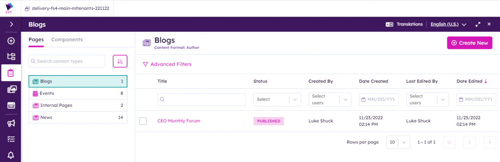
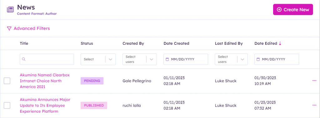
The right side of the Structured Content Module screen contains the following:
- The Create New button is used to add a new content item to the content app list (in our example, a new News item with content format of author)
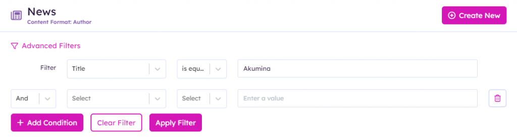
- Basic and Advanced Filters for filtering the content list to make it easier to find the desired content item. Users can
- search by title using the search box
- filter by status of content (Published, Pending, Draft, Rejected)
- filter by the person who originally created the content
- filter by the date content was created
- filter by the person who last edited the content
- filter by the date content was last created
- Use the Advanced Filter to search based on selected content fields using query terms within the items.
- Listing of each content item associated with the content app. The listing contains the title of the content, its current status, created by, date created, last edited by, and date last edited. Click on the content title to open the content for editing.
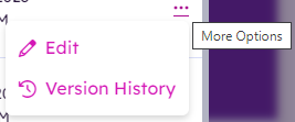
- Clicking on the ellipses for a content item will provide options to directly edit the item or view the changes made to the item in version history.
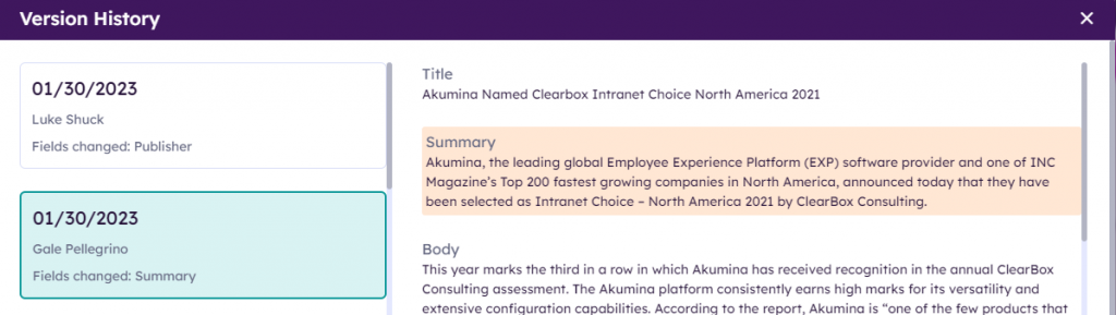
- The version history will display the changes made to the item in chronological date order and highlight the fields changed on the date selected.
Creating New Structured Content
For this example, we will add a new content item to the News. Clicking on the “Create New” button displays all of the available fields of information defined for the content in the editorial panel and non-editorial panel. The fields displayed in the editorial panel (left side of screen) and non-editorial panel (right side of screen) is set up by the admin for the site, so content authors only need to know what information is required based on the content app type (author, slider, curated) when creating new content. Completing all the applicable fields is as easy as using any word process (in fact, you can cut and paste text from Word if desired!).
Following is an example of the create new screen for News, followed by an explanation of the fields associated with the News author format type content:
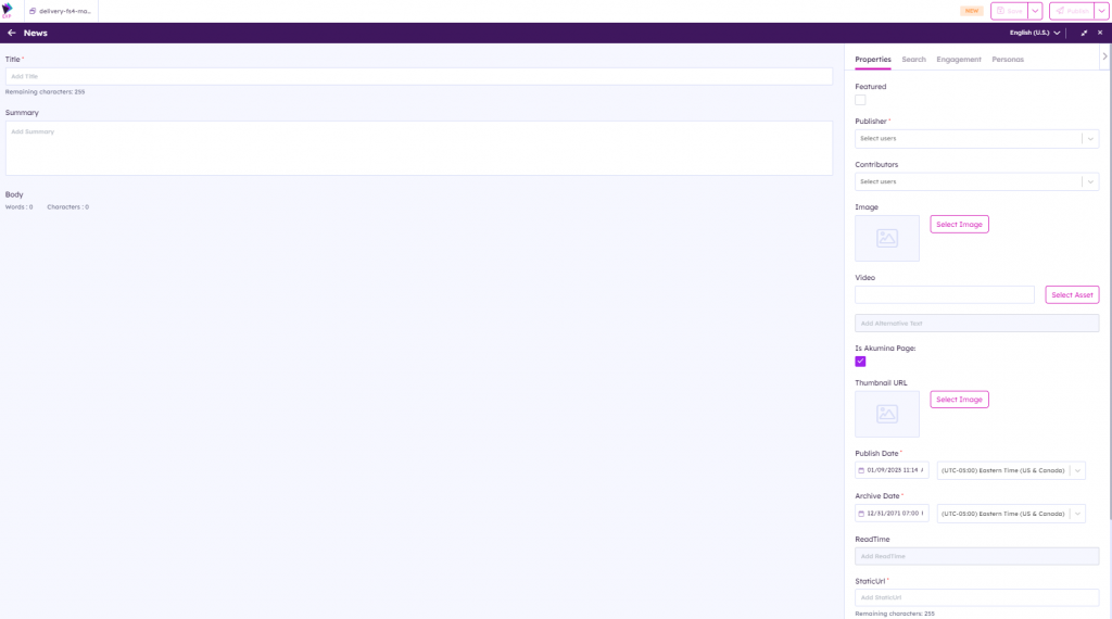
Editorial Panel
The Editorial Panel displays the page content for the site.
| Field | Details |
|---|---|
| Title | This is the title of the item that will appear on the website.
This title will be used to generate the FriendlyURL that will be assigned to view this item on the Details page. It is important to exclude any special characters from this title that are not URL legal. Spaces are OK. |
| Summary | This is the summary text that will be displayed under the title in the Summary view. |
| Body | This is the body content for the item. |
Non-Editorial Panel
The Non-Editorial Panel displays tabs to set page properties and metadata rules based on how the App has been defined by the site administrator.
When app usage is defined as Pages, the Properties tab and Search tab will display. When app usage is defined as Components, the Properties tab will display.
When enabled for the content app, the Engagement, Permissions, and/or Personas tabs will display in the non-editorial panel. To enable, go to Settings > Content Settings > edit the content app and enable the desired options for the content app.
Properties Tab – Pages
The properties tab fields that display are derived from the content app type and list associated with the content.
Below is an example of the Property tab fields displayed for the News author content app type with the FoundationNews_AK list.
| Field | Details |
|---|---|
| Featured | When checked, the content is shown as a featured and displays a featured tag on the front-end site. |
| Publisher | Publisher of the content, will appear on the news detail page and news card |
| Contributors | Contributing publishers of the news article |
| Image | Select the image to be displayed with the news article.
When Select Image is clicked, this launches the Asset Library Module to select or upload an image in the asset library. For additional details, please reference “Adding Content to the Asset Library” section here. |
| Video | Select the Video link to be displayed on the news card.
Either copy and paste a video URL or click Select Asset. When Select Asset is clicked, this launches the Asset Library Module to select or upload a video in the asset library. For additional details, please reference “Adding Content to the Asset Library” section here. |
| Add Alternative Text | This is the title of the item that will appear on the website. This title does allow for special characters. |
| Is Akumina Page | Checked by default to Akumina page link |
| Thumbnail URL | Alternate Image used on listing article widgets such as NewsWidget or CuratedNewsWidget. If not set, then the Image will be used on those widgets. |
| Published Date | Date in which the content will appear on the site, also the date that is displayed on the news article. |
| Archive Date | Date in which the content will be archived from the site. |
| ReadTime | Read time for the article – system calculated on publish. |
| StaticUrl | What will be added to the site Url to create the friendly Url for the news article. |
| FriendlyUrl | This is the generated FriendlyURL. This URL will ONLY appear once the content is saved. It is provided to the user as a convenient way to get the URL for the Detail View page for the content. |
| Shareable | When checked, allows for external sharing of the article to twitter and linkedin. |
| Shareable URL | The external shareable Url for twitter and linkedin. |
Search Tab
| Field | Details |
|---|---|
| Tags | Allows you to specify tags associated with the article. The tags will display on the front-end site. |
| Department | Allows you to specify Departments associated with the article. |
| Region | Allows you to specify Region associated with the article. |
| Search Description | Use the ckeditor, to add a search description to be used for searching or finding an article. |
Engagement Tab
When the Social rules have been enabled for this app, the Engagement tab will display.
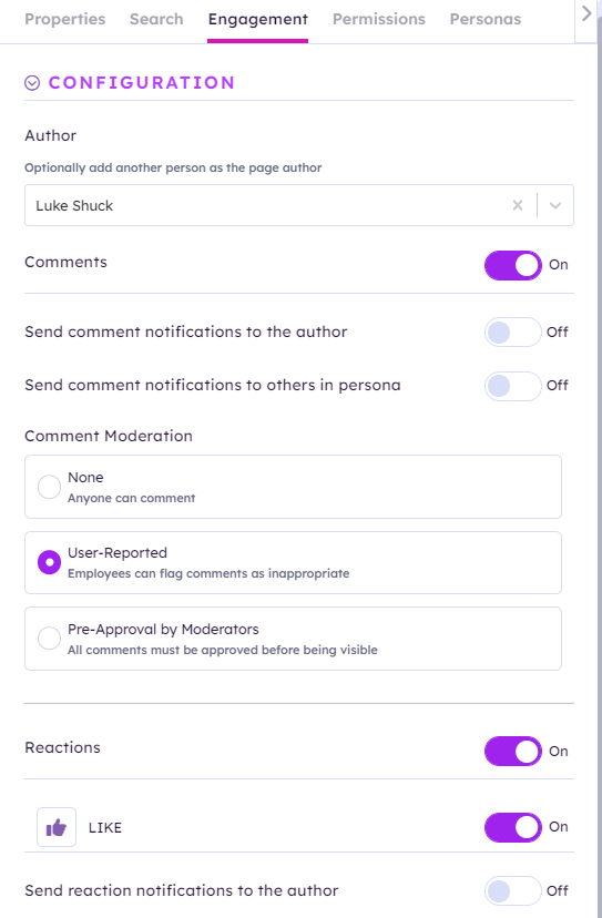
This tab allows a content editor to configure the engagement rules for this article.
Author: Select a name of the person or persons to associate with the page that will receive the social notifications.
Comments: Comments can be enabled or disabled using the toggle button. Comments are enabled by default. Disabling comments will remove the ability to comment on the content and will remove the comment moderation options.
Send comment notifications to the author: Turning the toggle on, will send notifications to the author when comments are made.
Send comment notifications to others in persona: Turning the toggle on, will send notifications to the selected desired personas from the drop down list.
Comment Moderation: Select which comment moderation should be enabled for this content (none, user-reported, pre-approval by moderators). Comment moderation is set to User Reported by default. When Pre-Approval is selected, a dropdown of the available content approval roles in Akumina Flow will appear. The roles define the users that can perform the comment moderation for this content. For additional details, see here.
Reactions: Reactions can be enabled or disabled using the toggle button. Reactions are enabled by default.
Reaction Types: Reactions can be enabled or disabled by reaction type for this content.
Send reaction notifications to the author: Turning the toggle on, will send reaction notifications to the author. This is disabled by default.
Personas Tab
When the Personas have been enabled for this app, the Personas tab will display.
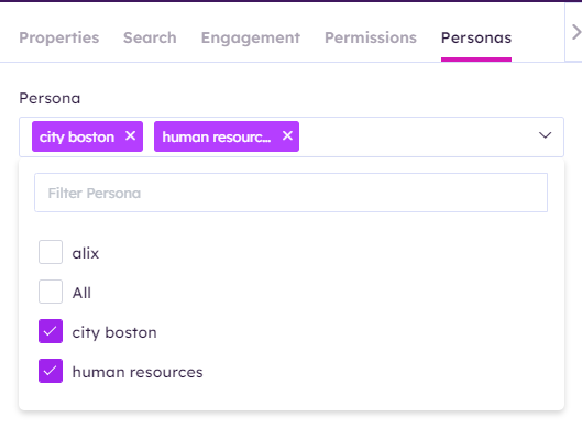
This tab allows a content editor to select the personas to be associated with this page content and it is used for filtering the content on the front end. Employees who are not bucketed with that persona will not have access to the page.
Permissions Tab
When the Permissions have been enabled for this app, the Permissions tab will display.
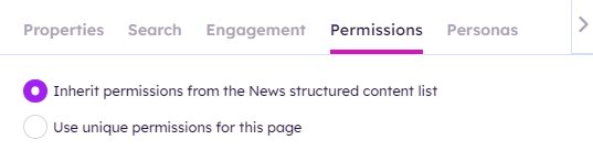
This tab allows a content editor to select whether the item should inherit permissions from its list (default) or whether they want to set custom permissions for the item.
When “Use unique permissions” is selected, an Administrators Permissions, Editor Permissions and View-only Permissions group drop down options will display to specify the security groups who can change permissions, edit or view the content.
There are three types of permissions that can be set on an item:
- ADMIN PERMISSIONS – users in any of the mapped groups can change the permissions on the content item
- EDIT – users in any of the mapped groups can both View the item on the front-end site AND Edit the item in AppManager
- VIEW – users in any of the mapped groups can ONLY View the item on the front-end site, but cannot access or edit the item in AppManager
Users that are not in Edit or View security groups will not see the item on the front-end site or have any access to it.
Authoring Permissions
The Save, Publish, and Submit buttons displayed to the user on the top action bar of the screen are dependent on the users editing permissions and the version settings established for the content app. For details on Voice Authoring Permissions, please visit here.
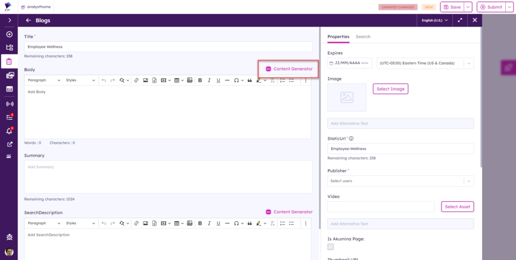
Using ChatGPT for Generating Content
AI content generation is available in the Structured Content module for rich text fields. Contact support to configure your account.
When the content generator is configured, click on the ‘Content Generator’ button for the corresponding rich text field:
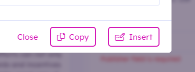
Generated content can either be inserted into the end of the rich text field or copied to the clipboard:
Content Creation
Generate new content on the ‘Compose’ tab by providing a prompt and clicking ‘Go.’
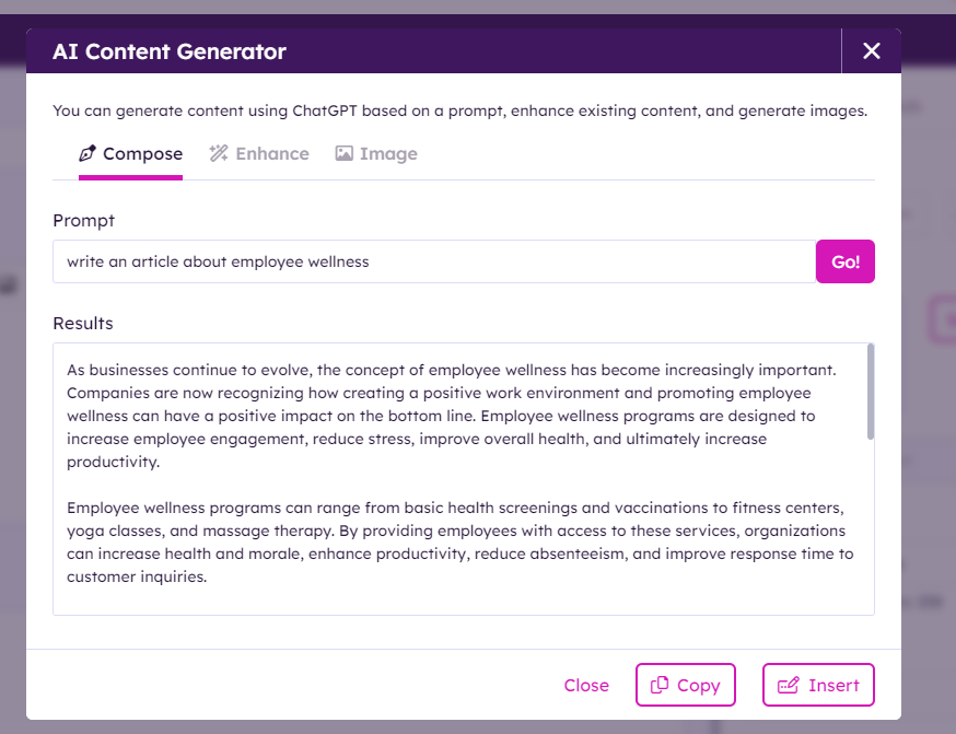
Content Enhancement
Existing content can be enhanced on the ‘Enhance’ tab by providing a prompt and clicking ‘Go.’
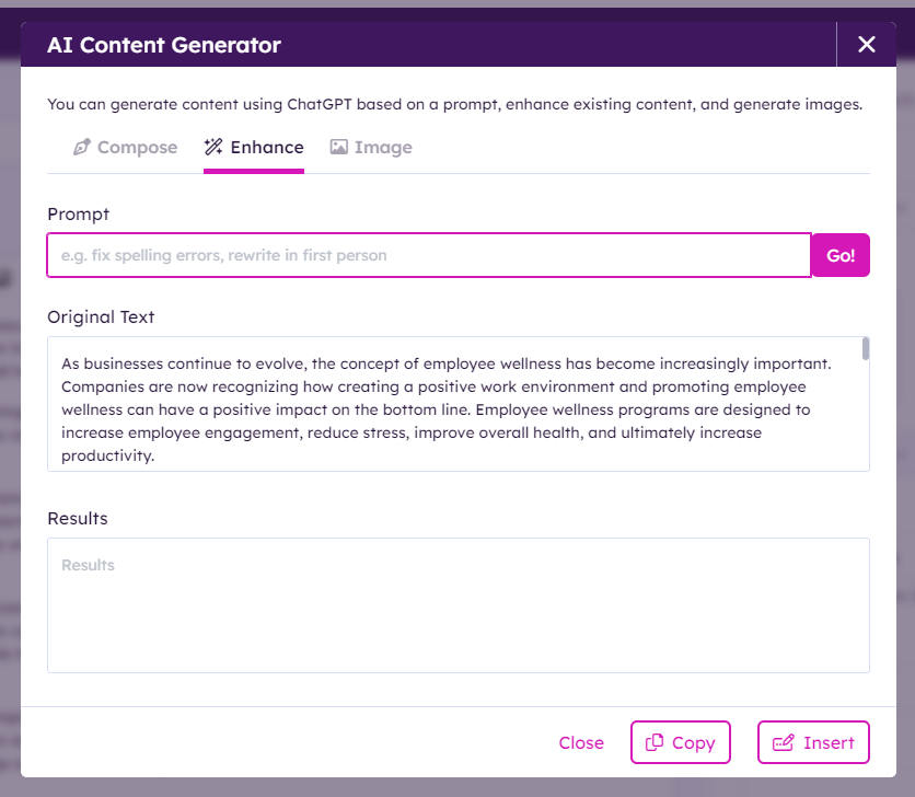
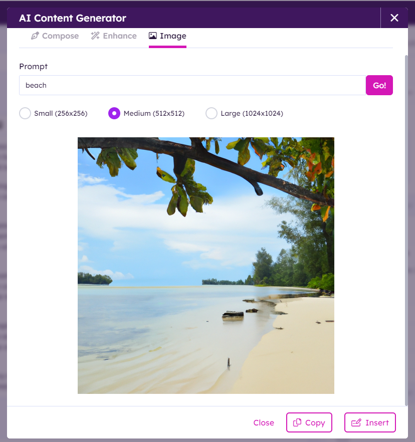
Image Creation
Images can be generated on the ‘Image’ tab by providing a prompt and clicking ‘Go.’ Either small, medium, or large image sizes can be selected.