Latest Featured Widget
Purpose
Provide a picker to a set of pages in a SharePoint List, this is ideal for presenting a picker for content managed in the Sites “Structured Content” > Pages. Enter the data in one place and it is possible to appear as a picker in many different views. This content will never be stale and will always present the latest data without having to edit another widget.
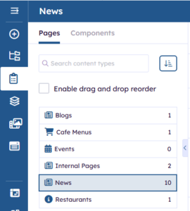
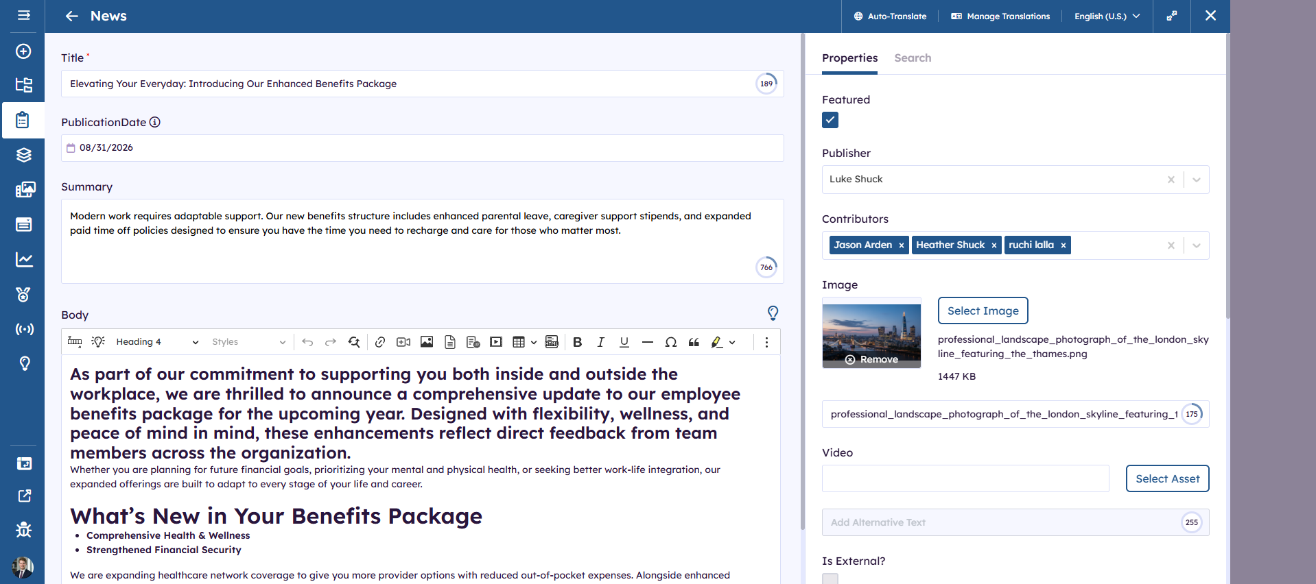
Dynamic pages are managed in “Structured Components” > Pages, by filling in a form, a page is generated and styled for the content author done. Example of a news article form:
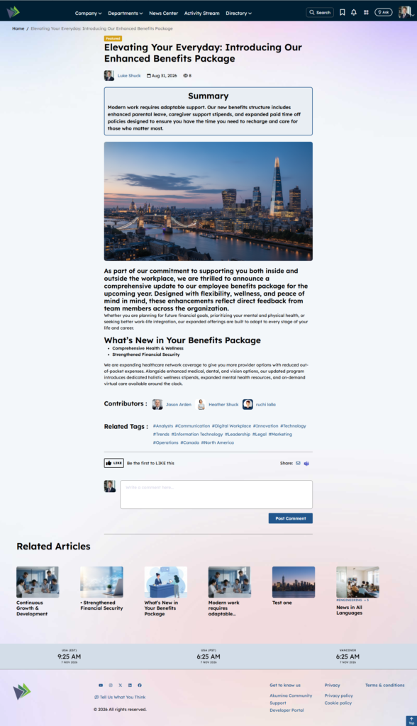
Fill in this form and you end up with a detail page that looks like this without worry about styling or page layouts:
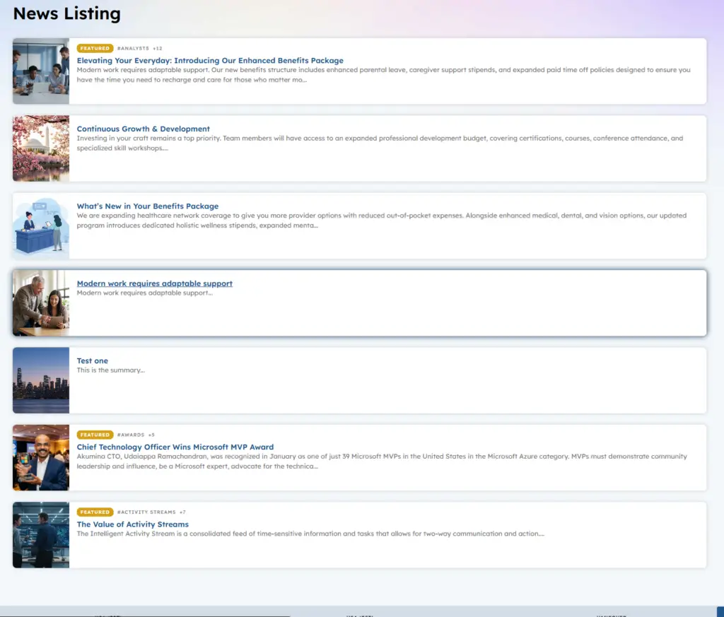
Organizing content by “Structured Content” > Pages in separate SharePoint list is powerful. Example I could create several new Page Components to organize news example CorpNews, HRNews, ItNew, ImportantNewUpdates by treating each as separate SharePoint list I can use a Latest Feature Widget to highlight and present the content to the end User in many different ways. By organizing your Pages under a root content type a listing page can be created such as our News Listing page using the News Widget that will pull in all items sorted by the latest, and present them together. Our New Listing page is looking at all Lists created by a root content type such as AkuminaArticle. We can use the “Latest Featured Widget” to highlight Cafe Menus (alphabetically) or Restaurants or Blogs as you see on our out of the box home page.
Their will be places on the intranet where highlighting content from a SharePoint list such as ImportantNewsUpdates, or Cafe Menus or HrNews, this is done automatically by using the “Latest Featured Widget” it will automatically keep your picker content updated and not stale there will be no need to update another widget to point to the new data.
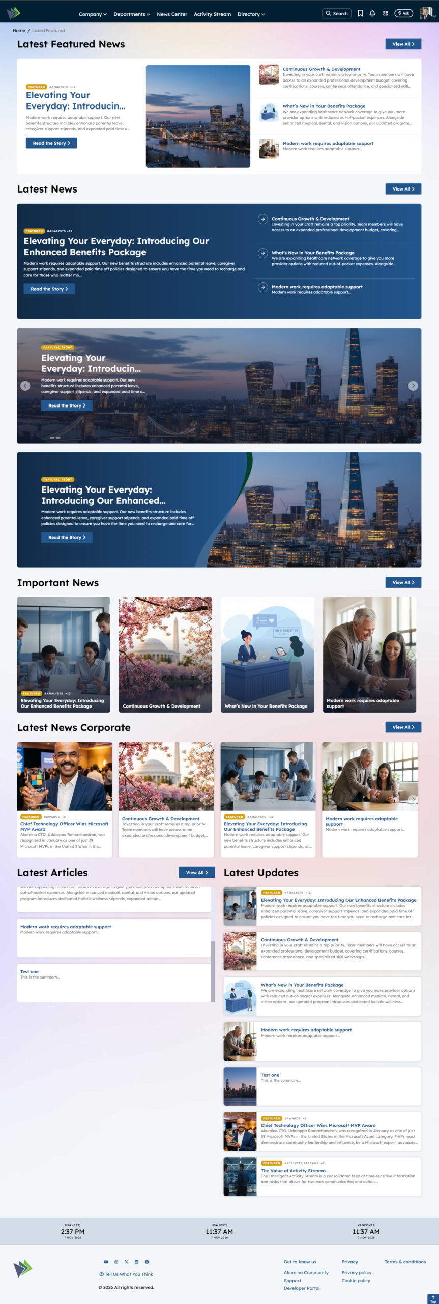
Below is the same content displayed in the Eight supported views. Please note their are also two views that support paging so that this widget can be used on a listing page that pulls all data from a SharePoint list without a scroll bar.
Features
-
- Supports Eight Views, two of which also support paging for displaying the entire List’s on a listing page.
- Never have stale data, if an article is able to be displayed by using the field set in “when article shows” (Publish Date) >= Now (Date/Time) < “when article should be hidden” (Archive Date)
- Control the order of the data to display, pick an ordering field example “Publish Date” or Title (alphabetical example Cafe Menu) and then select the sort order (Ascending or Descending).
- Point to a specific SharePoint List that is managed in “Structure Content” > Pages example “CafeMenus_AK”
- Pull in data from a different SharePoint Site collection, example on a department site a Latest Featured Widget can be configured to pull in the Latest news from Corporate.
- Give a unique title to the widget using language tokens if Multilingual or the exact text in widget property “Widget Title”. If not Title is set then it will not display.
- Configure the number of items to present on our banners it one item is select then the banner controls will not be presented.
- Configure if all items displayed must have a Feature choice selected, in this case only featured content will display
- Determine if there should be a “View All” button present and where it should link too.
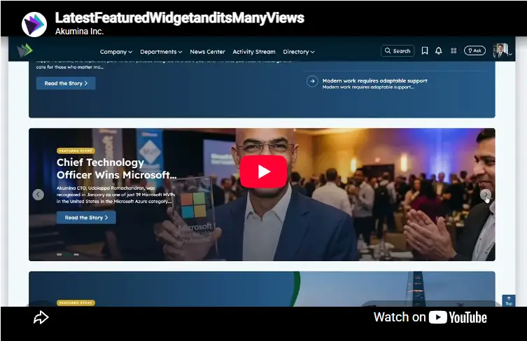
To Learn more about controlling this widget and it’s views watch the video below:
Details
-
- Widget Name: LatestFeaturedWidget
- Available With: Release 7.0.2602.0321
- Content App Type: Structured Content – Pages – ANY OF THEM
- Content Type: AkuminaArticle, AkuminaBlogs, AkuminaInternalPages, AkuminaNews(Pre-7.0), AkuminaFoundationNews (Pre-7.0) and AkuminaSearch (this content type is required on all supported list)
- Content App Name: Any Structured Component > Pages
- List Name: Lists used to manage dynamic articles e.g. News, Blogs, Cafe Menus, Internal Pages, Restaurants and any additional content app used to support dynamic pages
- Recommended Images Sizes: N/A
- Dependencies: GenericListWidget
Content
The Content displayed on this widget is populated by Content that has been created as “Structured Content” > Pages. Below is an example from the AkuminaArticle content type highlighted in BOLD are the columns used by Latest Featured Widget.
| Title | Title that will display in the Content App list |
| PublicationDate | Date that will display on the detail page as the article data if this is not set then the “Publish Date” will be used |
| Summary | Summary rich text. If this SharePoint list is used on a AnnouncementItemsWidget then this field will be displayed on the listing page. The summary does not display on this widget view but can be used else where |
| Body | Rich text that will makeup the body WYSIWYG allowing the author to view the source and style the content. |
| Featured | N/A not displayed on this widget views. |
| Publisher | Publisher of the news article, they will appear on the News Detail page |
| Contributors | People picker set of site users who have contributed to this article. N/A not displayed on this widget views. |
| Image | Image Displayed on Banners and Detail pages |
| Image Description(there is no label for this input field it is part of Image input) | Text description of the image to be leveraged for accessibility/screen readers. By default, the image Url, but should be updated to a description of the picture |
| Video | Web address for a video found in the Asset libraries (Link to an item in the SharePoint site) or External Video such as a YouTube Video. If This is an external video then “Is External” needs to be selected |
| Video Description (there is no label for this input field it is part of Video) | Link Title of the video to be displayed, to be leveraged for accessibility/screen readers. By default, the video Url, but should be updated to a description of the video |
| Is External | No Checked by default – If your Video link is from external source such as YouTube this must be selected. |
| Thumbnail URL | Alternate Image used on listing article widgets such as NewsWidget or CuratedNewsWidget if not set then the Image will be used on those widgets. |
| Thumbnail Description (There is not label for this field it is part of Thumbnail) | Text description of the Thumbnail image to be leveraged for accessibility/screen readers. By default, the image Url, but should be updated to a description of the picture |
| Published Date | Date in which the content will appear on the site, also the date that is displayed on the news article. |
| Archive Date | Date in which the content will be archived from the site |
| ReadTime | Auto Populated after content is SAVED |
| StaticUrl | What will be added to the site Url to create the friendly Url for the news article |
| FriendlyUrl | This is a calculated field based upon the site you are viewing the content. It is used to populate FriendlyUrlSearch. After Save this field is what you copy and past into a quicklink type app to add the article to the site navigation. |
| FriendlyUrlSearch | AkuminaSearch Content Type MUST be added to all “Structured Content” > Page supported list. This field is used to auto navigate by widgets such as Search, NewsWidget and LatestFeatureWidget
After the article has been SAVED this field will be auto populated. It is hidden. |
| Tags | Termstore Taxonomy Tags that can be linked to the article and leveraged in Searching relevant content. |
| Departments | Termstore Taxonomy Tags that can be linked to the article and leveraged in Searching relevant content. |
| Region | Termstore Taxonomy Tags that can be linked to the article and leveraged in Searching relevant content. |
| Search Description | Content that will display on the search results for this item. |
Properties
| Widget Title | This can be the literal title e.g. “Corporate News” or a language token example latestfeaturedwidget.latestfeaturednewstitle (which gets translated to “Latest Featured News”) | |
| List is on Root Site | When checked, the widget references the list on root site | |
| List Name | Name of the SharePoint list that contains the data to be displayed for this widget instance, examples: FoundationNews_AK, CafeMenus_AK…. (any list that is managed via Structured Content > Pages) | |
| Site Collection URL | Site collection URL where the SharePoint list defined in “List Name” can be found. | |
| viewxml | OOTB – Blank (used for widget expansion) XML that could be used in the view to query the data. | |
| Cache Interval |
|
|
| Function to call after fetching data | OOTB -Blank (used for widget expansion): Name of the function called after data has been fetched by the widget. | |
| Funtion to call before binding the UI events | OOTB -Blank (used for widget expansion): Name of the function called before the UI has been rendered to the screen | |
| Selected list columns | Columns in the SharePoint list that the widget is utilizing on the view:
ID,Title,FriendlyUrlSearch,Thumbnail_x0020_URL,Image,Summary, PublicationDate,Publish_x0020_Date,Archive_x0020_Date,Tags, Departments,Region,Featured |
|
| Items/Page | The maximum number of items to display on view. On Latestfeaturedcarousel and Latestfeaturedcarouselnoimages only 4 items display max. On listing views such as Latestfeaturedimages and Latestfeaturednoimages this is used to determine the number of items to retrieve before displaying a “Show More” only if “Enable Paging” = Yes else it is the number of items to display. | |
| Enable Paging | Only used on views Latestfeaturedimages and Latestfeaturednoimages this tells the view to look at the Items/Pages to determine how many items to display before presenting the “Show More” lazy load this is so this widget can be used on a listing page. | |
| Summary Character Limit | OOTB not used but could be used for expansion | |
| View All Title | OOTB Multilingual token {common.viewall} can be replaced with a literal or token that is used to display the text on this button:
|
|
| View All Link | Site Page which the user will navigate too when they select the “View All”. If this is not set ant “View All Title” is empty then not “View All” or link will be present. | |
| Order By | OOTB – Publish_x0020_Date this is the SharePoint internal name for “Publish Date”, it could be set to Title if you would like to display content by Title order (asc would mean alphabetically in this case) | |
| Order Direction | DESC/ASC – If Order by is a date then DESC means most recent if Order by is Title you may want this to be ASC for alphabetical. | |
| This is SharePoint column that must be a date field OOTB set to Publish_x0020_Date, it is the date that makes the content available to be displayed on the site. In the example of Publish_x0020_Date >= NOW for content to show up. | ||
| Internal field name for when articles should be hidden | This is SharePoint column that must be a date field OOTB set to Archive_x0020_Date, it is the date that determines when content will be removed from the widget NOW < Archive_x0020_Date | |
| Internal field name to determine if an article is featured | OOTB Featured | |
| Dependencies | GenericListWidget. |

Views
View Name: Latestfeaturedcarousel
View Description: Display Four items, based upon the widget property configurations example Latest news or Latest Feature News, or if Title is “order by” then alphabetically by Title. If the Title is not set or the “View All Title” and “View All Links” are not set then they will not display for this view. Displaying the Thumbnail image if set else the Image.
View Preview:
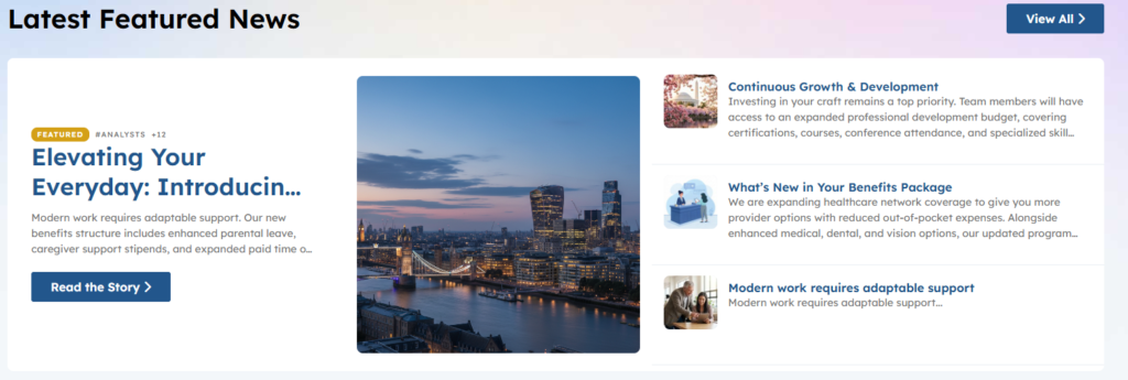
Example of this view without the Title, “View All Title” and “View All Link not set
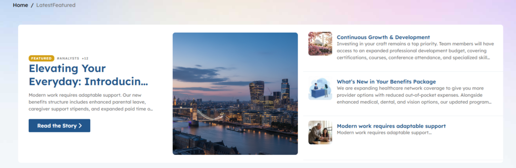
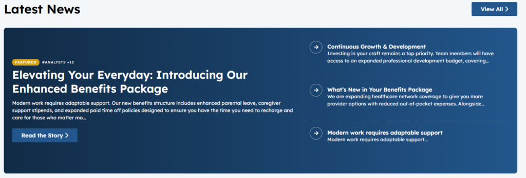
View Name: Latestfeaturedcarouselnoimages
View Description: Display Four items, based upon the widget property configurations example Latest news or Latest Feature News, or if Title is “order by” then alphabetically by Title. If the Title is not set or the “View All Title” and “View All Links” are not set then they will not display for this view.
View Preview:
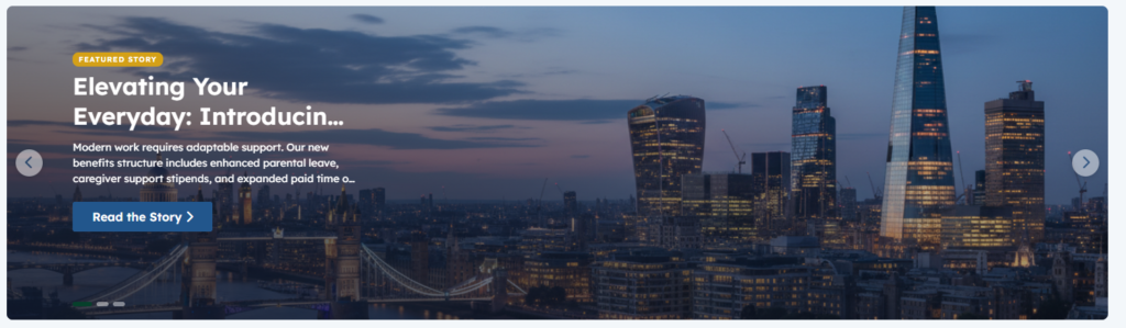
View Name: Latestfeaturedbanneralternate
View Description: Display based upon the widget properties, the Items/Page count of items, base upon your other widget properties configurations example Latest news or Latest Feature News, or if Title is “order by” then alphabetically by Title. This view does not display the “View All” or Widget Title. The banner slider controls and chevrons will not display on this view if only one items is pulled in. Displaying Image field as the Image if set else the Thumbnail.
View Preview:
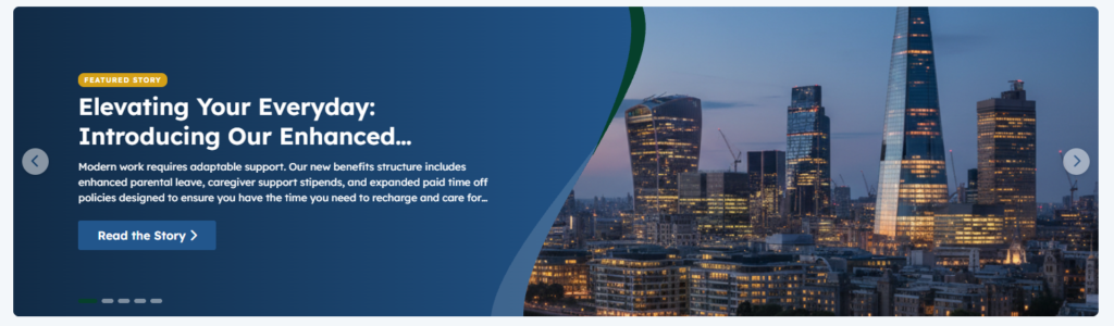
View Name: Latestfeaturedbanner
View Description: Display based upon the widget properties, the Items/Page count of items, base upon your other widget properties configurations example Latest news or Latest Feature News, or if Title is “order by” then alphabetically by Title. This view does not display the “View All” or Widget Title. The banner slider controls and chevrons will not display on this view if only one items is pulled in. Displaying Image field as the Image if set else the Thumbnail.
View Preview:
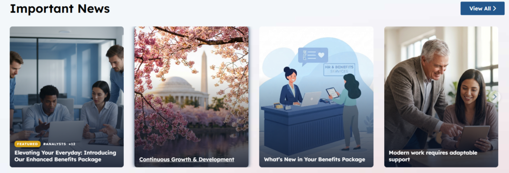
View Name: Latestfeaturedcardimages
View Description: Display based upon the widget properties, the Items/Page count of items, base upon your other widget properties configurations example Latest news or Latest Feature News, or if Title is “order by” then alphabetically by Title. If the Title is not set or the “View All Title” and “View All Links” are not set then they will not display for this view. Displaying the Thumbnail image if set else the Image.
View Preview:
View Name: Latestfeaturedcard
View Description: Display based upon the widget properties, the Items/Page count of items, base upon your other widget properties configurations example Latest news or Latest Feature News, or if Title is “order by” then alphabetically by Title. If the Title is not set or the “View All Title” and “View All Links” are not set then they will not display for this view. Displaying the Thumbnail image if set else the Image.
View Preview:
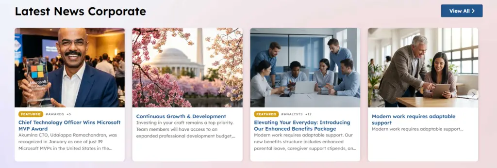
The Listing Views
Below are two views that can be used as a widget on the page respecting the appropriate widget height for our cards stacking, if there are more items that can display within the site card height then a scroll bar will appear. They can both be configured to use “Enable Paging” and in that case the Item/Page Count mean pull in that number of items before presenting a “Show More” lazy load. Below one view will be in the card height and the final view will be in “Enable Paging” Mode. If the Title is not set or the “View All Title” and “View All Links” are not set then they will not display for this view.
View Name: Listnoimagelatestfeatured
View Description: Listing view that can be displayed at a card height or configured to “Enable Paging” and all content will display
View Preview:
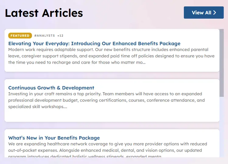
View Name: Latestfeaturedimages
View Description: Listing view that can be displayed at a card height or configured to “Enable Paging” and all content will display. In the example below the “View All Title” and “View All Links” are not set so they will not display, this is perfect for a listing view.
View Preview: