AppManager User Interface
The AppManager User Interface provides site specific details and functions for the AppManager site.
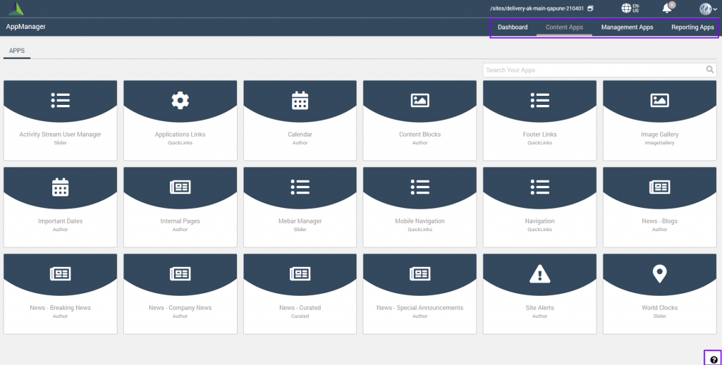
There are four main functions provided on the AppManager ribbon.
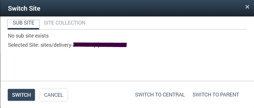
| Site Collection | Displays the current site and provides the ability to easily switch between sub-site or site collection. For central/delivery sites, provides the ability to switch to central or switch to parent site.
|
| Language | When multilingual is enabled for the site, the language selector displays the currently selected language and allows the user to switch to any other available language. Adding languages to the site are managed in the AppManager > Management Apps > Language Manager. |
| Notification Bell | Reserved for future use to display the Notifications within AppManager only. |
| Settings, Preferences, and Sign Out Access | 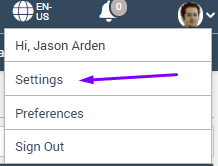
The User Profile Icon includes a dropdown that provides access to the AppManager “Settings”, “Preferences” and “Sign Out”. Settings only appears for users who are part of the Administrator Group for the current site (set in Global Settings). For additional information, please reference the following documents: |
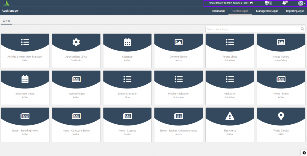
AppManager Pages
There are four main tabs for navigation to the AppManager Pages. And a help section is provided to knowledge-based links to Akumina Community user guide documentation.
| Dashboard Tab | Displays the Dashboard available to the logged in user. The Dashboard provides a personalized user experience to select user defined reporting and analytics widgets to display on the dashboard. Click here to learn more details on the AppManager Dashboard. |
| Content Apps Tab | Displays the Content Apps available to the logged in user. The Content App icons can be organized by dragging them to a desired position in the list. Search filtering is available for both the content apps and latest content list. Click here to learn more details on the AppManager Content Apps. |
| Management Apps Tab | Displays the Management Apps available for authorized users. If a user is not authorized for any Management Apps, the tab will display a message to that effect. Click here to learn more details on the AppManager Management Apps. |
| Reporting Apps Tab | Displays the Reporting Apps available for authorized users. If a user is not authorized for any Reporting Apps, the tab will display a message to that effect. Click here to learn more details on the AppManager Reporting Apps. |
Button styling in AppManager
The AppManager buttons are styled to indicate the available actions on the page.
Types of buttons:
- Primary button (solid color button): is only for the primary action on the page.
- Secondary button (white button with border): is for all the secondary actions on the page.
- Tertiary button (white button): is for any negative action on the page i.e. reject, delete, cancel etc.
- Text button (similar to anchor tag but on hover gets a background): used mostly inside cards to depict secondary or not an important function.
All the buttons will appear grayed out with a disabled mouse pointer on hover when they are disabled.