The purpose of this topic is to give an overview of the organization, pages, features and functions that are included in the Akumina Hive default install for both the Home site and the Department/ Market site collection. Hive is available with release 5.5 Hive Install and above.
Hive Foundation Site
The Foundation Home Site deployment package is a site template (Digital Workplace Foundation Site) which can be deployed from within the Akumina AppManager using the Site Creator Management app. It is meant to be deployed once in the Site Collection as the home site for the Intranet. HIVE deployment package provides a Modern Headless site.
Hive Home Page
Pages deployed within the HIVE Home Site
Deployed pages, main navigation, navigation elements, footer navigation and mission control are the same across the HIVE site.
Home – Home Landing Page contains section specific content and access to subpages within the current section.
News Detail – A dynamic page used to display detailed content for a specific news item.
News Listing – Displays all news articles from the News list.
Event Detail – A dynamic page used to display a detailed content for a specific selected event.
Event Listing – Displays all calendar events from the Calendar list.
Blogs Detail – A dynamic page used to display detailed content for a specific blog news item.
Blogs Listing – Displays all blog news articles from the Blogs list.
Streams – Displays the Activity Stream feed experience with O365 and 3rd party providers with the ability to share and promote content, communicate critical and time sensitive messages and ties comments and notifications to a user’s personalized collaborative activity stream.
People Directory – Contains a complete listing of People in the organization populated from AzureAD, SharePoint or a custom data source. People directory can be searched by Name or Keyword.
Employee Profile – A dynamic page used to display the details of each user and the user’s Org Chart tree. Going to your own user Employee Profile allows you to quickly edit your own information.
Search Results – Displays search results which can be filtered by facets and result types.
Internal Page – A dynamic page used to display a detailed internal page view for each of the current site section’s with/without related articles.
Documents – Displays and allows for management of documents from a specified library.
Logout – Displays a message to the user on logout.
Mission Control – Displays the list of Apps and Widgets mandated by the organization or selected by the current user.
Forms – A dynamic page used to display any form defined in the site.
Media Library – Displays the images and videos posted to the Media Gallery.
Main Navigation
The Main Navigation appears throughout all the pages of the Hive Site.
Foundation Site Ribbon
The items on the “Foundation Site Ribbon”, are discussed below:
Menu
A fully visible menu shows level one items in the menu by default out of the box.

The Menu Navigation appears on every page of the Home site and displays the site-specific menu items and an optional featured menu banner. The Menu Navigation is managed on the “Navigation” Content App in the AppManager. The navigation menu may contain internal and/or external links. Categories can be link able or not. Menu items can be opened in the same window or in a new window (new browser tab). The chevron icon indicates the Level 1 has child items.
The menu uses the QuicklinksWidget properties to display the categories and links on click of the arrow. The widget includes properties to easily configure the menu to display level two on hover or to show a menu navigation hamburger to launch the level one items in the menu. Clicking on the Menu Navigation hamburger will launch the level one items in the menu. Please visit here to learn more about QuicklinksWidget.
Featured Menu Item – Call to Action
The Featured Menu Item displays a featured banner topic on the level one menu items, when configured. If multiple featured items are created, the menu will randomly display on each level one node. The featured menu content app is used to add featured menu items to the FeaturedContent_AK list. Updating the Featured Menu Item is done in the AppManager > Content App > Featured Menu.
Company Logo

Clicking on the logo, navigates back to the Home Page. The site is defaulted to the hive site logo and Akumina branding site theme. Updating the Site Theme and the Site logo is done in the AppManager > Management App > Theme Manager, to learn more about managing the site logo and theme click here.
Search Bar – Type Ahead Search
The Type Ahead Search will be triggered on the third character of input entered in the Site Search box. The Type Ahead Search provides search results for the entire site for relevant documents, pages, and people in displayed tabs. The Type Ahead Search can be configured to display results from a single site or across sites.
Clicking on a different vertical tab will refine the search results specifically for Documents, Pages, or People, and display up to the top ten search results found in each tab drop down. When there are more than ten search results available, the total count of all results will display in a clickable message at the bottom of the page.
Clicking on the search results message at the bottom of the page; or clicking enter after the search term is entered in the search bar, will navigate the user to the full search results page.
Please visit here to learn more about Akumina Search Experience.
Bookmarks

When the bookmark icon is clicked in the header, a modal will be displayed to add the current page to favorites. The page will now show in the Favorites tab in Mission Control. Click here to learn more about the FavoritesWidget.
Notifications

The Bell is used to display Akumina social notifications and external notifications. Please visit here to learn more about Akumina Notifications.
User Profile

Displays the current user avatar and users team presence. On hover provides a drop-down list of available options. Clicking on an option allows the user to set their user preferences and interests, view and edit their profile, change their language selector (only if using multi-lingual), and log out of the intranet site. These items are found on the master page, labels are managed in the language files for multilingual. When multilingual is enabled for the Foundation site, the language selector displays the currently selected language and allows the user to switch to any other available language. Adding languages to the site are managed in the AppManager > Management Apps > Language Manager.
The users team presence will be activated when the user has signed into teams and the team presence azure ad permissions are turned on. The users avatar will reflect the teams status in the icon. The users team presence has been enabled by default for the following widgets on the hive site: GenericSearchList, PeopleDirectory, EmployeeDetailWidget, MyOrgTreeWidget, GenericPeopleQuery, NewsDetailWidget, NewsWidget, BlogsWidget, BlogsDetailWidget, and CuratedNewsWidget.
Setting User Preferences
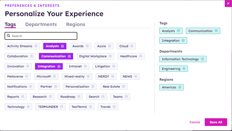
User preferences allows a user to customize their viewable content on the site by selecting the Tags, Departments, and Region taxonomy values to personalize their intranet experience. Please visit here to learn more about UserPersonalizationWidget.
The SharePoint Global taxonomy term store is used as the data provider for Personalization on central/delivery sites. For site collections with delivery only sites, a home site is defined in site manager to define the home site and the site term store. Personalization would support up to 2 levels of hierarchy to display.
Main Menu Navigation Elements
The Main Navigation displays the level 1 items with the ability to click to show level 2 items. The Main Navigation is using the QuickLinksWidget to learn more about this widget please click here. A featured item is available to link to the menu, see Featured Menu for more details.
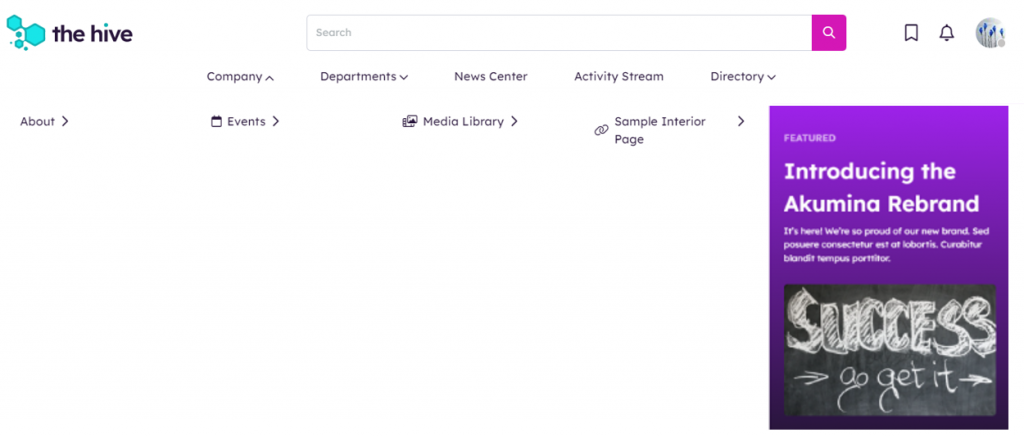
Company
Provides links to Company information in a dropdown selection for level 2 menu category items including About (provides an ad-hoc page outlining the company values), Events (links to main calendar), Media Library (links to media library), and Sample Interior Page (links to interior page).
Departments
Provides links to the Departments/Site Collections. The department link navigates the user to a dynamic page for the department page.
News Center
Navigates the user to the news listing page, where all news articles are displayed from the news list.
Activity Stream
Navigates the user to the Activity Stream page, where a user can find the latest stream events.
Directory
Navigates the user to the People Directory, where a user can search for colleagues via Name or Keyword. Also includes a secondary navigation option to an organization chart.
Site Alerts
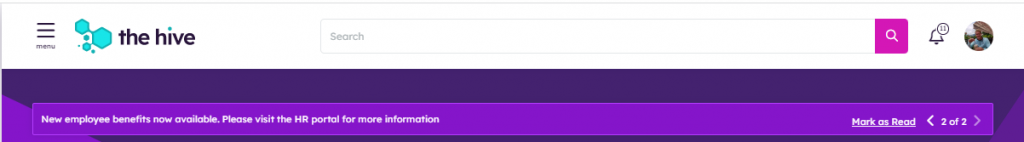
Displays one or more site alert messages on all site pages. If there are multiple site alerts, then the user can cycle through the alerts using the forward/back arrows. Messages will rotate and display in descending order based upon created time. Each site alert must be enabled and published via the Broadcast Center to appear on the site. Site alerts can be configured with a mandatory read option to require the user to acknowledge the message (mark as read) or have no indicator. To learn more about the NotificationBannerWidget, click here.
To learn more about the Broadcast Center, click here.
Footer Navigation Elements
Clicking on the logo, navigates back to the Home Page. This is the same logo that appears on the header, to manage the site logo navigate to AppManager > Management Apps > Theme Manager. To learn more about the AppManager “Theme Manager”, click here.
Page Contact
Displays the email address of the owner of the virtual page and last modified date. This information is dynamically pulled from PageContext.
Copyright
Displays a center aligned copyright dated information, with an automatic update based on the current year. Managed on the sites master page.
Widget instances deployed within the HIVE Master Page
Mission Control Launch
Launches the Mission Control Dashboard Page in a flyout available on all pages.
Mission Control Widget
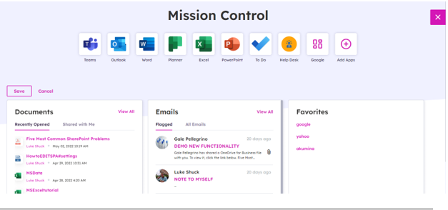
Displays the list of Apps and Widgets mandated by the organization or selected by the current user at a single location. To learn more about the MissionControlWidget, click here.
Launch Pad Widget
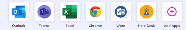
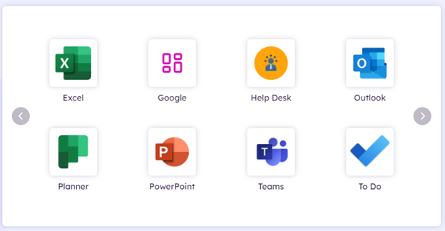
Displays list of Apps available to the current user in Mission Control. The default apps on the Hive site include Outlook, Teams, Excel, Chrome, Word, and Help Desk Apps. The Add Apps allows the users to customize their list of Apps to display on Mission Control. To learn more about the LaunchPadWidget, click here.
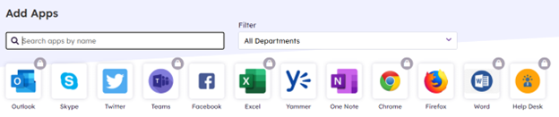
Add Apps also provides search and filter capabilities. Apps with a lock displayed indicates the App is mandated by Corporate and cannot be deleted by a user. Permissioned content owners can manage the list of Apps displayed for all users, navigate to AppManager > Content Apps > MyApps.
Mission Control – Dashboard Widgets
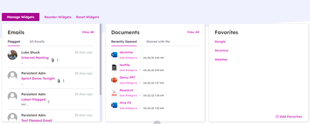
Displays the employee dashboard to allow end users the ability to create a personalized user defined dashboard page based on their selection from multiple available widgets; and define their page layout preferences. Click here to learn about Working with the Employee Dashboard.
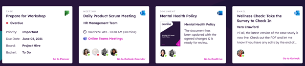
The following Dashboard Widgets are provided by default on the Hive site: Meetings, Documents, Emails, Tasks, and Favorites.
My Outlook Meetings Widget
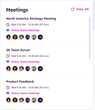
Displays the upcoming meetings with a list of attendees from Outlook and Teams for the current user. Clicking on the item will open the Outlook calendar to join the meeting. When a Teams meeting is upcoming within 30 minutes, a join icon will appear when selected the user can join the meeting right from the intranet. To learn more about the MyOutlookMeetingsWidget, click here.
My Recent Files Widget
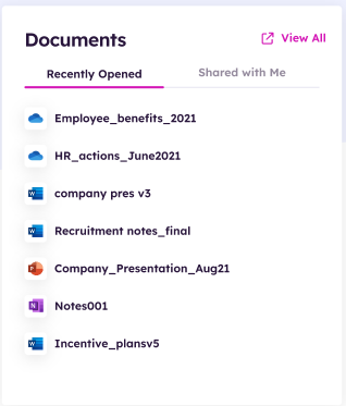
Displays a list of the recent files visited by the current user and the documents shared with the current user. Clicking on the document title will navigate the user into the document type in a new tab displaying the document details. To learn more about the MyRecentFilesWidget, click here.
My Email Widget
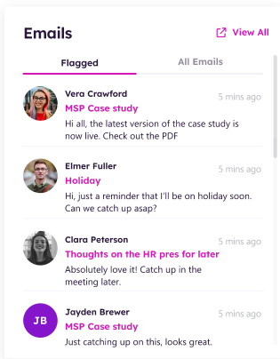
Displays the latest emails from Outlook for the current user. Clicking on the email title will navigate the user into Outlook in a new tab displaying the email details. To learn more about the MyEmailWidget, click here.
My Tasks Widget
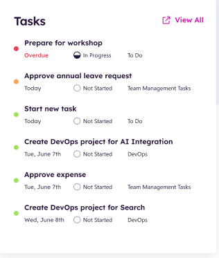
Displays the latest overdue and pending tasks from Planner sorted by due date for the current user. Clicking on the task title will navigate the user into Planner in a new tab displaying the task details. To learn more about the MyTasksWidget, click here.
Favorites Widget
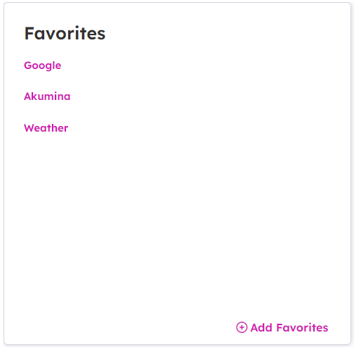
Displays a list of Saved Personalized links for the current user. To add a new link, click add favorites and a popup modal will display to add favorites.
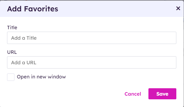
To learn more about the FavoritesWidget, click here.
Widget instances deployed within the HIVE Home Page
The home page site is deployed with default widget instances with the Hive Site, although, widgets can be changed or added in page edit mode.
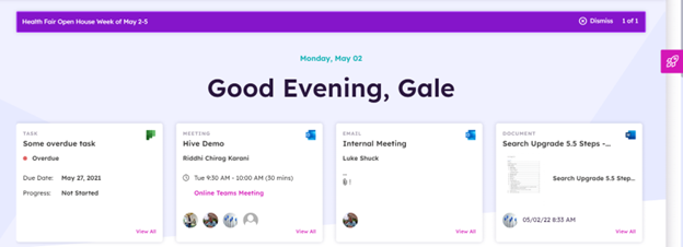
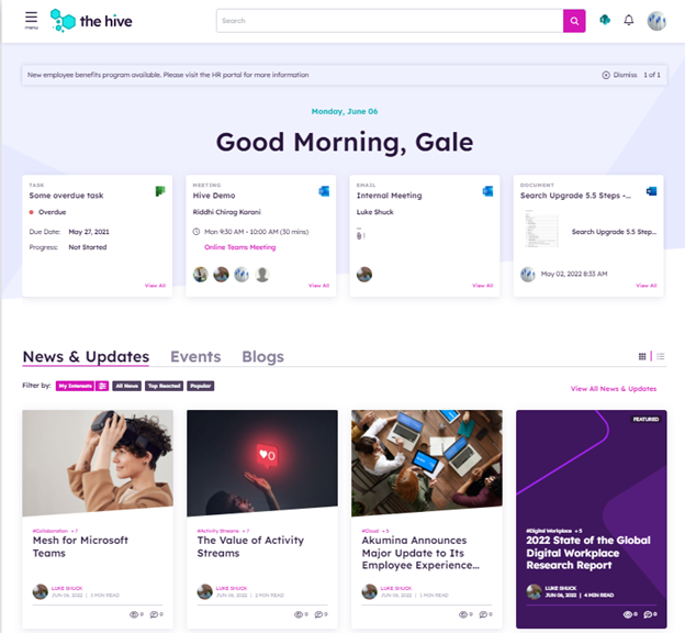
Greetings Widget
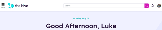
Displays today’s date, with a welcome message to the user based on the user’s local time of day. Message displays Good Morning (12 pm to 12 noon), Good Afternoon (12 noon to 6 pm), and Good Evening (6 pm to 12 pm) with users display name, when available. To learn more about the GreetingsWidget, click here.
Me Bar Management Widget
Displays a list of widgets in a slider format for the latest task, meeting, email and document for the signed in user. Each widget displays a card on the home page for each of the latest Task, Meeting, Email, and Document for the current logged in user. When a card is selected, the item will open in the associated app in a separate window. Content displayed on the cards is pulled from the full results on the associated app, based on the following criteria:
- Task displays the most overdue task using MyTasksWidget. To learn more, click here.
- Meeting displays the latest occurring meeting using MyOutlookMeetingsWidget. To learn more, click here.
- Email displays the latest users email using MyEmailWidget. To learn more, click here.
- Document displays the most recent document using MyRecentFilesWidget. To learn more, click here.
The MeBarManagement widget is used to control the available widgets, widget titles, display order and determine if the widget opens in a collapsed or expandable state. For multilingual, the titles displayed on these widgets are managed in the AppManager slider app. “Mebar Manager”, make a language version of the content and translates the titles appropriately. To learn more about the MeBarManagementWidget, click here.
News, Events, and Blogs
Tab Widget
Displays a tab list of the News and Events for the site. When a tab is selected the widget content will be displayed. To learn more about the TabWidget, click here.
News Widget
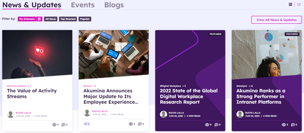
Displays eight news cards in two rows of the latest and/or featured (configured to consider feature on widget property) news from the FoundationNews_AK list. This widget can be configured to pull news from across sites or from the current site only. Quick filter buttons display the news based on the radio button selected for My Interests (defined user’s preferences), All News, Top Reacted (based on highest number of likes), or Popular (based on number of views). News is loaded by default based on the current users’ preferences. If users’ preference is not setup than it will load All News by default. Radio buttons are configurable and can also be removed from the view. News cards display the article title, image, author, last updated date, article tags, read time, and the associated reactions, views, and comment counts. Click on front-end toggle to change view from tile to list. Click on “View All News & Updates” will navigate the user to the news listing page. Click on an Article will navigate the user to a news detail page. To learn more about the NewsWidget, click here.
Events Widget
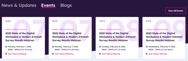
Displays eight event cards in two rows of the latest events in chronological order using the Calendar_AK list. This widget can be configured to pull events from across sites or from the current site only. Quick filter buttons display the events based on the radio button selected for My Interests (defined user’s preferences), and All Events. Events are loaded by default based on the current users’ preferences. Radio buttons are configurable and can also be removed from the view. Click on front-end toggle to change view from tile to list. Click on “View All Events” will navigate the user to the events listing page. Click on an Event will navigate the user to an event detail page. To learn more about the EventsWidget, click here.
Blogs Widget
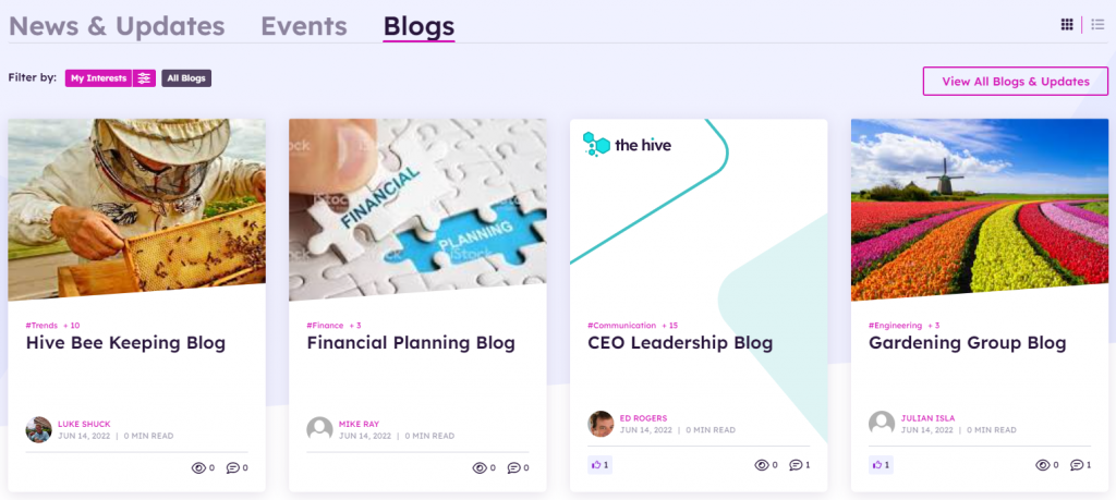
Displays eight blog cards in two rows of the latest and/or featured (configured to consider feature on widget property) news from the Blogs_AK list. This widget can be configured to pull blogs from across sites or from the current site only. Quick filter buttons display the blogs based on the radio button selected for My Interests (defined user’s preferences), or All Blog. Blogs are loaded by default based on the current users’ preferences. If users’ preference is not setup than it will load All Blogs by default. Radio buttons are configurable and can also be removed from the view. Blogs cards display the article title, image, author, last updated date, article tags, read time, and the associated reactions, views, and comment counts. Click on front-end toggle to change view from tile to list. Click on “View All Blogs & Updates” will navigate the user to the blogs listing page. Click on an Article will navigate the user to a blogs detail page. To learn more about the BlogsWidget, click here.
My Feed Widget
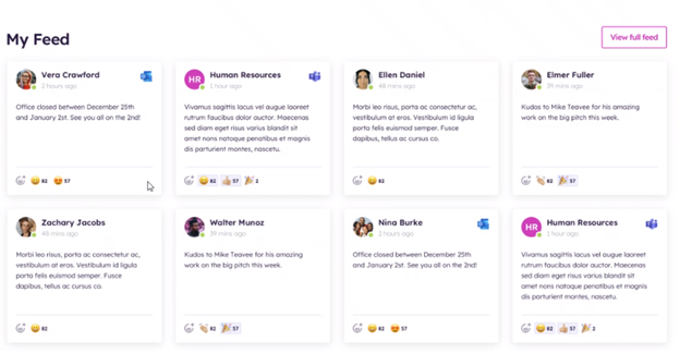
Displays eight compact view stream cards in two rows of the most recent activity stream event items displaying reaction and comment counts in My Feed using the StreamCards_AK list for SharePoint, Outlook, and Push events (applicable if licensed for Activity Streams). The compact stream cards are read only, click on the individual card to view the full card details and to action on the card (react or comment). Clicking on “View Full Feed” will navigate to the Activity Streams page. To learn more about the MyFeedWidget, click here.
Department Summary Widget
Displays a summary of users accessible data from the selected department site on the home page for News, Documents, Birthdays, Anniversaries, and Key Contacts. Displays the department content based on the logged in users department property (usercontext) to provide the department site information. Provides the user with the ability to switch the department site in the drop down to view other department summary data connected to this site. To learn more about the DepartmentSummaryWidget, click here.
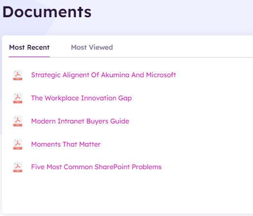
Documents
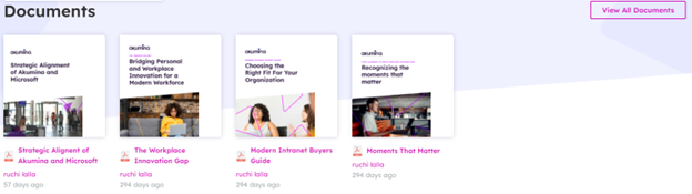
Displays eight document cards of the latest documents in chronological order using the Documents_AK list. This widget can be configured to pull documents from across sites or from the current site only. Click on a Document will navigate the user to the document in a separate tab. Click on “View All Documents” will navigate the user to a complete document listing. To learn more about the DocumentsSummaryListWidget, click here.
Additional Pages Deployed on the Home site
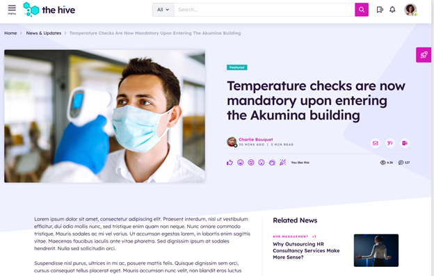
News Detail Page
Clicking on a news article, the user will navigate to the news detail page.
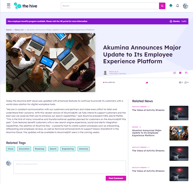
The News Detail page pulls content data from the FoundationNews_AK list. Each page dynamically displays the full details of the currently selected article, title, date, body, image, tags, time to read and content author. Allows the user to like and share articles, leave a comment, and select related news articles or related tags. News articles can be tagged by category and persona. News Detail is managed using the News content app via the Akumina AppManager. To learn more about the NewsDetailWidget, click here.
Comments
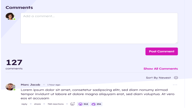
The news detail page uses the ActivityCommentsWidget, which ties the comment to the specific news article. To learn more about the ActivityCommentsWidget, click here.
Each news detail widget is using RelatedNewsWidget, to display related news article from a specified News list.
Related Tags
Clicking on a related tag, will navigate to the news listing page displaying with all the news with that related tag.
Related News

Displays the list of the Related News articles from the FoundationNews_AK list. Each list item contains an image, linked title of the current item and start date. Clicking on the item will direct the user to the dynamic NewsDetail page where the full article will be displayed using a friendly URL. To learn more about the RelatedNewsWidget, click here.
News Listing Page
On the Home page, click on the “View All News & Updates” and the user will navigate to the News listing page.
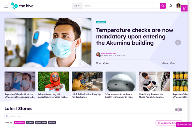
Curated News
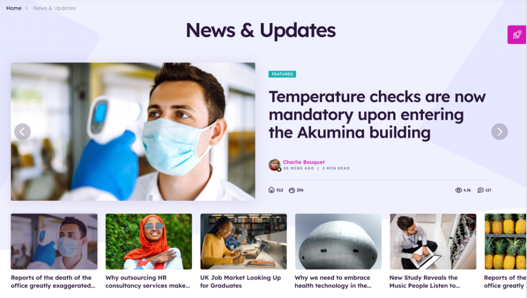
The Curated News displays the Curated News Widget in a carousel view and pulls targeted items from Curated_AK list which drives the landing page experience. A maximum of 20 items are allowed per curated list. Items are selected from multiple SharePoint lists and multiple SharePoint sites to create a single curated news list configured in the Curated News App. Curated News can be configured to pull items from across sites. Curated News items are displayed on the home page with a right and left chevron to view additional news items in the list. The Curated Experience is built on the robust virtual page experience and supports multilingual, taxonomy, and personas.
Clicking on an item navigates the user to the Detail page for that item.
To learn more about the CuratedNewsWidget, click here.
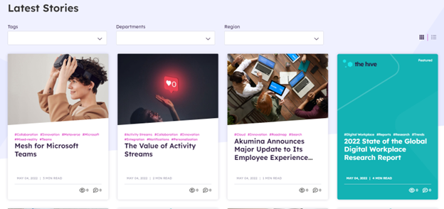
Latest Stories
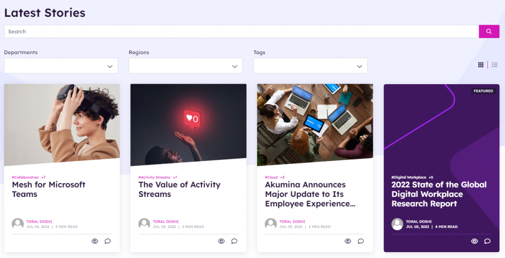
The Latest Stories displays the latest 8 news card on the page, sorted by published date. A widget property controls the items (defaulted to 8) to display before a lazy load (show more) will appear. Click on show more will load the next 8 news items. Displays the filtering of tags, department, and region taxonomy values for news filtering or search all news articles. Click on a news article and the user will navigate to the detail news page. To learn more about the NewsWidget, click here.
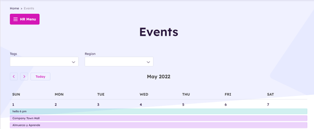
Events Listing Page
Clicking “View All Events” from the home page, the user navigates to the events listing page.
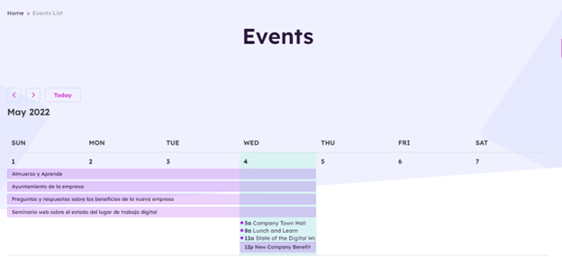
The Events Listing page displays a monthly calendar view with all events. The user can use the toggle keys to view other month events or click on today to return to current month event view. The user can select an event from the calendar, and they will navigate to the event detail page. To learn more about the EventsWidget, click here.
Event Detail Page
Clicking on an event, user is navigated to the events detail page to view the full details of the event.
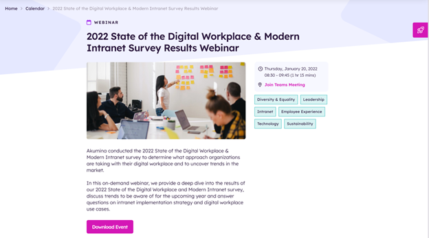
Click on an event from the Home page or Event listing page and the user will navigate to the Event Detail page. The Event detail is displayed, the user can download the event to their local outlook calendar by clicking on “Download Event”. To learn more about the EventDetailWidget, click here.
Internal Pages
Clicking on the Main Menu Navigation click on Company > “Sample Interior Page”.
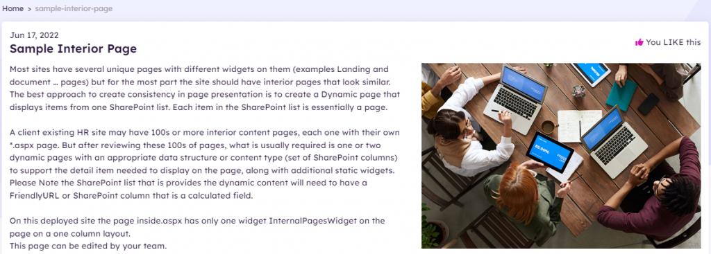
The Internal Page is a dynamic page that displays content from a widget property defined SharePoint list. Each item in the SharePoint list is considered to be a separate page. The page displays a title, a publication date, an image (if set on the item), and related content section, if populated in the item. The display of likes and share are configurable on the widget instance. To learn more about the InternalPagesWidget, click here.
People Directory Page
Clicking on the Main Menu Navigation click on Company > Directory > Employee Search.
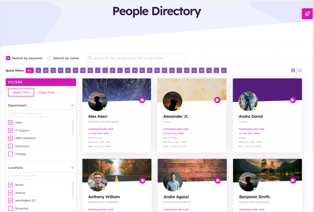
The People Directory page displays a searchable and filterable list of users. Two views are available: the list view or a tile view (shown). Default filters include Department and Office Location; however, these can be modified to include additional categories based on the information available in the people data provided. Search can be done by keyword search or name search.
Requires a connection to AzureAD, SharePoint Profile service, or a custom data file integration to be enabled to populate the people data.
To learn more about the PeopleDirectoryWidget, click here.
Employee Profile
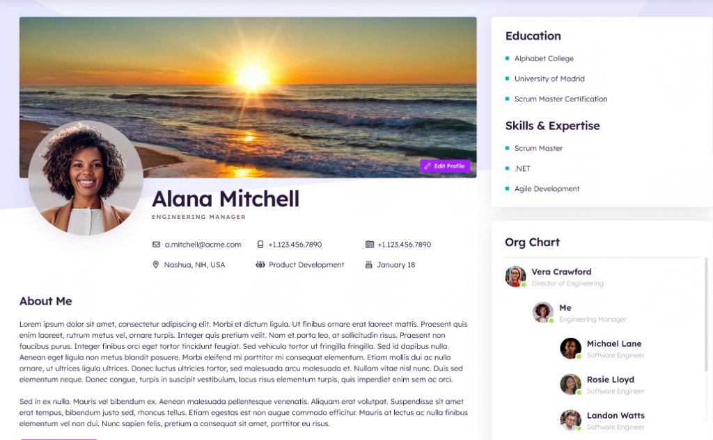
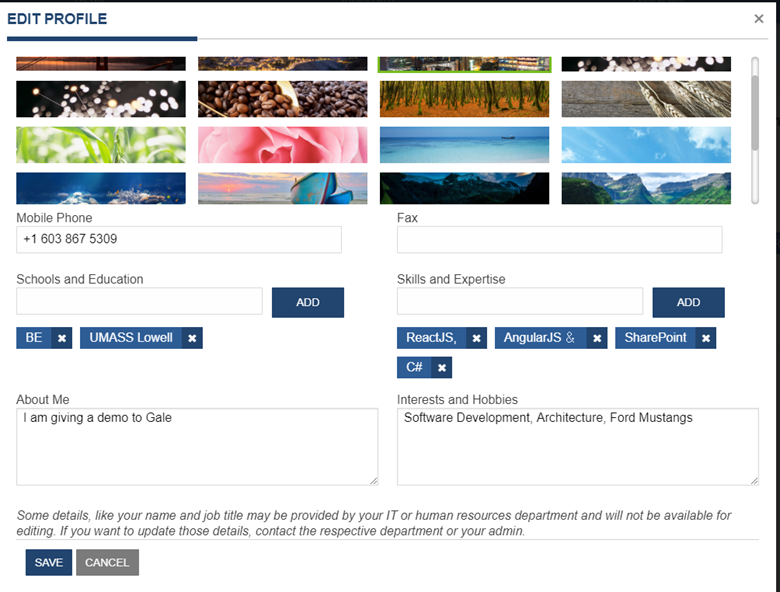
The Employee Detail page displays when you click on a name from the People Directory, or by selecting the “View Profile” drop down menu item, under the users profile on the header. If this page belongs to the logged in user then the user can edit items on this page, add content, and remove tags under categories by clicking on x. Click on the “Edit Profile” and a modal will appear allowing the user to edit all fields that are configured on the widget instance for edit. The background image is specific to this site using the user preference api and does not update the users background image in delve. There is a supporting library “BackgroundImages_AK” where the possible background images are stored, additional images can be added to that library to allow for user selection. All other properties besides the background image are updated in the user’s delve site. To learn more about the EmployeeDetailWidget, click here.
Editing the Employee Profile
Example of Edit Profile modal when all fields are set as editable:
Default Profile Image
If a background image has not been set by the user, a default image will be populated.

Org Chart
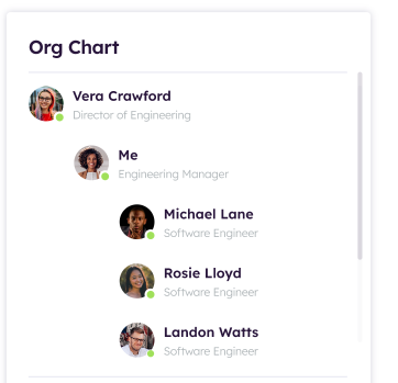
Displays the organization hierarchy of the current user, displays who I work for and who reports to me. To learn more about the MyOrgTreeWidget, click here.
Streams Page
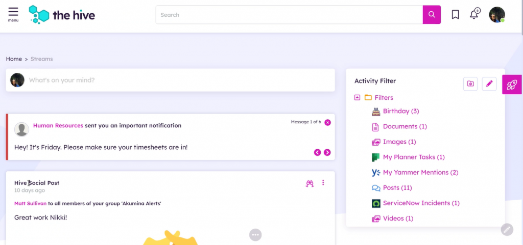
The Streams page provides a multi-lingual feed experience with M365 and 3rd party providers with the ability to share and promote content, communicate critical and time sensitive messages and ties comments and notifications to a user’s personalized collaborative activity stream. Each user has the ability to configure Stream subscriptions, adjust notification settings, filter the stream, save subscription cards, post messages, and view/read notifications. To learn more about the Activity Stream, click here.
Search Results Page
Clicking on the search results message at the bottom of the search bar; or clicking enter after the search term is entered in the search bar, will navigate the user to the full search results page.
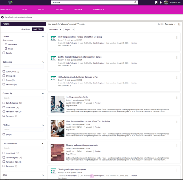
The Search Results Page initially displays with the site results based on the search selection from the search bar. The search term will be highlighted for each search results item.
The Search Results Page provides default filters on the left column of the page to provide results from this site or across sites for documents, pages, and people. Additional refiners can also be selected from the left column. The Search filter and refiner tags are displayed at the top of the page with the total count of the returned search results. Please visit here to learn more about Akumina Search Experience.
Forms Page
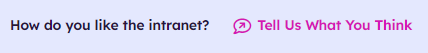
Clicking on the “Tell Us What You Think” for the Intranet Survey in the Footer, will navigate the user to the New Intranet Feedback Survey Forms Page.
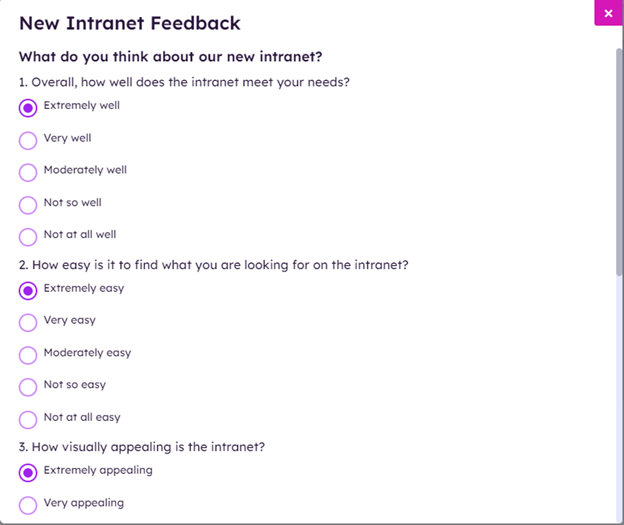
Displays a form to collect the New Intranet Feedback Survey when a user clicks the footer link “Tell us what you think”. The form is configured for one response per user per day and displays the following post back message.
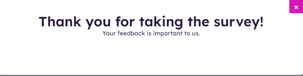
The Form Widget Instance is a sample form survey. The overall results of a form widget are managed by the reporting group user in the AppManager. For multilingual sites forms are created in different languages and displayed on this front-end site by creating language version of the same widget instance in the AppManager. To learn more about the FormsWidget, click here.
Media Library Page
Clicking on the Main Navigation Menu > Company > Media Library, will navigate the user to the Media Library Page.
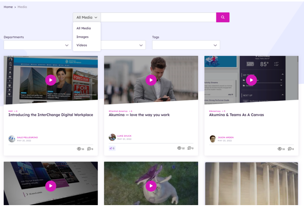
The Media Library Page displays the enabled images and videos stored in the central foundation site or specified home site content apps in AppManager. The Media Library is searchable and integrated with the social engine to allow reactions and comments. The media widget can be configured to search a specific site or across sites. The media page can be filtered to display all media, images only, or videos only. The taxonomy selector dropdowns can be selected to filter images and videos based on a user’s selected preferences. Clicking on the image or video will provide a popup modal with additional details on the content and actionable buttons to copy or download the content. To learn more about the MediaWidget, click here.
HIVE Department/Market Site Overview
The Department/Market Site deployment package is a site template (Digital Workplace Foundation Department site (v4)) which can be deployed from within the Akumina AppManager using the Site Creator Management app. It is meant to be deployed as many times as needed to create new department site collections.
Pages deployed within each Department/Market Site
Home – Department Landing Page contains department specific content and access to subpages within the current site.
NewsList – Displays all news articles from a specified “news” SharePoint list.
NewsDetail – Is a dynamic page used to display a detailed page views for each of the current site section’s news articles.
EventsList – Displays the monthly calendar view with all events listed for the selected month from the current site.
EventDetail – Department site specific Calendar Event Detail Page
Document Viewer (Documents) – Contains document library pages, queried by search
DiscussList – Department site specific Discussion Board List Page
DiscussThread – Department site specific Discussion Board Thread Page, click on a thread on a discussion to add a new thread on this page
DiscussNew – Create New site-specific Discussions
Search Results – Displays search results which can be filtered by facets and result types
Internal Page – A dynamic page used to display a detailed internal page view for each of the current site section’s with/without related articles.
Department Home Page
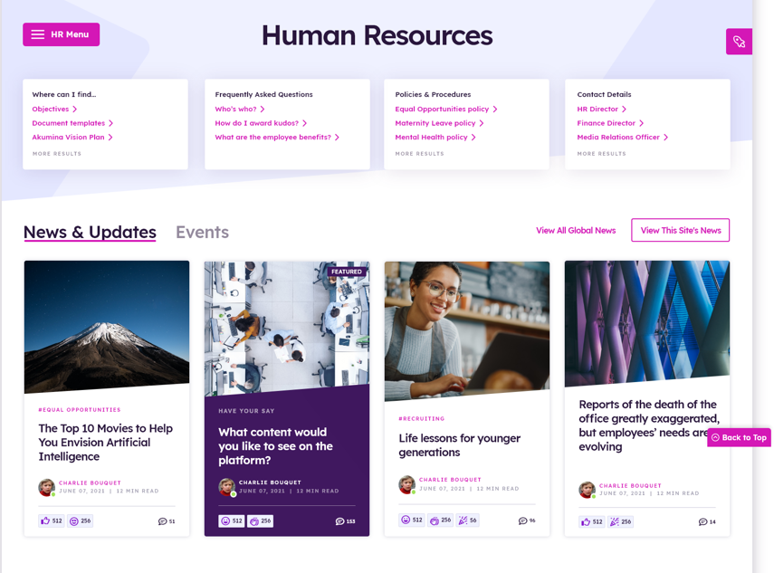
The following Widgets are included on the Department Home Page:
Department Navigation
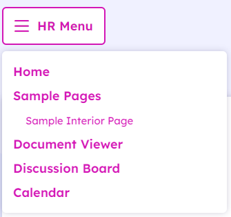
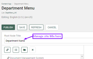
The Department Navigation hamburger menu appears on every page of the Department site, the widget is set on the department site master page “virtualmasterpagehivedept.html”. The Department Navigation displays the site-specific menu items. The Site title, in this case “HR Menu” is managed on the “Department Menu” Content App in the AppManager, the title of the site is set in the “Root Node Title”. Multilingual site titles and menu items are managed in the AppManager by making a language version of the menu and updating the “Root Node Title” and links appropriately for the new language. This menu supports one level deep of categories. The navigation menu may contain internal and/or external links. Categories can be link able or not. Menu items can be opened in the same window or in a new window (new browser tab). Items in the menu are managed using the Department Menu app for the current subsite located in the AppManager. To learn more about the QuickLinksWidget, click here.
Breadcrumbs Widget
The Breadcrumbs Widget displays the navigational steps a user took to get to the current page. Clicking within the breadcrumbs link will navigate the user the linked page. To learn more about the BreadcrumbsWidget, click here.
Text Block Widget

The Text Block Widget is used to display the Department Page Title on the page. The page title, in this example “Human Resources” is managed using the ckEditor of Text Block widget. The department page titled is provisioned by default to Human Resources. To learn more about the TextBlockWidget, click here.
Summary Links Widget
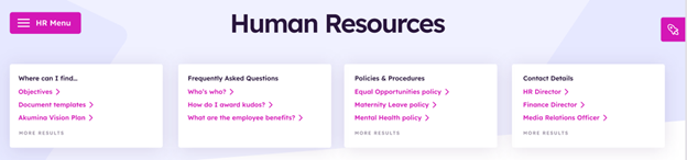 The Summary Links Widget displays a set of frequently used Links in a collapsible menu which are specific to the current department. The Links may contain internal and/or external links. Users can also create sub items in the menu that display in a collapsible menu. The OOTB display for department links content is managed in the DepartmentRoot Group Collection of the SummaryLinksWidget. The links are grouped, and all links within the groups are displayed on the department home page. The data is stored in SummaryLinks_AK. To learn more about the SummaryLinksWidget, click here.
News and Events
Tab Widget
Displays a tab list of the News and Events for the site. When a tab is selected the widget content will be displayed. To learn more about the TabWidget, click here.
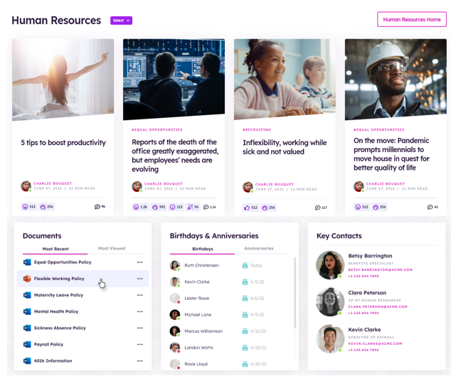
News Widget
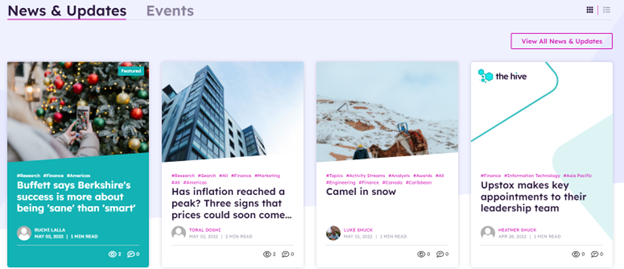
Displays eight news cards in two rows of the latest and/or featured (configured to consider feature on widget property) news from the DeptNews_AK list. The widget is configured to pull local news from the current site, or display news based on the selected department tag. News cards display the article title, image, author, last updated date, article tags, read time, and the associated reactions, views, and comment counts. Click on front-end toggle to change view from tile to list. Click on “View All News & Updates” will navigate the user to the news listing page for global news which contains a full list of all news articles for the foundation home site. Click on an Article will navigate the user to a news detail page. To learn more about the NewsWidget, click here.
Events Widget
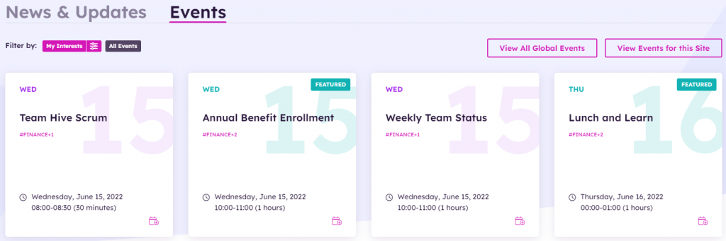
Displays eight event cards in two rows of the latest events in chronological order using the Calendar_AK list. This widget is configured by default to pull events from the current site only. Event cards display the event title, event tags, date, time, and duration. Quick filter buttons display the events based on the radio button selected for My Interests (defined user’s preferences), and All Events. Events are loaded by default based on the current users’ preferences. Radio buttons and view event buttons are configurable and can also be removed from the view. Click on “View Events for this Site” will navigate the user to the events listing page for local events which contains a full list of all events for the current site. Click on “View All Global Events” will navigate the user to the events listing page for global events which contains a full list of all events for the foundation home site. The widget view can be updated to display the buttons. Click on an Event will navigate the user to an event detail page. To learn more about the EventsWidget, click here.
Key Contacts – Employee Spotlight Widget
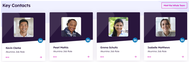
Displays the Key Contacts for the department using the Employee Spotlight Widget. The key contact card displays a profile image, username, and job title. When the LinkedIn URL field is populated on the widget, the LinkedIn icon will display on the card. Clicking on the LinkedIn icon will take you to the users LinkedIn profile. Clicking on the bio link at the bottom of the card, will navigate to the users’ profile page. The widget count property is configured OOTB by default to display the top 16 key contacts on the department home page. The order in which the users appear, are based upon the order users appear in the supporting AppManager slider app “Employee Spotlight”.
To learn more about the EmployeeSpotlightWidget, click here.
FAQs and Discussions
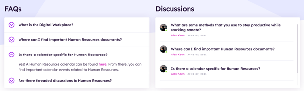
FAQs
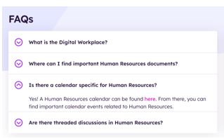
The FAQs on the department home page display a specified number of FAQs (OOTB set to 20). The OOTB content for FAQs is managed in the FAQ Group Collection of the SummaryLinksWidget using the FAQ display view. The FAQ Group determines the display order and FAQs are managed as a Title (question)/Answers pairs. Clicking on an FAQ, the answer will appear, the FAQ appears expanded, click on FAQ again and it will collapse. To learn more about the SummaryLinksWidget, click here.
Discussions
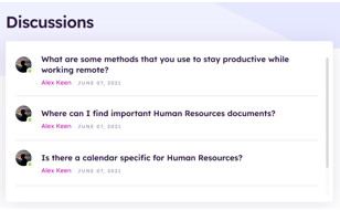
The Discussions Summary on the department home page, displays the five most recently added discussion threads that have been added to the current site Discussions_AK list. Click on the title of a thread and the user will navigate to the selected discussions thread page, where the full thread is displayed and where a user can reply to the thread. Click on “All Discussions” and the user will navigate to the Discussion listing page where all active discussion threads will be displayed. To learn more about the Discussion Board, click here.
Resources, Birthdays and Anniversaries
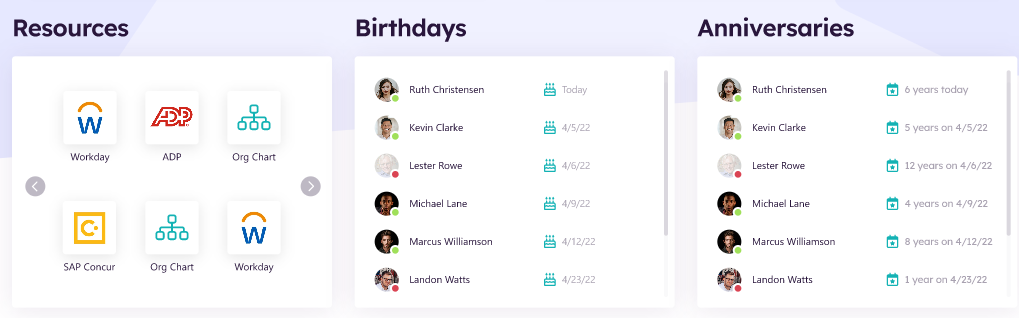
Resources – Launch Pad Widget
Resources displays the Mission Control Apps on the launch pad targeted to this department. The top 20 Apps for this department are displayed on the department home page. Clicking on an App will open the App in a separate window. To learn more about the LaunchPadWidget, click here.
Birthdays & Anniversaries Widget
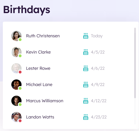
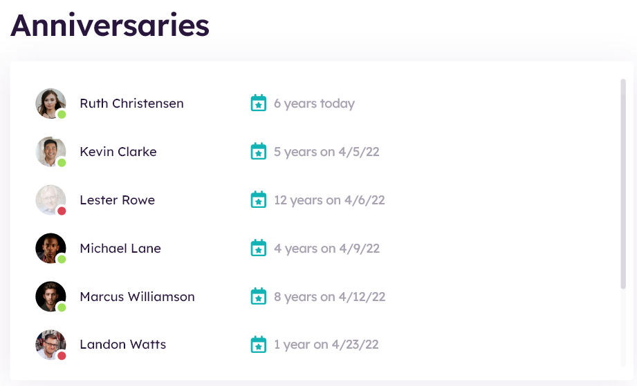
Displays the birthdays and anniversaries of users who are in the current department within a certain time duration (this week, month, or quarter). The time duration (week, month or quarter) is a configurable property in the widget. The Azure People directory data is used to filter on employee birthdays (AD birthday) and employee anniversary dates (AD hiredate) in the current department. To learn more about the GenericPeopleQueryWidget, click here.
Documents
Displays a tab list of the latest documents in chronological order using the Documents Library (note the library is configurable). The department widget instance is configured to pull documents from the current department site only. Click on a Document will navigate the user to the document in a separate tab. To learn more about the DocumentsSummaryListWidget, click here.
Additional Pages Deployed on the Department site
Department News Detail
Clicking on an article from the Department Home page, will navigate the user to the News Detail page to display the full details of the currently selected article.
The Department News Detail page pulls local news content data from the current department using DeptNews_AK list based upon “Start Date” in descending order. Each page dynamically displays the full details of the currently selected article, title, date, body, image, tags, time to read and content author. Allows the user to like and share articles, leave a comment, and select related news articles. News articles can be tagged by category and persona. Department News articles are managed using the Department News content app via the Akumina AppManager. To learn more about the NewsDetailWidget, click here.
Comments
The news detail page uses the ActivityCommentsWidget, which ties the comment to the specific news article. To learn more about the ActivityCommentsWidget, click here.
Each news detail widget is using RelatedNewsWidget, to display related news article from a specified News list.
Related Tags
Clicking on a related tag, will navigate to the news listing page displaying with all the news with that related tag.
Related News
Displays the list of the Related News articles from the DeptNews_AK list. This page is automatically populated based on the current user profile data from Sharepoint or Azure AD. Each list item contains an image, linked title of the current item and start date. Clicking on the item will direct the user to the dynamic NewsDetail page where the full article will be displayed using a friendly URL. To learn more about the RelatedNewsWidget, click here.
Department News Listing Page
On the Department Home page, click on the “View All News & Updates” and the user will navigate to the News listing page.
Curated News
The Curated News displays the Curated News Widget in a carousel view and pulls targeted items from Curated_AK list which drives the landing page experience. A maximum of 20 items are allowed per curated list. Items are selected from multiple SharePoint lists and multiple SharePoint sites to create a single curated news list configured in the Curated News App. Curated News items are displayed on the home page with a right and left chevron to view additional news items in the list. The Curated Experience is built on the robust virtual page experience and supports multilingual, taxonomy, and personas.
Clicking on an item navigates the user to the Detail page for that item.
To learn more about the CuratedNewsWidget, click here.
Latest Stories
The Latest Stories displays the latest 8 news card on the page, sorted by published date. A widget property controls the items (defaulted to 8) to display before a lazy load (show more) will appear. Click on show more will load the next 8 news items. Displays the filtering of tags, department, and region taxonomy values for news filtering. Click on a news article and the user will navigate to the detail news page. To learn more about the NewsWidget, click here.
Events Listing Page
Clicking “View All Events” from the department home page, the user navigates to the events listing page.
The Events Listing page displays a monthly calendar view with all global events for the foundation home site. The user can search for an event by selecting applicable tags or region, and use the toggle keys to view other month events or click on today to return to current month event view. The user can select an event from the calendar, and they will navigate to the event detail page. To learn more about the EventsWidget, click here.
Event Detail Page
Clicking on an event, user is navigated to the events detail page to view the full details of the event.
The Event detail displays the event title, description of the event, meeting time, duration, and tags. The user can join the meeting via Join Teams meeting link and download the event to their local outlook calendar by clicking on “Download Event”. To learn more about the EventDetailWidget, click here.
Document Viewer – Documents Page
On the Department Landing Page, click on HR Menu > “Document Viewer”.
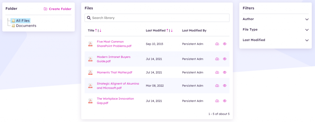
The Document Viewer Widget is a search-based document listing solution that combines a folder tree view, document list and search filters/refiners into one easy to use interface. Because it is a search-based widget, it has the capacity and performance to search, filter and display libraries with tens of thousands of documents, while still providing the ability to upload (via drag and drop), edit and share documents. The Search allows you to search in a particular folder or the entire library, for a term, that can be found in the document title or document content. On the Folder tree, if “All Files” is selected then search and filters will return documents for the entire library. If a specific Folder is selected in the Folder tree, e.g., “Finance”, then search and filters will be done on the selected folder only. For example, if Finance is selected on folder tree, then search and refiners will focus on the Finance folder only. To learn more about the DocumentViewerWidget, click here.
The Document Viewer Widget includes a powerful drag/drop mode with a tagging wizard that prompts users to complete any required metadata fields and select whether they want to check-in the documents as part of the upload.
Documents Folder Tree
The Documents Folder Widget is an expandable tree navigation, that allows the user to navigate to any folder in the library. The content of the folder then displays on the Document Grid.
Document Grid
The Document Grid Widget displays the folders and files that are found in its document library. The user may create folders, view (edit, open, share and follow), add new files via drag/drop and download files. Search, and refiners work together to refine data on the Document grid. There is no AppManager app associated with this widget.
Document Refiners
The default document refiners include date, modified by, and file type. Additionally, any managed metadata categories set on the document library will also display as refiners without any changes to the widget property, the meta data categories are returned from search and displayed. Clicking on an available refiner will refine the current document list to show items that match the selected refiner.
To learn more about the Document Viewer, click here.
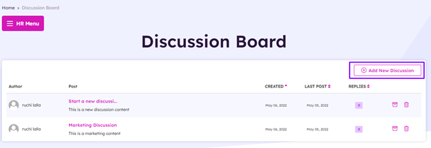
Discussion Board Listing
On the Department Landing Page, click on HR Menu > “Discussion Board”.
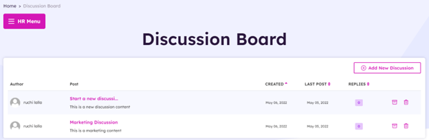
The Discussion Board Listing displays the discussions that are in the Discussions_AK list. Clicking on the Discussion link will bring you to the DiscussThread page. Clicking Add New Discussion will take you to DiscussNew page and allow you to create a new Discussion. Discussions can be sorted by creation date, last post, and number of replies. Users with ownership of discussion can archive or delete their discussion. This widget is not associated with any AppManager app.
Discuss Thread
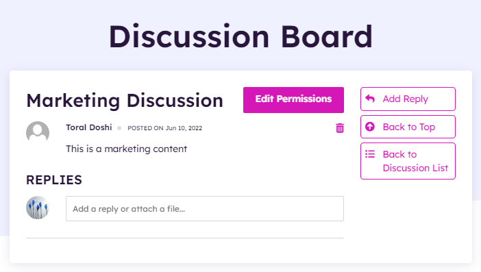
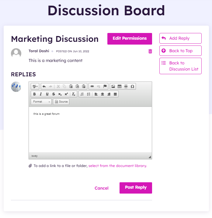
Discussion Thread
Discussion Thread is an item in the Discussion_AK list. Here users may add replies, edit permissions, delete replies, or delete the thread. When a user clicks into the “Add a reply or attach a file”, the WYSIWYG editor will appear, allowing user to add a reply. Click on “select from the document library”, a modal will appear, allowing the user to attach a file link to this discussion thread. Click on “EDIT PERMISSIONS”, a modal will appear, allow the user to update and specify one or more SharePoint security group who have access and able to view this discussion thread. This widget is not associated with any AppManager app.
Discuss New
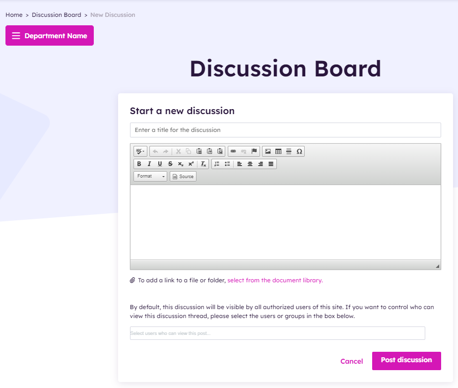
Allows the user to add a new discussion thread, a new item will be added to Discussions_AK. The user enters the Thread title in the “Enter a title for the discussion”, input field. The WYSIWYG editor allow the user to add the detail of the discussions. Click on “select from the document library”, a modal will appear, allowing the user to attach a file link to this discussion thread. By default, all users who have access to the site have access to this discussion. Click on “Select users who can view this post” will allow the user to specify one or more SharePoint security group who have access and able to view this discussion thread. This widget is not associated with any AppManager app.
To learn more about the Discussion Board, click here.
Hive – Akumina AppManager Use
The following topics cover the use of the AppManager for managing content within the Home and Department sites.
Accessing the Akumina AppManager
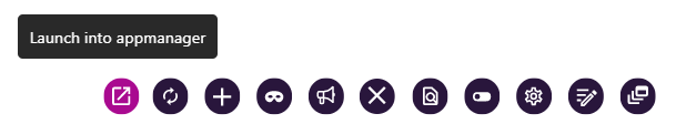
To access the Akumina AppManager, click the Launch into AppManager button on the Akumina bottom tray. This will launch the Akumina AppManager interface and display the content apps a user has access to for the site/site collection.
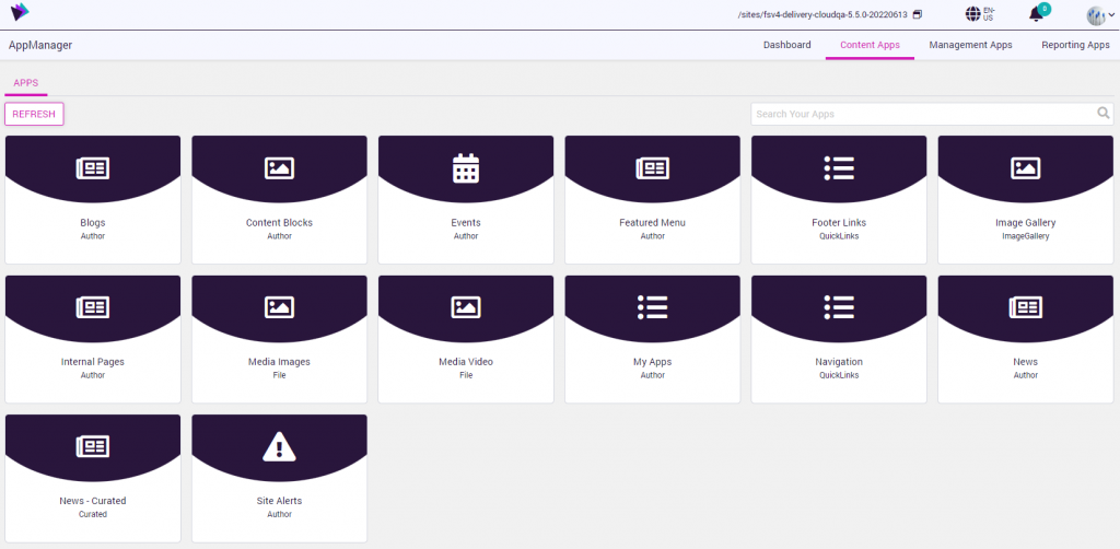
Viewing Apps for the Site
Once in the Akumina AppManager a user can look in the top right corner of the ribbon to see the current site/site collection they are viewing apps for.
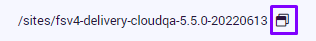
If the user needs to switch the view to another site/site collection, click the switch site icon
A switch site modal will allow you to select the sub site or site collection.
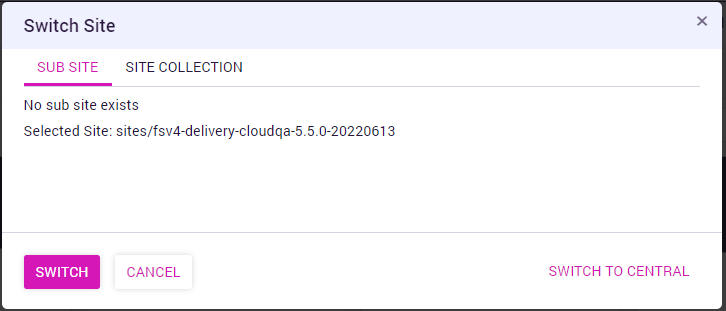
Select the appropriate site in the modal and click switch
HOME SITE Configuration
The Foundation Home Site hosts the global data for site collections having provisioned multiple delivery sites.
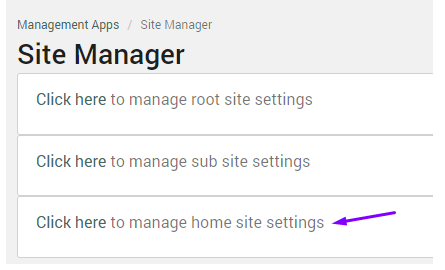
To select a Home Site, go to AppManager > Management Apps > Site Manager > Click to manage home site settings. Enter the delivery site to be used for the foundation home site and click update.
Root/Parent/Home Site Content Apps
Below are the default apps which are included in the Hive Site Home.
- Blogs: Content App to define specific blog news related items for display in the blog section on the News Experience Home page. The items are saved in the Blogs_AK list.
- Content Blocks: Content App to add HTML content items to GenericHTML_AK list. Provides the company about message in the main menu and logout message as default OOTB for the Hive site.
- Events: Content App to define specific event related items for display in the Home Page section. The items are saved in Calendar_AK. Added items will be seen on events, events detail and events listing pages.
- Featured Menu: Content App to add featured content items to the level one menu items, when configured. If multiple featured items are created, the menu will randomly display on each level one node. The featured items are stored in FeaturedContent_AK list.
- Footer Links: Content App to add and customize the page footer categories and links to FooterLinks_AK list. The Footer supports one level of category.
- Image Gallery: Content App to select which images from an existing image library to display in the Media Gallery.
- Internal Pages: Content App to add dynamic pages to create consistency in internal page presentation. The pages are saved in InternalPages_AK list.
- Media Images: Content App to select which media images to display in the Media Library.
- Media Video: Content App to select which media videos to display in the Media Library.
- My Apps: Content App to add Apps to the Mission Control Launch pad. Apps can be defined as mandatory or tagged with department and region taxonomy values. Apps are stored in FoundationApps_AK list.
- Navigation: Content App to add links to the FoundationTopNavigation_AK list which drives the main site menu which is part of the site header. Added links will be seen on EVERY page of the Site Collection/sub-sites.
- News: Content App to define specific news related items for display in the Home Page section. The items are saved in FoundationNews_AK. Added items will be seen on news, news detail and news listing pages.
- News – Curated: Content App to define the targeted set of curated news items for display on the landing page. The items are saved in the Curated_AK list.
- Site Alerts: Content App used to enable and define the displayed text for the Site Alert banner, which appears in the site header when and site alert item is enabled. Alerts can be defined to be dismiss-able or not. Site alerts are saved in SiteAlerts_AK list.
Department Site Content Apps
Below are the default apps which are included in the Department Site Home.
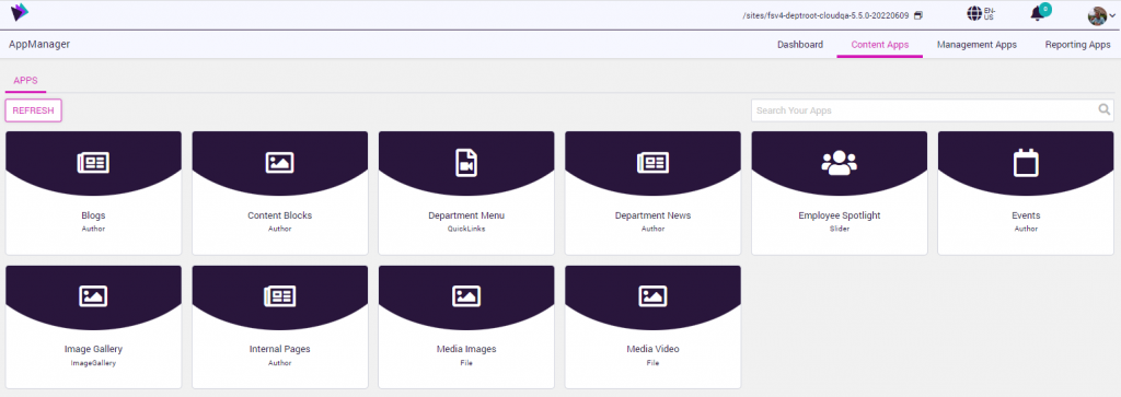
Below are the apps which are included in each newly deployed department/site collection site.
- Blogs – Content App to define specific blog news related items for display in the blog section on the News Experience Home page. The items are saved in the Blogs_AK list.
- Content Blocks: Content App to add HTML content items to GenericHTML_AK list.
- Department Menu: Content App to add links to the DeptMenu_AK list. Added links will be seen on EVERY page on department site. The department title, e.g. Finance comes from this list set in the “Root Node Title”.
- Department News: Content App to add to DeptNews_AK list. Added News items will be seen on the landing page of the department site, News Listing page, and News Detail page for selected article.
- Employee Spotlight: Content App displays a profile image, user name, title and information link. The items are saved in EmployeeSpotlight_AK list which allows for predefined selectable values for filtering and determines the display order sequence.
- Events: Content App to define specific event related items for display in the Events page section. The items are saved in Calendar_AK. Added items will be seen on events, events detail and events listing pages.
- Image Gallery: Content App to choose which images from an existing image library to display in the Media Gallery page, links to ImageGallery_AK list.
- Internal Pages: Content App to add dynamic pages to create consistency in internal page presentation. The pages are saved in InternalPages_AK list.
- Media Images: Content App to select which media images to display in the Media Library, links to FoundationImages_AK, Images_AK, Pictures_AK lists.
- Media Video: Content App to select which media videos to display in the Media Library, links to VideoImages_AK list.
For additional information on Using the AppManager Content Apps, click here.