Foundation Top Navigation Widget
Purpose
Display a managed set of categories and links to be displayed as the Main navigation.
Features
-
- Features top level mega menu navigation with links and categories for the site. Two levels of categories are supported on the “Default” view.
- Allows for an unlimited number of top level links and categories.
- Using the default view, category and links can have an associated icon.
- Link management is done in the AppManager content app “Navigation”, which allows for drag/drop, tree style UI for adding categories and links.
- Menu items honor user’s SharePoint permissions
- Personas can be applied to categories and links.
- Using the “business” view, this widget can be used to define a mega menu from a “starting” category (set on the widget property) with subcategories to include tile (background color with icon) that links.
Details
-
- Widget Name: FoundationTopNavigationWidget
- Available With: Release 4.5 and Above
- Content App Type: QuickLinks (Working with Quick Link Apps)
- Content Type: FoundationTopNavigation
- Content App Name: Navigation
- List Name: FoundationTopNavigation_AK
- Recommended Images Sizes: N/A
- Dependencies: SharePoint, Quick Links Widget
Content
| Root Node Title | This is the title of the root of the quicklinks and not displayed on the front end. |
| Category – Link Label | Title that displays for this category. |
| Category – Link | Categories can link, if set this is the url the user will navigate to when selecting the category |
| Category – Is Akumina Page | Checked by default, uncheck this when you want to link to a modern SharePoint site page outside to of the Akumina environment. |
| Category – Active | If checked then the category is active and displays on the front end. |
| Category – Open With | When the category is selected, the link can be configured to open in the Same Window or New Window. |
| Category – Icon | Icon to display along with the category title. |
| Link – Link Label | Link Text to appear under the links icon or image |
| Link – Link | URL – When the icon is selected the user will navigate to this link |
| Link – Is Akumina Page | Checked by default, uncheck this when you want to link to a modern SharePoint site page outside to of the Akumina environment. |
| Link – Active | If checked then this link will appear on the widget |
| Link – Open With | Choices – Same Window or New Window, determines if the link opens in a new browser tab or not |
| Link – Icon | Icon to display along with the link label |
| Link – Spalink | N/A |
| Link – JSFunction | Js function can be added to this link to call when the link has been selected. |
| Link – TileBackgroundColor | Background color that the icon will display on if using the “business” view. The background colors is not controlled via the Theme manager. The background color is set as choices options in the supporting list’s “TileBackgroundColor” this can be expanded by editing the column and adding additional choice option, adding your site branding colors example by adding: #e69138 orange, orange will be added as a TileBackgroundColor choice. |
| Form – Form Link Label | Title to appear under the form links icon or image |
| Form – Active | If checked then this form link will appear on the widget |
| Form – Link | Using the “Browser Form” modal a link to the selected form. |
| Form – Icon | Icon to display along with the form link label |
| Form – Spalink | N/A |
| Form- JSFunction | N/A |
| Form – TileBackgroundColor | Background color that the icon will display on if using the “business” view. The background colors is not controlled via the Theme manager. The background color is set as choices options in the supporting list’s “TileBackgroundColor” this can be expanded by editing the column and adding additional choice option, adding your site branding colors example by adding: #E69138 orange, orange will be added as a TileBackgroundColor choice. |
Properties
| Selected list columns | N/A – This should be BLANK for content managed via a AppManager quicklinks app type because there are certain required columns that cannot be changed to display the navigation. Use widget property “Additional selected list columns” to expand select list columns for this widget. |
| Cache Interval | – 1 – is default
Sets the time, in minutes, that the data should be saved in the local browser cache of the current user.
Whole Number = Cache for specific time, in minutes |
| Function to call after fetching data | OOTB -Blank (used for widget expansion): Name of the function called after data has been fetched by the widget. If using the “Business” view then this needs to be set to: FoundationTopNavigationBusinessCallback |
| List Name | Name of the SharePoint list that contains the data to be displayed for this widget instance. |
| List is on Root Site | When checked, the widget references the list on parent/root site collection. |
| Displayed Title | If a value is entered, then the title will appear on the header of the App |
| Icon | Selects the icon that is displayed to the left of the widget title |
| Additional selected list columns | Any additional select fields (beyond content type AkuminaQuickLinks) gets added here in order to expand the widget. |
| startcategory | For the “business” view, identifies the starting category to display a list of subcategories and links with Tilebackgroundcolor and icon links. If this is a multilingual site then the category for each language must be listed with a comma separation with no space. Example: Corporate,Corporativa |
| Site Collection URL | Site collection URL where the SharePoint list defined in “List Name” can be found. |
| Function to call before binding the UI events | OOTB -Blank (used for widget expansion): Name of the function called after the UI has been rendered to the screen |
Views
View Name: MegaMenu
View Description: A row of top navigation menu items, that has a mega menu dropdown interface, supports two levels of categories. Sub level categories display in one pane.
View Preview:
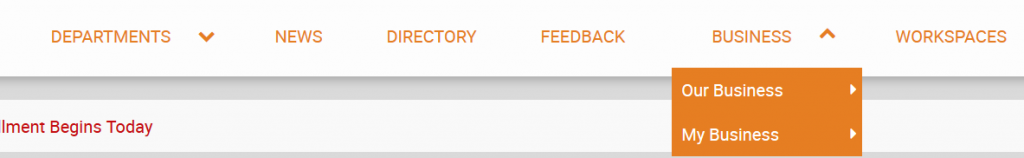
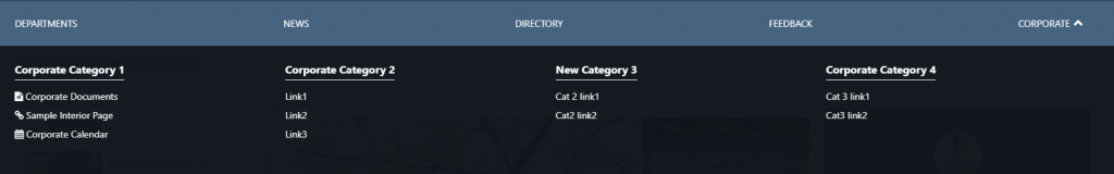
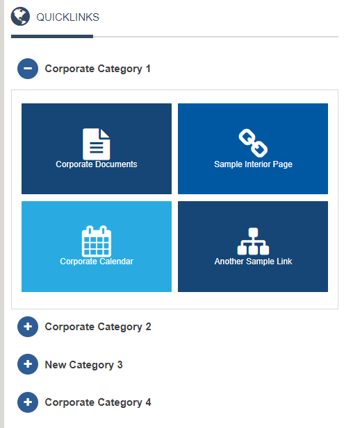
View Name: Business
View Description: Display a list of categories and links in a tiled view from a starting category set on the widget property “Start Category”. The background colors are expandable on the SharePoint list definition by expanding column “TileBackgroundColor”. The “starting category” must have subcategories to expand for this view. Example below “Corporate” would be the Starting category that has several child categories of links, in this example “Corporate Category 1” and “Corporate Category 2″…..
View Preview:
View Name: default
View Description: FS2 site supported only, display a row of links and top level categories. This view supports two levels of categories with the second level of category links displaying when the second level category is selected.
View Preview: