News Widget
Purpose
Displays news cards of the latest and/or featured news, filtered based on user’s preferences and refiners leveraging search.

Features
-
-
- Displays eight news cards in two rows of the latest and/or featured news from the FoundationNews_AK list. FoundationNews_AK list exists on each delivery site with unified content type and unified taxonomy.
- Search driven capability to query on content type (can be configured to filter on list id, etc.)
- Ability to display global or local news (department/market) or featured news including taxonomy tags and featured items
- Global news widget
- Displays global news based on latest modified news date
- Displays user preferred news (if not enabled then shows all news)
- Local news widget
- Displays all news from current department/market site
- Configurable to display news based on list id/taxonomy
- Featured news widget
- Displays all featured news from current department/market site
- Global news widget
- Ability to configure to pull news from across sites or from the current site only.
- Quick filter buttons display the news based on the radio button selected for My Interests (defined user’s preferences), All News, Top Reacted (based on highest number of likes), or Popular (based on number of views). Radio buttons are configurable in the widget property. Radio buttons can be disabled by removing them from the view.
- News is loaded OOTB by default based on users’ preferences defined.
- Displays the article title, image, author, last updated date, article tags, read time, and the associated reactions, views, and comment counts.
- Click on front-end toggle to change view from tile to list.
- Click on “View All News & Updates” will navigate the user to the news listing page.
- Click on a selected Article will navigate the user to a news detail page.
-
Details
-
- Widget Name: NewsWidget
- Available With: Release 5.5 Hive Install and above
- Content App Type: Author
- Content Type: AkuminaArticle
- Content App Name: News
- List Name: FoundationNews_AK
- Recommended Images Sizes: Thumbnails – 352 px wide x 250 px tall; Main – 736 px wide x 488 px tall
- Dependencies: SharePoint
Content
| Title | Title that will display in the Content App list and on the News Detail widget |
| Summary | Summary data that can be displayed on this widget under the title |
| Body | The body text of the article |
| Tags | Allows you to specify Tags associated with the article |
| Department | Allows you to specify Departments associated with the article |
| Region | Allows you to specify Region associated with the articled be updated to a description of the picture |
| Featured | When checked, news is shown as a featured article and displays a featured tag |
| Publisher | Publisher of the news article, will appear on the news detail page and news card |
| Contributors | Contributing publishers of the news article |
| Image | The selected image will display with the news article |
| Image Description | By default is the image Url, but should be updated to a description of the picture |
| Video Web Address URL | Video link displayed on the news card. For additional details, please see instructions here. |
| Link Title | Title that will display in the Content App list and on the News Detail widget |
| Is Akumina Page | Checked by default to Akumina page link |
| Thumbnail URL | Alternate Image used on listing article widgets such as NewsWidget or CuratedNewsWidget if not set then the Image will be used on those widgets. |
| Published Date | Date in which the content will appear on the site, also the date that is displayed on the news article. |
| Archive Date | Date in which the content will be archived from the site |
| StaticUrl | What will be added to the site Url to create the friendly Url for the news article |
| Shareable | When checked, allows for external sharing of article to twitter and linkedin |
| Share Url | The external shareable Url |
Properties
| Widget Framework | Determines the type of framework the widget provides. Value = react |
| Widget Title | Title that the widget will display to the user |
| Query Text | Query string to be executed for the search.
Default query text is (ContentTypeId:0x0100A75A29C9F7894C83AA451364A226C855*)(ArchiveDate>{Now}) |
| Select Fields | The SharePoint Managed Metadata properties or aliases that map to the SharePoint list columns that will be used to display content on this widget. Example:
ListID,ListItemID,PublishDate,ImageOWSURLH,Title,owstaxidmetadataalltagsinfo,FeaturedOWSBOOL, PublisherOWSUSER,ThumbnailURLOWSURLH,ServerRedirectedURL,VideoOWSURLH,ReadTimeOWSNMBR,WebId,SiteId,OriginalPath |
| Search Cross Sites | Determines to search for news across sites or news from this site only. When checked (true), searches for news across all sites. If not checked (false), searches this site only. |
| Enable Refiners | When checked, displays filter buttons
Please note that if Enable Refiners is true, then Popular and Highest rated tabs will be disabled, if Display popular and Display Top Reacted is set to true. |
| Search Refiners | Defines the search data refiners to be displayed in JSON format.
Name – the name of the alias set in the search schema Display Name – the name in the drop down to be displayed for refinement Id – corresponding term id from term store {“termStoreId”:””,”termSetName”:”Category”,”terms”:[{“name”:”SPTags”,”displayName”:”Tags”,”id”:””},{“name”:”Departments”,”displayName”:”Departments”,”id”:””},{“name”:”Region”,”displayName”:”Regions”,”id”:””}]} Date Filters – provides a date range picker {“termStoreId”:”1b8077fe-95c2-4f5a-ad97-d39d41493459″,”termSetName”:”Category”,”terms”:[{“name”:”SPTags”,”displayName”:”Tags”,”id”:”a14e71d3-2457-4ef3-8852-9cae739e8eae”},{“name”:”Departments”,”displayName”:”Departments”,”id”:”a91e4ea3-5458-4ff4-bc79-3a19ccddac9c”},{“name”:”Region”,”displayName”:”Regions”,”id”:”3c19a0c6-e675-42d3-bf09-686122328985″}],”dateFilter”: {“name”:”PublishDate”,”displayName”:”datefilters.publishdate”}} Note: The Date Filters value by default will empty i.e. “dateFilter”: {“name”:””,”displayName”: “} The value being given against name should be name of the managed property (and not the name of the actual column) on which the news will be filtered. When the date filters is defined, the date filter for published date will be displayed. The from and to dates can be selected in the date pickers and on click of apply, the news articles will get filtered to show the news belonging to the selected date range.
|
| Refiner Condition | Determines if the search refiners (user preferences between categories) are set to AND or OR condition. By default, the search refiner between the refiners is set to AND condition. |
| Display count | Number of news cards to be displayed. Default is set to 8 news cards. |
| Enable Paging | Determines if lazy loading is enabled. When checked, enables lazy loading by pages by count based on the display count property. By default, pages by a count of 8. |
| Enable Interests | When checked, displays the My Interest filter in the news widget to search for the latest news based on users’ preferences |
| Enable Top Reacted | When checked, displays the Top Reacted news filter in the news widget to search for the social reactions top reacted count description. |
| Enable Popular | When checked, displays the Popular news filter in the news widget to search for the most viewed article based on view count in application insights |
| Enable All Events | When checked, displays the All News filter to search for all the latest published news |
| Sort By | The Managed Metadata property or alias used to sort the content, default is PublishDate, which maps to the article column “Published Date” |
| Is Department Specific | Check this box when using the news widget on a department site. |
| Function to call before binding the UI events | OOTB -Blank (used for widget expansion): Name of the function called after the UI has been rendered to the screen |
| Function to call after fetching data | OOTB -Blank (used for widget expansion): Name of the function called after data has been fetched by the widget. |
Views
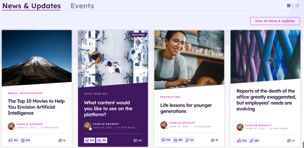
View Name: News Home Page
View Description: News cards display of the latest and/or featured news, filtered based on user’s preferences, all news, top reacted and popular
View Preview:
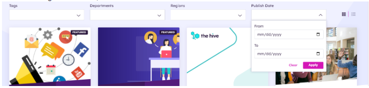
View Name: News Listing Page
View Description: Displays the latest eight news cards on the page, sorted by published date, and the ability to load more news. Provides search capabilities for a specific news item or by a category tag.
View Preview:
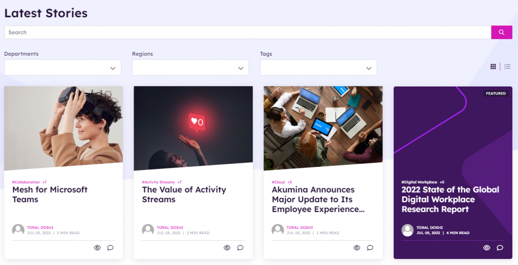
View Name: News Featured Page
View Description: News cards display of featured news, filtered based on user’s preferences, all news, top reacted and popular
View Preview:
View Name: News Department Home Page
View Description: Department news cards display of the latest and/or featured news, filtered based on local news
View Preview: