Foundation Site (FS ‘20) Reference Guide
The purpose of this topic is to give an overview of the organization, pages, features and functions that are included in the Akumina FS ‘20 default install for both the Home site and the Department Sub-sites. FS’20 is available with release 4.8 and above.
FS’20 Home Site
The Foundation Home Site deployment package is a site template (Digital Workplace Foundation Site) which can be deployed from within the Akumina AppManager using the Site Creator Management app. It is meant to be deployed once in the Site Collection as the home site for the Intranet.
FS’20 deployment package provides a Modern site allowing a choice of one of three home page layout options (center, left, or right focus) to be selected for the site during deployment. The Home Page layout option can also be changed after deployment using the site creator app in AppManager.
A new rail layout option is available with FS’20 Home Page, please reference Using Rail Layouts to Customize Your Pages
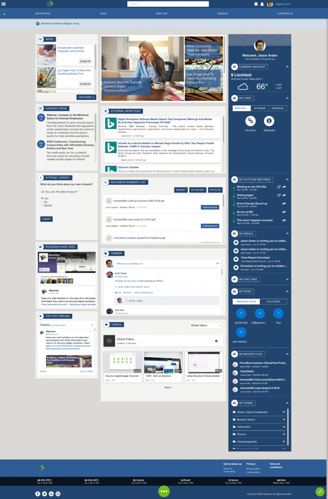
Home Page Options
Option Home 1 Center Focus
The Center Focus delivers the main content on the left rail and center of the page with a right rail displaying the MeBarManagementWidget.
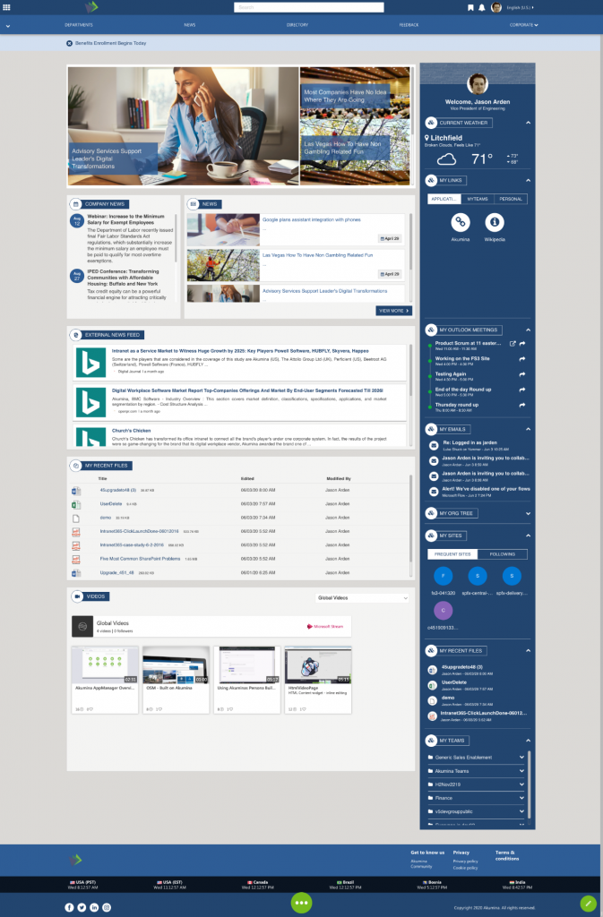
Option Home 2 Left Focus
The Left Focus delivers the main content on the left side of the page with a right rail displaying the MeBarManagementWidget.
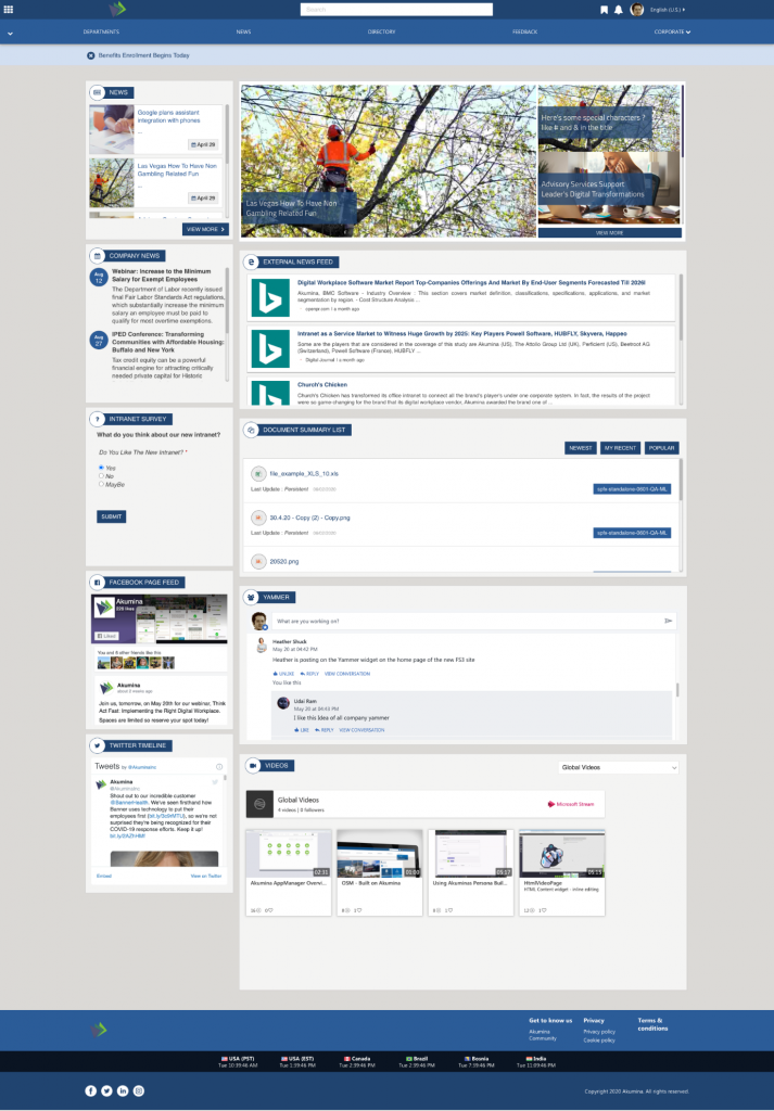
Option Home 3 Right Focus
The Right Focus delivers the main focus content on the right and additional content on the left.
Pages deployed within the FS’20 Home Site (same for all options)
Deployed pages, main navigation, navigation elements and footer navigation are the same across the three home page options.
Home – Home Landing Page contains section specific content and access to subpages within the current section. Options for left, right or center focus on the page. Center and left focus pages include the MeBarManagementWidget in the rail.
InternalPage – A dynamic page used to display a detailed internal page view for each of the current site section’s with/without related articles.
News – Displays a variety of news experience.
NewsDetail – A dynamic page used to display detailed content for a specific news item, from a defined SharePoint list, OOTB configured to display the Foundation News.
BlogDetail – A dynamic page used to display a detailed page view of the blogs.
BreakingNewsDetail – A dynamic page used to display a detailed page view of the breaking news articles.
SplAnnouncementNewsDetail – A dynamic page used to display a detailed page view of the Special Announcement News articles.
NewsList – Displays all news articles from a specified “news” SharePoint list, OOTB configured to display the Foundation News.
Departments – Department Listing with links to the Departments/Subsites, displays a filtered by permission list of sites the user has access too. Link titles are the site titles.
UserDirectory – Contains the People Directory populated from AzureAD, SharePoint or a custom data source
EmployeeDetail – A dynamic page used to display the details of each user. Going to your own user Employee Detail allows you to quickly edit your own information
Calendar – Displays the Calendar widget in the Modern Full view and shows the event for the selected month
EventDetail – A dynamic page used to display a detailed page of the selected event
Documents – Displays and allows for management of documents from a specified library (OOTB Documents) using the DocViewerWidgets
Forms – A dynamic page used to display any form defined in the site
Help – A sample form page that displays results if selected on the form
Media Gallery – Displays the photos posted to the Media Gallery
Mynews – Displays a set of NewsCardsWidgets, that allow the user to follow news based upon tags from a specified news list
Search Results – Displays search results which can be filtered by facets and results types (tabs)
Main Navigation

The Main Navigation appears throughout all the pages of the Foundation Site. The navigation is manageable in the AppManager, supports two level of links, and supports category and link icons. The Main Navigation uses the FoundationTopNavigationWidget, to learn more about that widget please visit here.
Foundation Site Ribbon
The items on the “Foundation Site Ribbon”, are discussed below:
O365 Waffle
Launches the Microsoft applications
Company Logo

Clicking on the logo, navigates back to the Home Page. Updating the Site Theme and the Site logo is done in the AppManager > Management App > Theme Manager, to learn more about managing the site logo and theme click here.
Search Bar
Type ahead search will be triggered on the third character of input in the Foundation Site Search box. This allows the user to search the entire site for relevant pages, documents, and people. The results for the selected tab are displayed in the drop down. Clicking on a different tab will refine the search results specifically for Pages, Documents, or People. The “All” tab displays results for Pages and Documents. Clicking on a search result item will navigate the user to the appropriate page. On the People tab, click on a user, their “Profile Summary Card” displays. Enter a search term and hit the enter key will navigate the user to the search results page. The tabs displayed items and order are managed in the TabWidget properties, click here to learn more about the TabWidget. The TabWidget contains several GenericSearchListWidgets instances (click here to learn more about GenericSearchListWidgets) and a PeopleDirectoryWidget instance (click here to learn more about PeopleDirectoryWidget).
Bookmarks
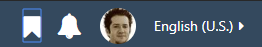
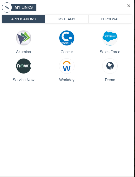
Displays a pop-up modal of My Links including Applications, Teams and Personal customizable links. Teams can be configured on the widget property, to pull in all Teams the user has permissions to or a specific set or even one Team. Click here to learn more about the MyLinksWidget.
Notifications

In 4.8 the bell displayed SharePoint notifications. In 5.0 the Bell is used to display Akumina social notifications. Please visit here to learn more about Akumina Notifications.
User Profile
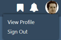
Allows the user to view and edit their SharePoint User Profile information and log out of the intranet site. These items are found on the master page, labels are managed in the language files for multilingual.
Language Selector (only if using Multilingual)
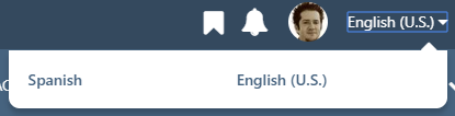
When multilingual is enabled for the Foundation site, the language selector displays the currently selected language and allows the user to switch to any other available language. Adding languages to the site are managed in the AppManager > Management Apps > Language Manager.
Sharepoint Bar Toggle
Found on the Main Navigation ribbon, allows the current user to show/hide the SharePoint bar in their view.
Main Menu Navigation Elements

The Main Navigation is using the FoundationTopNavigationWidget to learn more about this widget please click here.
Departments
Launches a dynamic page for department subsite page navigation. Links to the Departments/Subsites, displays a filtered by permission list of sites the user has access too. Link titles are the site titles.
News
Navigates the user to the news page, which displays a variety of news experiences.
Directory
Navigates the user to the People Directory, where a user can search for colleagues via Name or Keyword.
Feedback
Navigates the user to the help page, which displays a demo form as well as results.
Corporate
Displays a dropdown selection for links in the Corporate category including Corporate Documents, Sample Internal Page and Corporate Calendar.
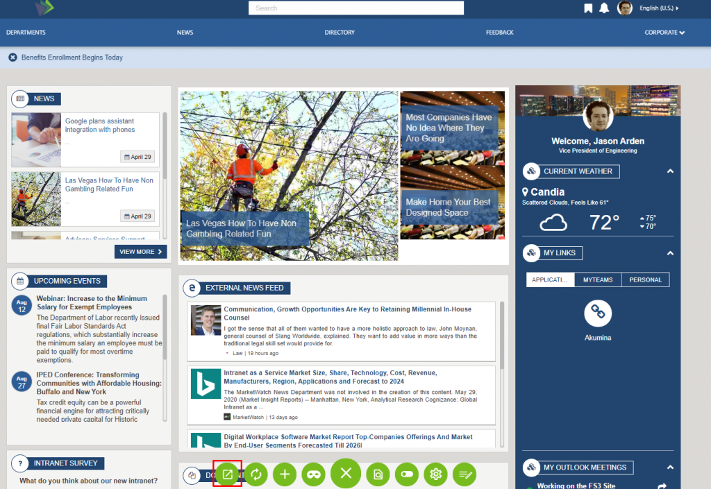
Site Alerts

Displays site alerts on all site pages. If there are multiple site alerts, then the user can cycle through the alerts using the forward/back arrows. Each site alert must be enabled to appear on the site. Site alerts can be configured to allow for dismissing of the alert message. If a site alert has been configured to allow for dismissal, then an “x” will appear with the alert. The alert will be dismissed until the end user refreshes their cache. To learn more about the SiteAlertWidget, click here.
Footer Navigation Elements
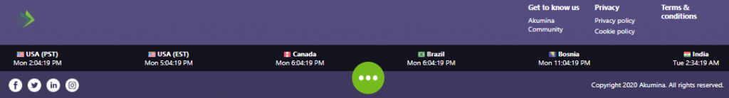
The Footer appears throughout all the pages on the Foundation Site. The Footer consists of a logo, footer links, world clock items, social links and copyright statement.
Company Logo

Clicking on the logo, navigates back to the Home Page. This is the same logo that appears on the header, to manage the site logo navigate to AppManager > Management Apps > Theme Manager. To learn more about the AppManager “Theme Manager”, click here.
Foundation Footer Links
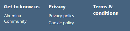
Displays a customizable set of footer links that support one category level.To learn more about the QuickLinksWidget, click here.
World Clock
Displays specified time zones including time, labels, and flags. Time zone selection and order can be managed in the AppManager via a slider app called “World Clocks”. For multilingual the titles of the countries are managed in the controlling sliding app by making a language version of the content and translating the titles. To learn more about the WorldClockWidget, click here.
Social Media
Displays the social media icons and links to the home page for Facebook, Twitter, LinkedIn, and Instagram. Managed on the site’s master page.
Copyright
Displays dated copyright information. Managed on the sites master page.
Widget instances deployed within the FS’20 Home Site
The home page site options are deployed with different widget instances depending on the option you select, although, widgets can be changed or added in page edit mode. The MeBarManagementWidget instance is deployed with the center and left focus option of the Foundation Site and can be changed or added to a page using the AppManager.
MeBar Rail Element
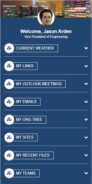
Displays an accordion list of widgets in a rail layout format. The MeBarManagement widget can be edited thru the MeBarManager content app in the AppManager to control available widgets, widget titles, display order and determine if the widget opens in a collapsed or expandable state. For multilingual, the titles displayed on these widgets are manage in the AppManger slider app.
“Mebar Manager”, make a language version of the content and translate the titles appropriately. To learn more about the MeBarManagementWidget, click here.
Personal Information

Displays the current user avatar and users job title. Whether the users preferred background displays above the avatar (as seen here) or the site theme, is configurable via a widget property. The user preferred background comes from the user’s profile page on this intranet site and not from delve. The property to display the user’s preferred background should only be set if the EmployeeDetailWidget is configured to allow for the user to set their preferred background image.
Current Weather
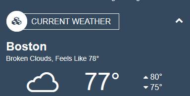
Displays the weather for the user’s current location if allowed by the user or display the weather based upon the properties defined in the widget instance. To learn more about the CurrentWeatherWidget, click here.
My Links
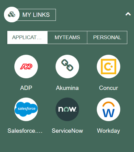
Displays a list of Applications, Teams, and Personalized links for the current user. The Applications displayed are the same for all users and managed by the site author in the “Application Links”, quicklinks Content App. MyTeams displays the teams and channels that the logged in user has permissions too. Teams can be configured on the widget property, to pull in all Teams the user has permissions too or a specific set or even one Team. Expanding a Team and clicking on a channel, launches the user into the channel inside Teams. Personal, allow the user to specify any link as one of their personal favorites. To learn more about the MyLinksWidget, click here.
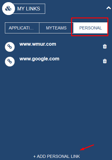
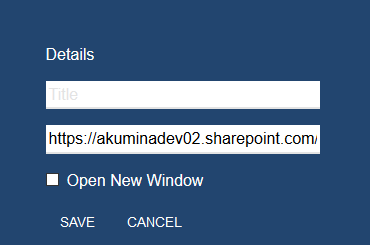
Personalized links can be quickly added to the page. The URL is prepopulated with the link to the current page but can be edited and set to any url.
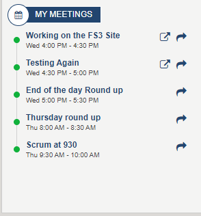
My Outlook Meetings
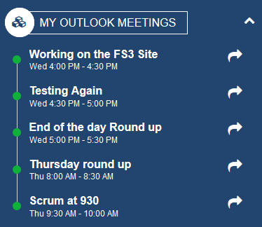
Displays the upcoming meetings from Outlook and Teams for the current user. Clicking on the item will open the Outlook calendar to join the meeting. When a Teams meeting is upcoming within 30 minutes, a join icon will appear when selected the user can join the meeting right from the intranet. To learn more about the MyOutlookMeetingsWidget, click here.
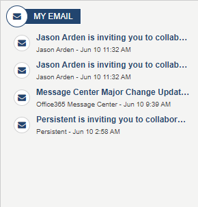
My Emails
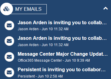
Displays the latest emails from Outlook for the current user. To learn more about the MyEmailWidget, click here.
My Org Tree
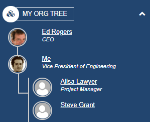
Displays the organization hierarchy of the current user, displays who I work for and who reports to me. To learn more about the MyOrgTreeWidget, click here.
My Sites
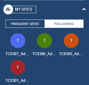
Displays the SharePoint sites the current user has recently accessed, or sites being followed. To learn more about the MySitesWidget, click here.
My Recent Files
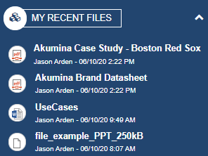
Displays a list of the recent files visited by the current user. To learn more about the MyRecentFilesWidget, click here.
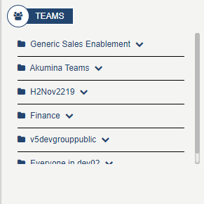
My Teams
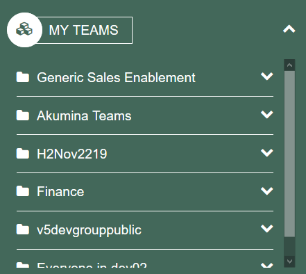
Displays Teams and channels that the logged in user has permissions to. Expand a team select a channel will navigate the user into the channel in Teams. Teams can be configured on the widget property, to pull in all Teams the user has permissions to or a specific set or even one Team. To Learn more about the MyTeamsLinkWidget, click here.
Widget instances deployed within the FS’20 Home Site – Center Focus
The Center Focus Home Site delivers the main content on the left rail and center of the page with the right rail displaying the MeBar Managed set of widgets.
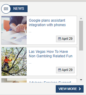
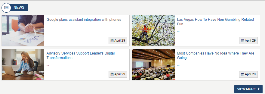
Latest Featured News
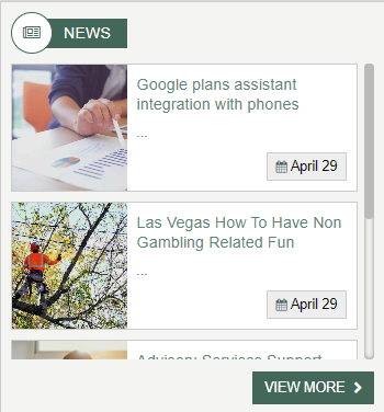
Displays the latest and/or featured (configured to consider feature on widget property) news from the FoundationNews_AK list. Click on “View More” will navigate the user to the news listing page. Click on an Article will navigate the user to a news detail page. To learn more about the LatestFeaturedNewsWidget, click here.
Important Dates

Displays a list of a specified number of events in chronological order using ImportantDate_AK list (the order in which the events will occur). The number of events displayed is defined on the widget property. This widget can be configured to pull data from a SharePoint list such as ImportantDates_AK or from a calendar. If data is configured from the Important dates then the click event (url) is defined on the item in the Important Dates content app. If the events are configured to come from a calendar, then the clicking on an event will navigate the user to the event detail page for the selected event. To learn more about the ImportantDatesWidget, click here.
Survey
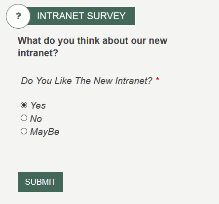
Displays the form defined on the widget property and the results of the survey. The Form definition can have one column that is of type “radio-group” that is used to display as the results. The form definition itself can have many columns and even be configured to allow for only one response per user. In the event that the form definition is configure for one response per user (as it is in most surveys) the widget can be configured to display the post back message or always the results after the user has completed the survey. The OOTB Form Widget Instance is just a sample form survey. The overall results of a form widget are managed by the reporting group user in the AppManager. For multilingual sites forms are created in different languages and displayed on this front-end site by creating language version of the same widget instance in the AppManager.
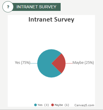
If the form definition has the “Property” for “Form Restrictions” set to “One submission per user” then the site admin has the choice to always display the result (pie chart) or always display the form definition “Postback” message (in this case the logged in user will not see the results), via a widget property. If the form definition “Property” for “Form Restriction” allows for more than one submission (e.g. No restriction) then the form itself will always display, the user will see the results every time they submit the form.
To learn more about the FormsWidget, click here.
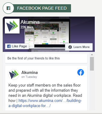
Displays a widget property specified public Facebook feed on the site. Widget properties will control to hide the Timeline, Messages, Events tabs, and cover photo from the Facebook feed. To learn more about the FacebookPageWidget, click here.
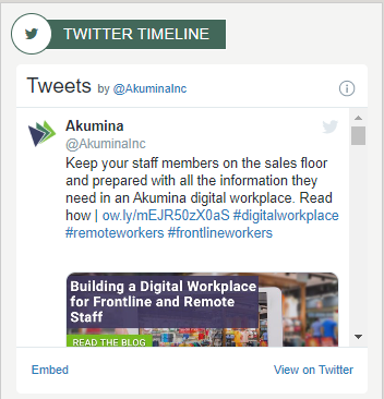
Displays a widget property specified public Twitter account on the site. To learn more about the TwitterTimelineWidget, click here.
Curated News

The Curated News is made up of a single instance of a curated widget. The Curated Widget pulls targeted items from Curated_AK list which drives the landing page experience. A maximum of 20 items are allowed per curated list. Items are selected from multiple SharePoint lists and multiple SharePoint sites to create a single curated news list configured in the Curated News App. Three items are displayed on the home page with a right scroll bar to view additional news items in the list. The Curated Experience is built on the robust virtual page experience and supports multilingual, taxonomy and personas.
Clicking on a item navigates the user to the Detail page for that item.
To learn more about the CuratedWidget, click here.
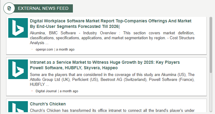
Bing News

Displays external news feed from Bing Cognitive Services. This widget requires a “Bing Resources” key. For multilingual create a language version of the widget instance and change the widget property “Market” to point to news from a different language source. To learn more about the BingNewsWidget, click here.
Document Summary List
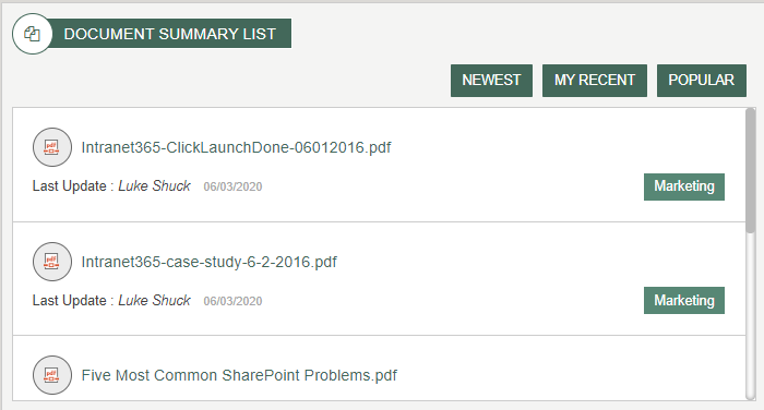
Displays a listing of the most recent documents added to a widget property specified library. Documents can be displayed by Newest, “My Recent” and Popular. On the Root site the widget is configured to pull in documents from the root site as well as department sites, from library with the same name, in OOTB the library is set to Documents. To learn more about the DocumentsSummaryListWidget, click here.
Yammer
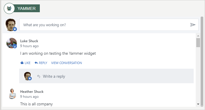
On this home page the yammer widget is configured to pull in all yammer feeds that the user has permissions to. This YammerWidget can also be configured to pull in a specific yammer group and display the feed to users who have access to the feed. User with permissions can contribute to the yammer groups displayed on this widget. To learn more about the YammerWidget, click here.
Embedded Video
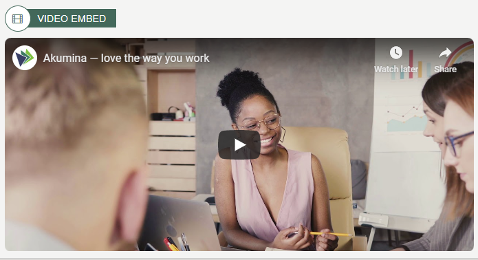
Displays embedded videos in Iframe such as YouTube using the Video Embed Instance of the Generic Embed Widget. For multilingual a language version of the widget instance can be created, the language version of the widget instance can point to a video that is in a different language. To learn more about the GenericEmbedWidget, click here.
Stream Channel Videos
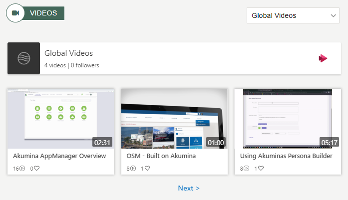
Displays a list of videos populated from the company’s Microsoft Stream channels with standard video thumbnail, video title, number of views and likes. Videos are displayed one channel at time and allows a user to switch channels via a drop-down menu. Clicking on a video item will play the video. For multilingual, a language version of the widget instance can be created, titles and channel ids can be set to display content from a different language. To learn more about the StreamChannelWidget, click here.
Widget instances deployed within the FS’20 Home Site – Left Focus
The Left Focus delivers the main content on the left of the page with the right rail displaying the MeBar Rail Element.
Curated News

The Curated News is made up of a single instance of a curated widget. The Curated Widget pulls targeted items from Curated_AK list which drives the landing page experience. A maximum of 20 items are allowed per curated list. Items are selected from multiple SharePoint lists and multiple SharePoint sites to create a single curated news list configured in the Curated News App. Three items are displayed on the home page with a right scroll bar to view additional news items in the list. The Curated Experience is built on the robust virtual page experience and supports multilingual, taxonomy and personas.
Clicking on a item navigates the user to the Detail page for that item.
To learn more about the CuratedWidget, click here.
Important Dates
Displays a list of a specified number of events in chronological order using ImportantDate_AK list. (the order in which the events will occur). The number of events displayed is defined on the widget property. This widget can be configured to pull data from a SharePoint list such as ImportantDates_AK or from a calendar. If data is configured from the Important dates then the click event (url) is defined on the item in the Important Dates content app. If the events are configured to come from a calendar, then the clicking on an event will navigate the user to the event detail page for the selected event. To learn more about the ImportantDatesWidget, click here.
Latest Featured News
Displays the latest and/or featured (configured to consider feature on widget property) news from the FoundationNews_AK list. Click on “View More” will navigate the user to the news listing page. Click on an Article will navigate the user to a news detail page. To learn more about the LatestFeaturedNewsWidget, click here.
Bing News
Displays external news feed from Bing Cognitive Services. This widget requires a Microsoft Cognitive key. For multilingual create a language version of the widget instance and change the widget property “Market” to point to news from a different language source. To learn more about the BingNewsWidget, click here.
My Recent Files

Displays a list of the recent files visited by the current user. Clicking on a line item launches the document in a new page. To learn more about the MyRecentFilesWidget, click here.
Stream Channel Videos

Displays a list of videos populated from the company’s Microsoft Stream channels with standard video thumbnail, video title, number of views and likes. Videos are displayed one channel at time and allows a user to switch channels via a drop-down menu. Clicking on a video item will play the video. For multilingual, a language version of the widget instance can be created, titles and channel ids can be set to display content from a different language. To learn more about the StreamChannelWidget, click here.
Widget instances deployed within the FS’20 Home Site – Right Focus
The Right Focus delivers the main content in a right and left column on the page. No MeBar rail element is included.
HTML Content
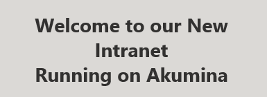
Displays information about the page using an HTMLContentWidget. If the HTMLContentWidget is in a rail, such it is on this home page (left rail), inline editing on the front-end only is not available. Managing the content on this particular HTMLContentWidget, is done in the AppManager Content App “Content Blocks”, specifically item called “Welcome Message”. To learn more about the HTMLContentWidget, click here.
Important Dates

Displays a list of a specified number of events in chronological order using ImportantDate_AK list. (the order in which the events will occur). The number of events displayed is defined on the widget property. This widget can be configured to pull data from a SharePoint list such as ImportantDates_AK or from a calendar. If data is configured from the Important dates then the click event (url) is defined on the item in the Important Dates content app. If the events are configured to come from a calendar,then the clicking on an event will navigate the user to the event detail page for the selected event. To learn more about the ImportantDatesWidget, click here.
My Email
Displays the latest emails from Outlook for the current user. Click on the email title will navigate the user into Outlook in a new tab displaying the email details. To learn more about the MyEmailWidget, click here.
My Meetings
Displays the upcoming meetings from Outlook and Teams for the current user. Clicking on the item will open the Outlook calendar to join the meeting. When a Teams meeting is upcoming within 30 minutes, Join meeting button will display, when selected the user will join the team meeting directly from this site. To learn more about the MyOutlookMeetingsWidget, click here.
Teams
Display Teams and channels that the logged in user has permissions too. Expand a team select a channel will navigate the user into the channel in Teams. Teams can be configured on the widget property, to pull in all Teams the user has permissions too or a specific set or even one Team. To learn more about the MyTeamsLinkWidget, click here.
Curated News
The Curated News is made up of a single instance of a curated widget. The Curated Widget pulls targeted items from Curated_AK list which drives the landing page experience. A maximum of 20 items are allowed per curated list. Items are selected from multiple SharePoint lists and multiple SharePoint sites to create a single curated news list configured in the Curated News App. Three items are displayed on the home page with a right scroll bar to view additional news items in the list. The Curated Experience is built on the robust virtual page experience and supports multilingual, taxonomy and personas.
Clicking on an item navigates the user to the Detail page for that item.
To learn more about the CuratedWidget, click here.
Latest Featured News
Displays the latest and/or featured (configured to consider feature on widget property) news from the FoundationNews_AK list. Click on “View More” will navigate the user to the news listing page. Click on an Article will navigate the user to a news detail page. To learn more about the LatestFeaturedNewsWidget, click here.
Image Gallery active Photos
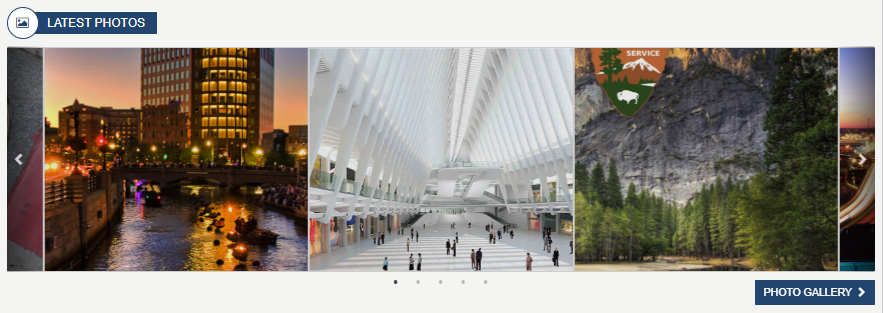
Displays latest active photos set in the “Image Gallery” a customizable slick slider format. Click on a photo and the photo will open in a modal. Clicking on Photo Gallery button will direct you to the MediaGalleryPhotoList page. To learn more about the LatestMediaWidget, click here.
My Recent Files
Displays a list of the recent files visited by the current user. Clicking on a line item launches the document in a new page. To learn more about the MyRecentFilesWidget, click here.
Additional Pages Deployed on the Root site:
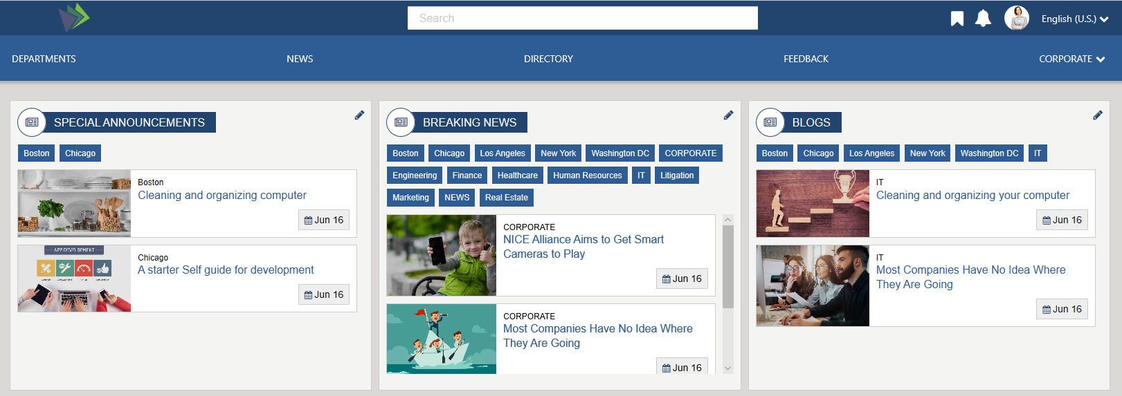
News
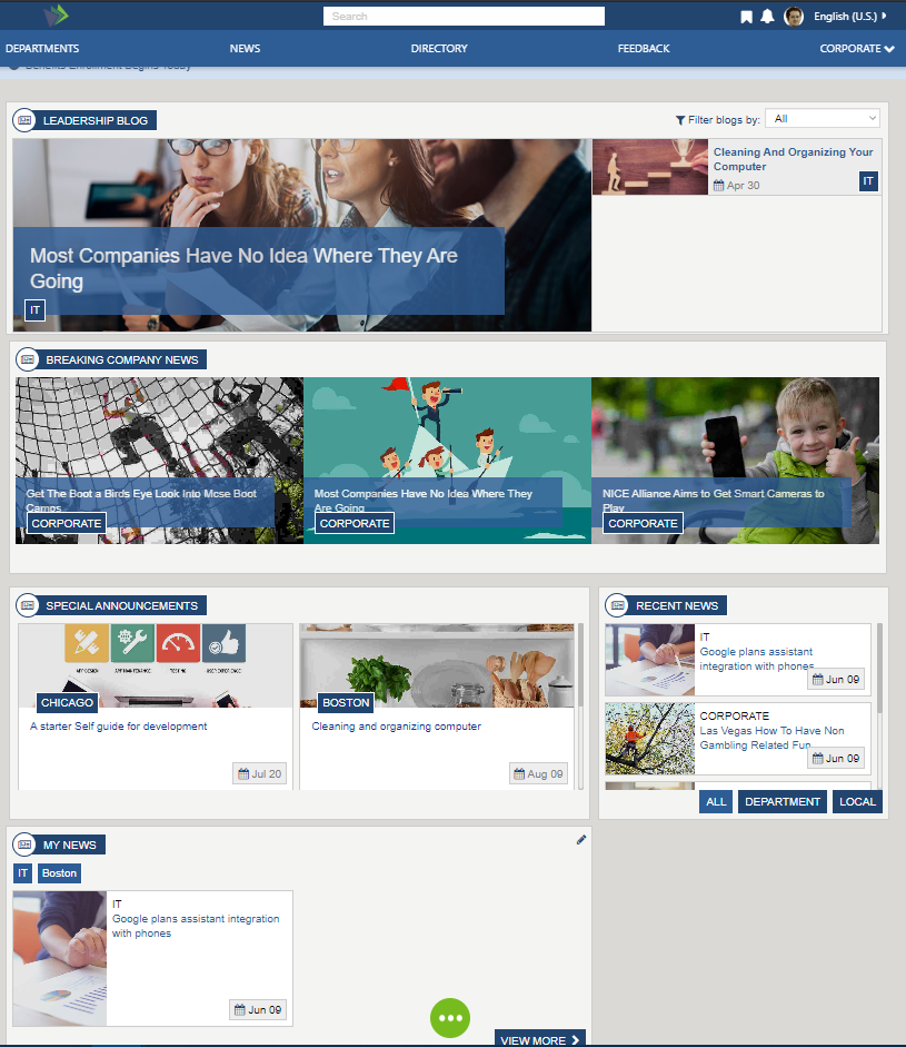
The News Experience page displays company news. Some widgets support targeted and filtered views. These widgets display news from blogs, breaking news, foundation news (recent news), special announcements and my news. My news are articles from a specified new list, in this case Foundation News, personalize by each user’s preferred tags to follow.
Blog News
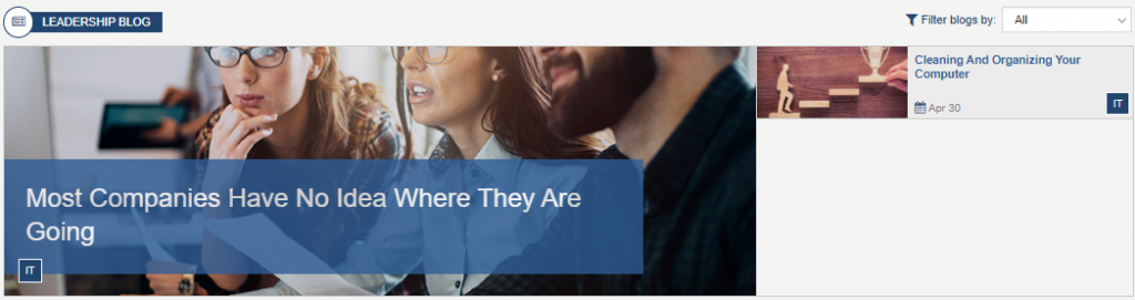
The Blog News widget pulls news items from Blogs_AK list. Each list item contains an image, linked title to the detailed blog item and start date. News articles can be managed using the News-Blog News content app via the Akumina AppManager. Items are filtered based on category tags with a drop-down list filter by location. Clicking on the item will direct the user to the dynamic BlogDetail page where the full article will be displayed. The widget is configured OOTB to first target the end user by their department, the widget property category OOTB is set to: {{UserDepartment}}, if this is removed from the widget property then all blogs will be displayed regardless of the users department. To learn more about the BlogsWidget, click here.
Breaking News
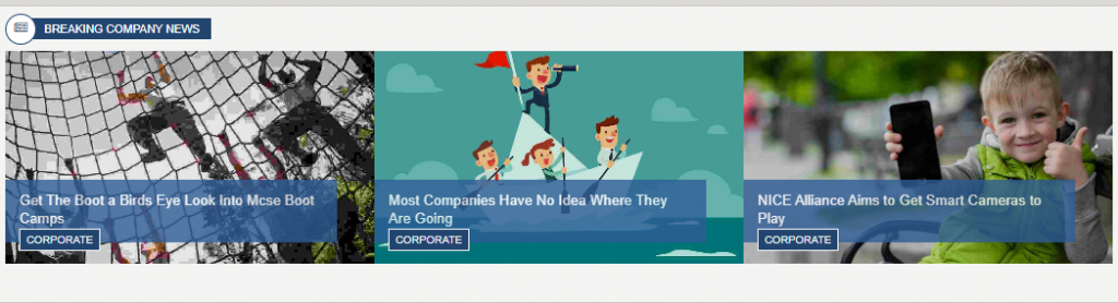
The Breaking News widget pulls news items from BreakingNews_AK list. Each list item contains an image and a linked title to the detailed blog item. News articles can be managed using the News-Breaking News content app via the Akumina AppManager. The widget property category, can be used to filter content based upon a specified Tag such as “IT”, if the widget property category is not set (as it is OOTB) then items from the BreakingNews_AK list will display in descending order based upon when they were created. Clicking on the item will direct the user to the Breaking News Detail page where the full article will be displayed. To learn more about the BreakingNewsWidget, click here.
Special Announcements
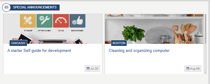
The Special Announcements widget pulls news items from SpecialAnnouncements_AK list. Each list item contains an image, linked title to the detailed item and date. News articles can be managed using the News-Special Announcements content app via the Akumina AppManager. Items are filtered based on category tags and location. Clicking on the item will direct the user to the dynamic NewsDetail page where the full article will be displayed using a friendly URL. To learn more about the SpecialAnnouncementsWidget, click here.
Recent News
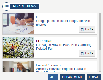
Displays the list of the most Recent News articles from the FoundationNews_AK list. This page is automatically populated based on the current user profile data from Sharepoint or Azure AD. Each list item contains an image, linked title of the current item and start date. Clicking on the item will direct the user to the dynamic NewsDetail page where the full article will be displayed using a friendly URL. To learn more about the RecentNewsWidget, click here.
My News
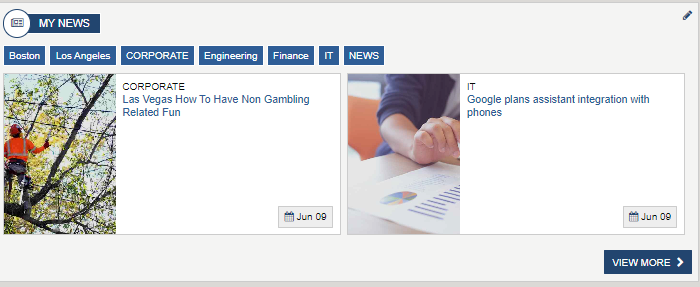
My News is a NewsCardsWidget, displays the most recent items in the FoundationNews_AK list based on the user selected news categories. News categories can be changed by clicking on the pencil icon. Each list item contains an image, linked title of the current item and the date item was created. Clicking on the item will direct the user to the dynamic NewsDetail page where the full article will be displayed. To learn more about the NewsCardsWidget, click here.
Clicking on View More from My News navigates the user to the My News page.
My News Page
My News page displays three NewsCardsWidgets, each pointing to a different News List. For each widget, the user can select categories or tags to follow. Different categories can be selected by clicking on the pencil icon for each news list. The latest news articles will be displayed based upon the user’s preferred categories. These widgets are configured OOTB to display articles from special announcements, breaking news and blogs. Clicking on an article will direct the user to the news detail page where the full article will be displayed. To learn more about the NewsCardsWidget, click here.
News Detail Pages – NewsDetail, BlogDetail, BreakingNewsDetail and SplAnnouncemntNewsDetail
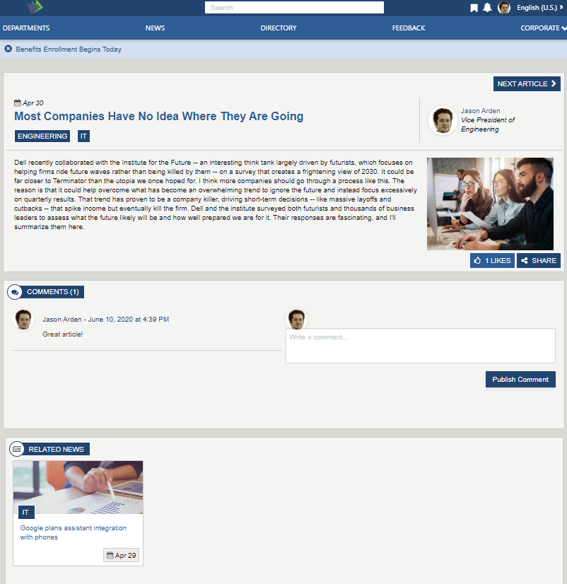
There are several News Detail pages, each pulling data from a specific widget property defined SharePoint list, example FoundationNews_AK. Each page dynamically displays the full details of the currently selected article, title, date, body, and image. Allows the user to like and share articles, use the previous and next to scroll thru articles, leave a comment and select related articles. News articles can be tagged by category and persona and managed using the Foundation News app via the Akumina AppManager.
Each one of the detail pages are using a different detail widget
- To learn more about the NewsDetailWidget, click here.
- To learn more about the BlogDetailWidget, click here.
- To learn more about the BreakingNewsDetail, click here.
- To learn more about the SpecialAnnouncementDetailWidget, click here.
All three new detail pages use the NewsCommentsWidget, which ties the comment to the specific news article. To learn more about the NewsCommentsWidget, click here.
Each news detail widget is using RelatedNewsWidget, to display related news article from a specified News list. To learn more about the RelatedNewsWidget, click here.
News Listing
On the Home page click on the “News” widgets, “View More” and the user will navigate to the News listing page.
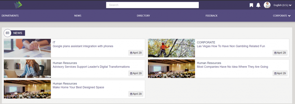
The News Listing page displays all active (respects start date and expired) news articles associated with the SharePoint list configured on the widget property. In the OOTB case, the news articles in the FoundationNews_AK list. The news articles are displayed in descending order. Click on a news article and the user will navigate to the detail news page. A widget property controls a number of items to display before a lazy load (view more) will appear. To learn more about the GenericListWidget, click here.
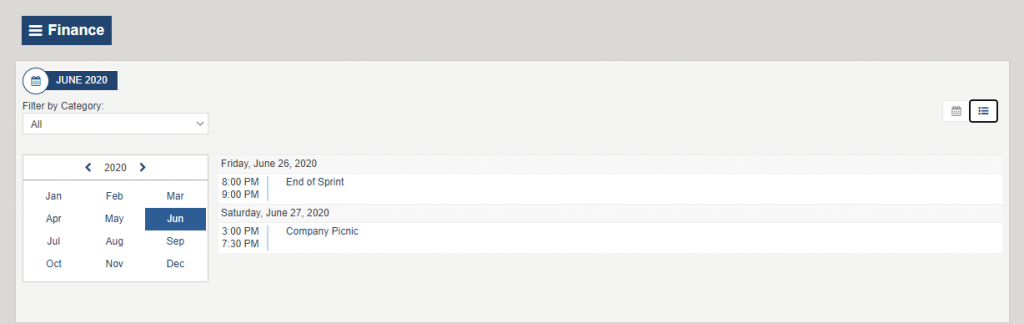
Calendar Page
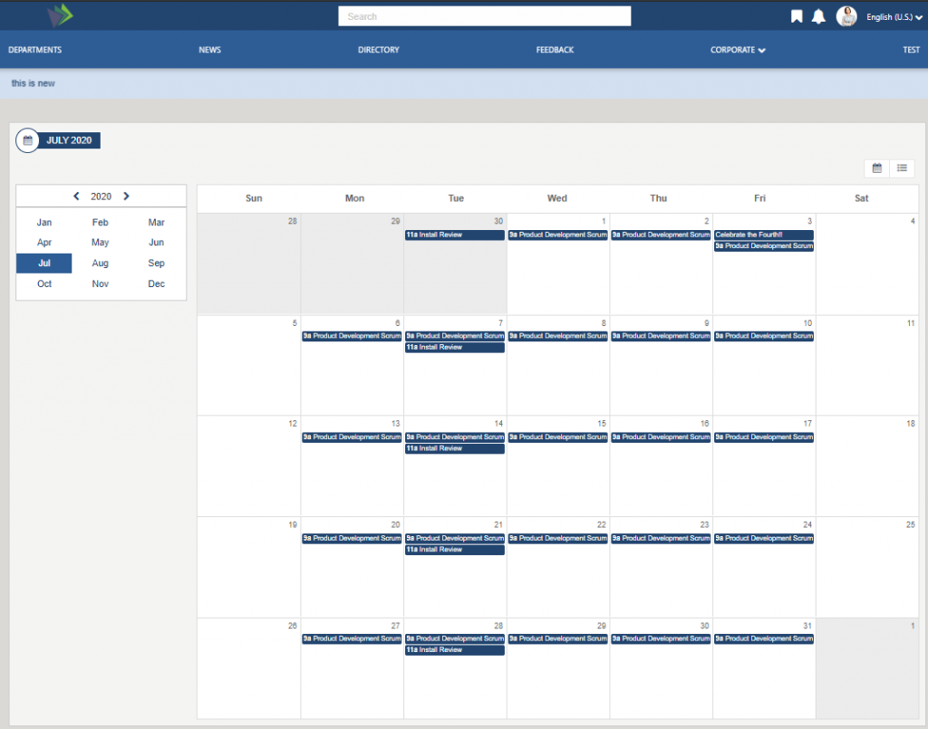
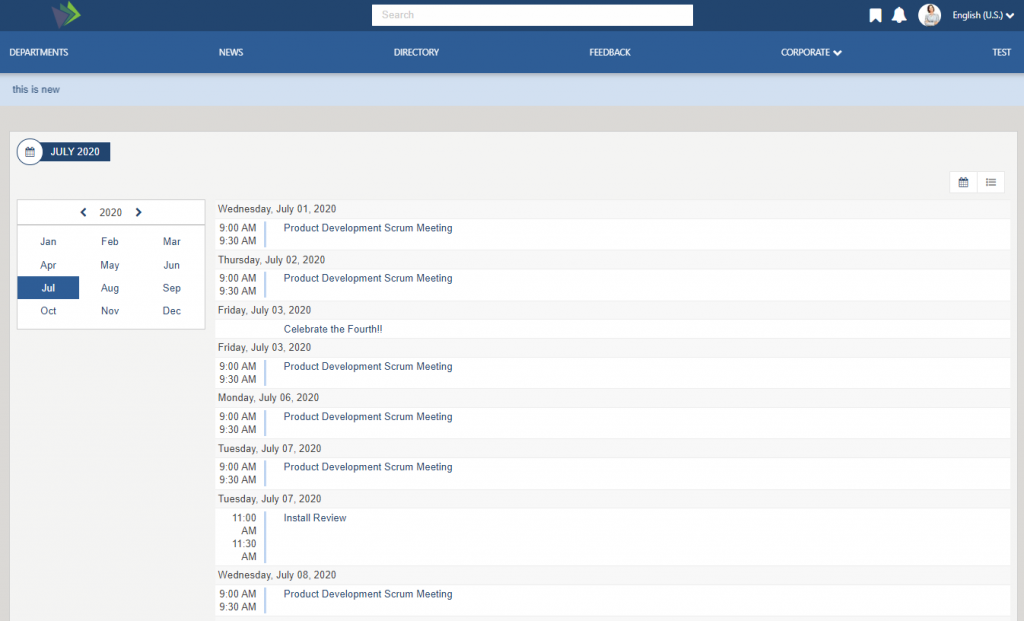
The Calendar page displays events in a tile view or a list view format depending on the user preference (click on the view keys on the page to determine your view). The user can select an event from the calendar, and they will navigate to the event detail page. To learn more about the CalendarWidget, click here.
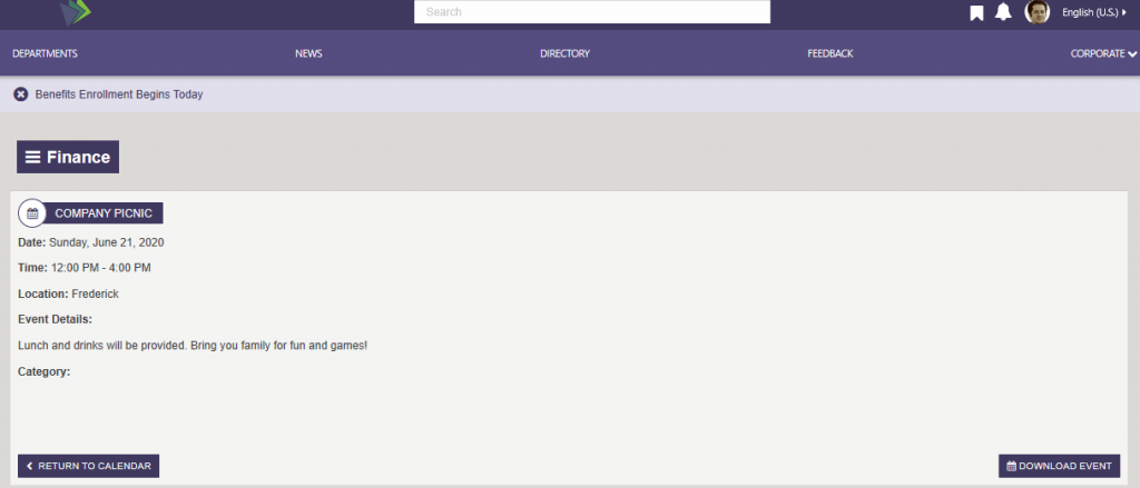
Event Detail Page
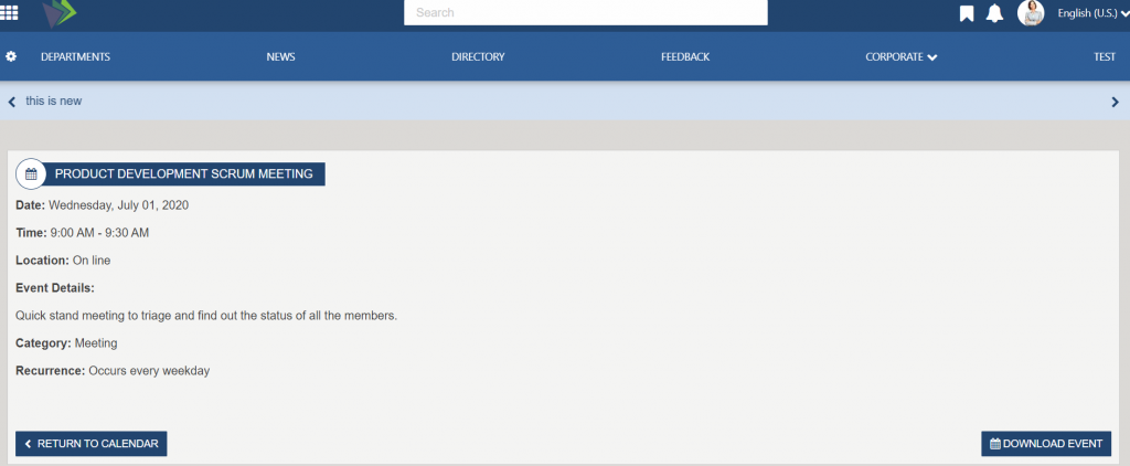
Click on an event from the Calendar page or from an Important date featured items, and the user will navigate to the Event Detail page. The Event detail is displayed, the user can download the event to their local outlook calendar by clicking on “Download Event”. The “Return to Calendar” link is a configurable widget property and will return the user to the link specified on the property. To learn more about the EventDetailWidget, click here.
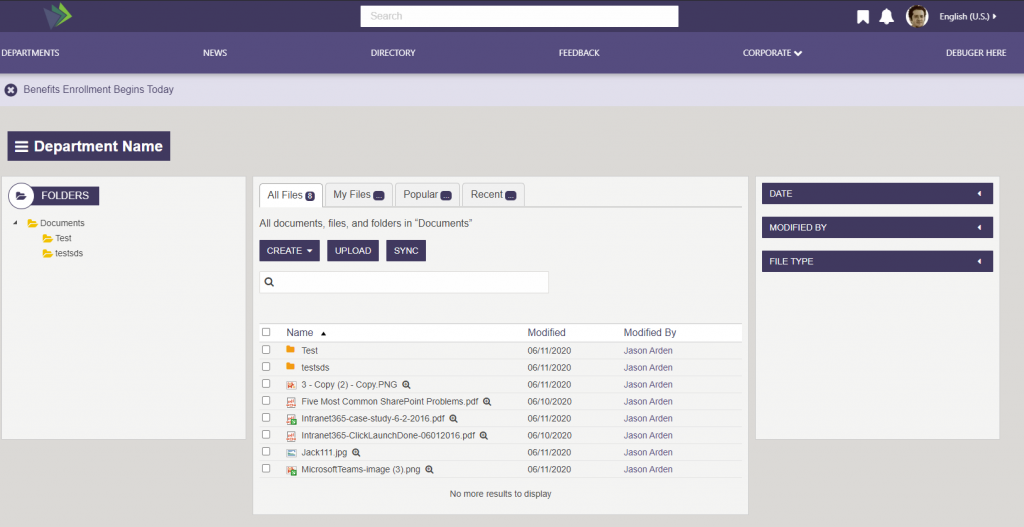
Documents Page
On the OOTB Main Navigation click on Corporate > “Corporate Documents”.
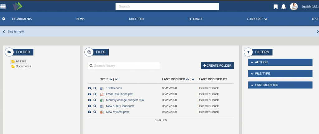
The Akumina Document Viewer Widget is a search-based document listing solution that combines a folder tree view, document list and search filters/refiners into one easy to use interface. Because it is a search-based widget, it has the capacity and performance to search, filter and display libraries with tens of thousands of documents, while still providing the ability to add new files via drag and drop, edit and share documents. To learn more about the DocumentViewerWidget, click here.
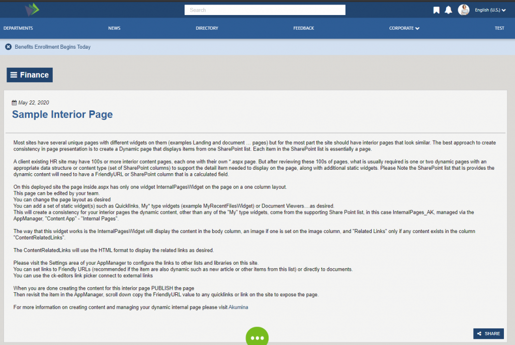
Internal Page – inside
On the OOTB Main Navigation click on Corporate > “Sample Interior Page”.
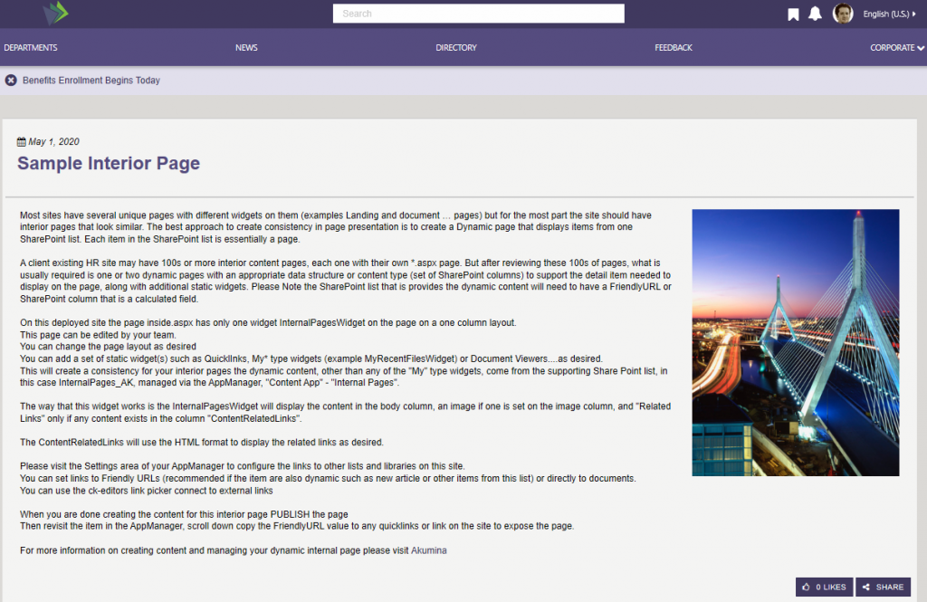
The Internal Page (inside) is a dynamic page that display content from a widget property defined SharePoint list. Each item in the SharePoint list is considered to be a separate page. The page displays a title, a publication date, an image (if set on the item), and related content section, if populated in the item. The display of likes and share are configurable on the widget instance. To learn more about the InternalPagesWidget, click here.
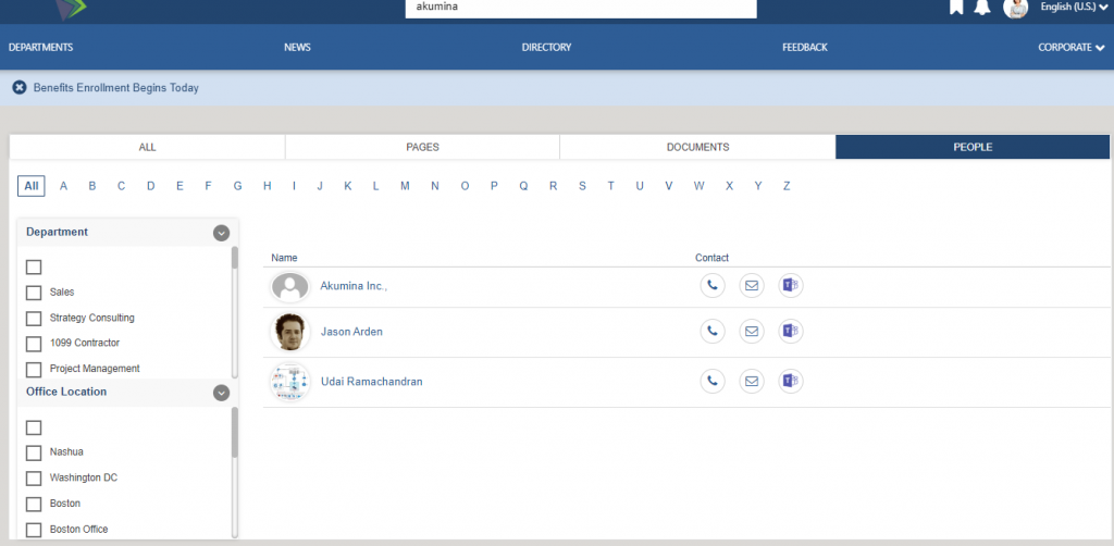
User Directory Page
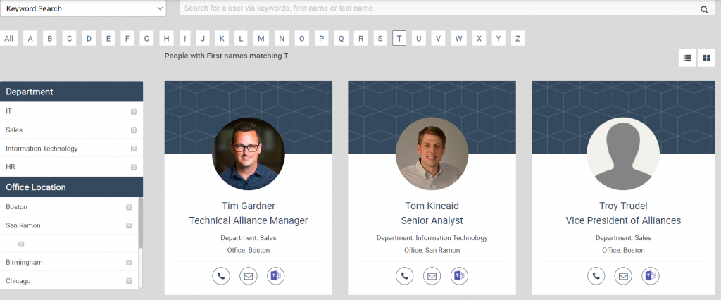
Displays a searchable and filterable list of users. Two views are available: the list view or a tile view (shown). Default filters include Department and Office Location; however, these can be modified to include additional categories based on the information available in the people data provided. Search can be done by keyword search or name search.
Requires a connection to AzureAD, SharePoint Profile service, or a custom data file integration to be enabled to populate the people data.
To learn more about the PeopleDirectoryWidget, click here.
Profile Summary Card
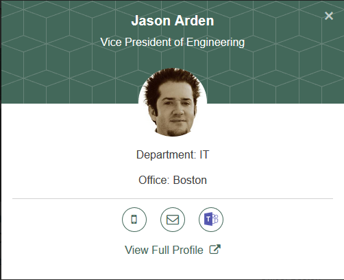
Click on a user and the Profile Summary Card will display, which includes the selected user’s information from their AzureAD, SharePoint Profile service, or a custom data file integration record. Also included is a link to this user’s Full Profile card. To learn more about the PeopleDirectoryWidget, click here.
Full Profile Card – Employee Detail
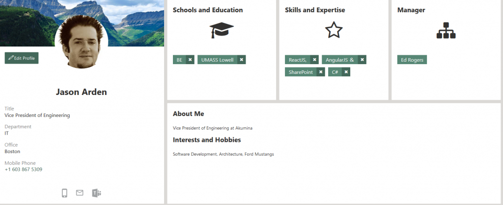
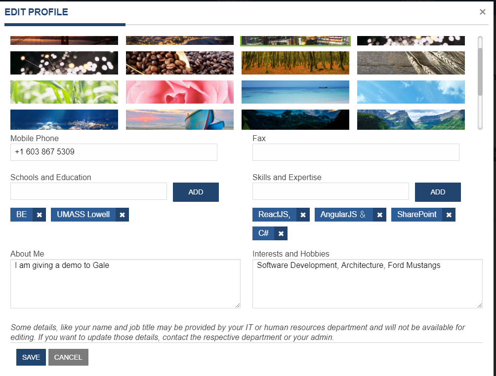
Select “View Full Profile” on the profile summary card or view your own profile, by selecting the “View Profile” drop down menu item, under the users profile on the header. The Employee Detail displays. If this page belongs to the logged in user then the user can edit items on this page, remove tags under Schools.. and Skills by clicking on x. Click on the “Edit Profile” and a modal will appear allowing the user to edit all fields that are configured on the widget instance for edit. A custom column in the user profile has to be configured to store the user preferred background image this column is not exposed to the end user and only used within the intranet. The background image is specific to this site and does not update the users background image in delve. There is a supporting library “BackgroundImages_AK” where the possible background images are stored, additional images can be added to that library to allow for user selection. All other properties besides the background image are updated in the user’s delve site. To learn more about the EmployeeDetailWidget, click here.
To configure the properties for background of the user profile, please reference Updating the User Profile’s Background Image
Example of Edit Profile modal when all fields are set as editable:
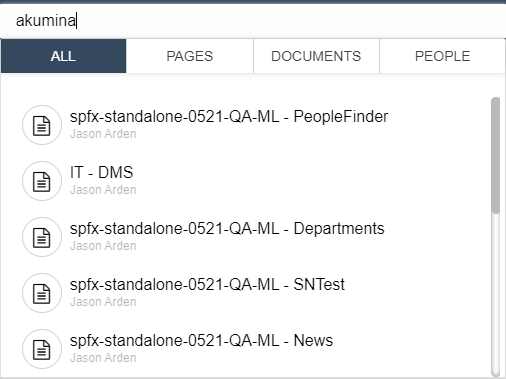
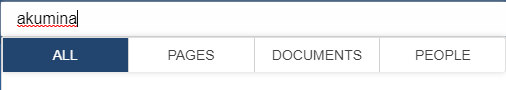
Search
The type ahead search (shown below) will be triggered on the third character of input in the Foundation Site Search box. This allows the user to search the entire site for relevant pages, documents, and people. The results for the selected tab are displayed in the drop down. Clicking on a different tab will refine the search results specifically for Pages, Documents, or People. The “All” tab displays results for Pages and Documents. Clicking on a search result item will navigate the user to the appropriate page. On the People tab, click on a user, their “Profile Summary Card” displays. Enter a search term and hit the enter key will navigate the user to the search results page. The tabs displayed items and order are managed in the TabWidget properties. To learn more about the TabWidget, click here.
Search Results Page
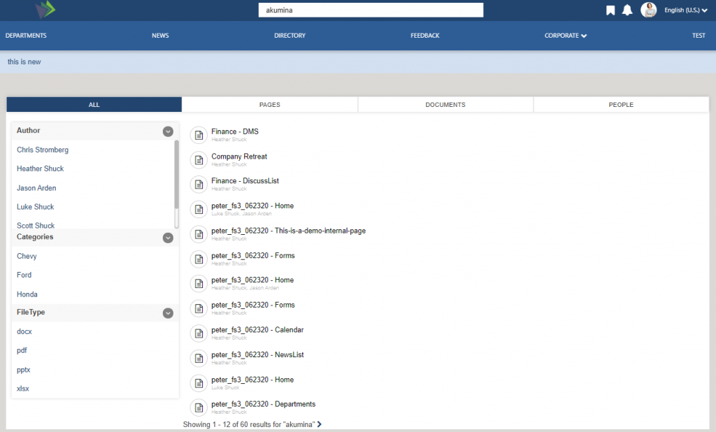
The user navigates to this page by entering in a search term and then clicking on ENTER key. This page displays the search result and facets for the entered term and the appropriate selected tab. Change tab selection from ALL to Pages or Documents, the content will update along with the facets, select a returned result will navigate the user to the appropriate site page. Change the Tab to “People” and the page changes to reflect a similar experience to the People Directory page (including configurable facets), click on a user and the user’s Profile Summary Card will display. Update the Search term on the header on the third keystroke the page will update, displaying the appropriate results for the selected search tab. The tabs displayed items and order are managed in the TabWidget properties, click here to learn more about the TabWidget. The TabWidget contains several GenericSearchListWidgets instances (click here to learn more about GenericSearchListWidgets) and a PeopleDirectoryWidget instance (click here to learn more about PeopleDirectoryWidget).
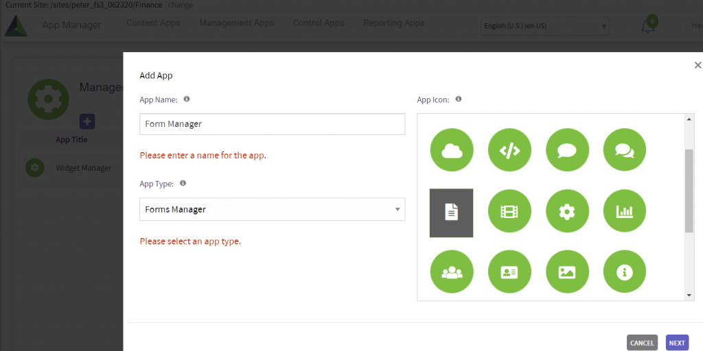
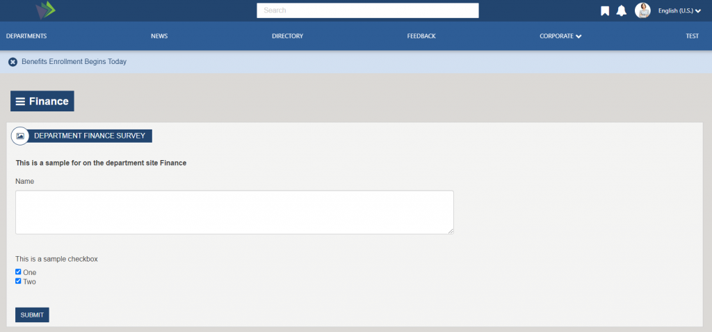
Forms
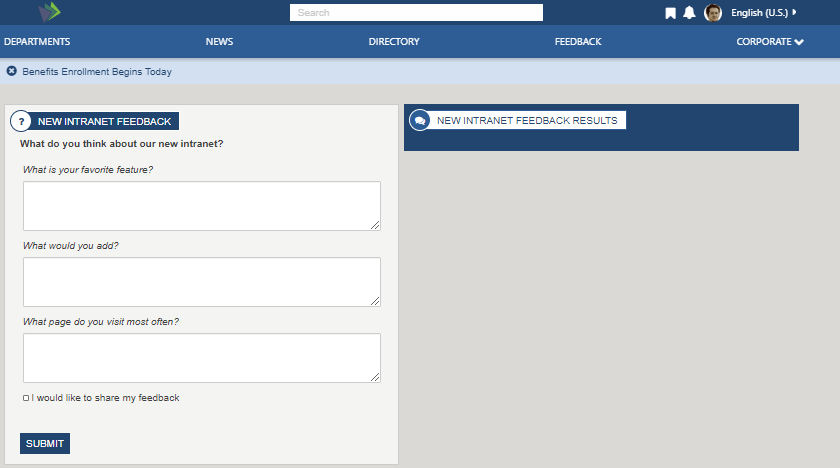
The “Feedback” or help page, displays a sample form that the user can complete and submit. If they check the “I would like to share my feedback” then their feedback is dynamically added to the widget on the right. Feedback (Main Menu) is a sample form “New Intranet Feedback” which is provided in the Foundation Site deployment.
Each site has their own dynamic form page. The Quicklinks content app types such as the Navigation, have a “Adding Form Link”, forms added to Quicklinks using the quicklink selector use the dynamically form page to display the form. The dynamic form page is also used on the AppManager > Management app >Form Manager, where a list of forms are displayed. When an author clicks on “Get Form Link” and copies the link into a new browser tab. The form will display on the sites dynamic form.
Form submitted results are managed and reviewed in the AppManager, under the “Reporting Apps”, by users set in the sites “Reporting Access Group”. The “Reporting Access Group” is defined in the AppManager > Settings > Global settings. To learn more about the FormWidget, click here.
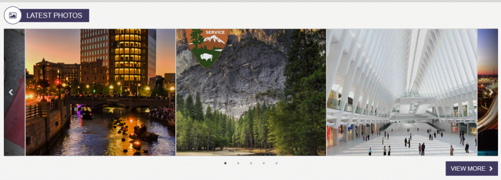
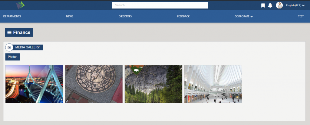
Media Gallery
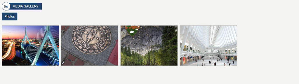
Displays the photos that have been enabled using the Image Gallery content App. The page is enabled for infinite scroll so will display additional photos as the user scrolls down. Clicking on a photo displays a lightbox window with the larger image. To learn more about the LatestMediaWidget, click here.
Department Page
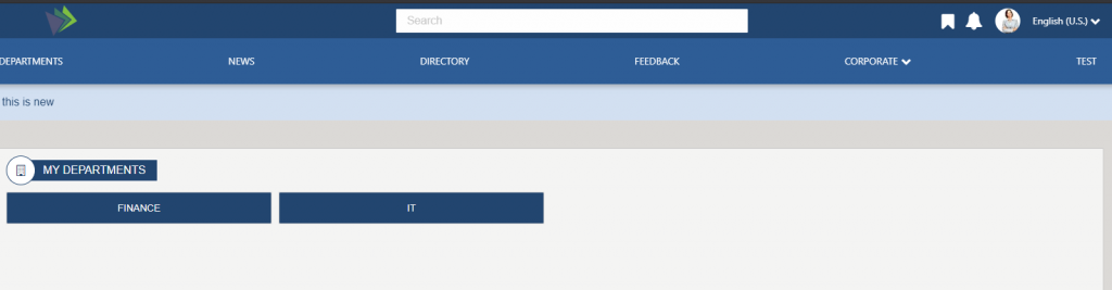
Displays a permission filtered list of departments, that the logged in user has access to. The titles on the departments come from the Site Titles set in SharePoint. To learn more about the DepartmentListWidget, click here.
FS ’20 Home Site – Akumina AppManager Use
The following topics cover the use of the AppManager for managing content within the Home site.
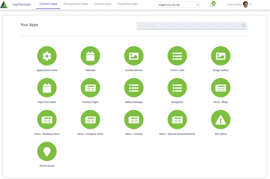
Accessing the Akumina AppManager
To access the Akumina AppManager, click the Launch into AppManager button on the Akumina bottom tray. This will launch the Akumina AppManager interface and display the content apps a user has access to for the site/site collection.
Note: Users can select the site they want to manage from the select a site dropdown to access apps for each of the sites they have permission to manage.
Viewing Apps for the Home site
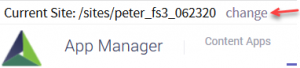
Once in the Akumina AppManager a user can look in the top left corner to see the current site/sub-site they are viewing apps for.
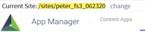
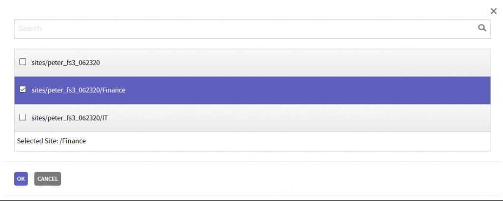
If the user needs to switch the view to another site/sub-site, click “change”
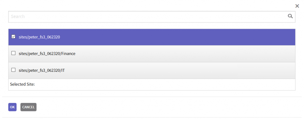
Select the appropriate site in the modal and click OK
Root/Parent Site Content Apps
Below are the default apps which are included in the Foundation Site Home.
Application Links: Content App to add Application links to the MyLinks_AK list. The title “Applications” come from the category title. The “MyLinksWidget” support one category of links if teams has been configured on the widget. If on the MyLinksWidget instance the teams instances id is blank, then a second category of links can be supported on the widget. In this case the second category title will display as a TAB on the MyLinks Widget. MyLinksWidget supports up to three tabs.
Calendar: Calendar allows the content author to add and manage events in the Calendar_AK SharePoint list. These events are displayed on the calendar page or the Important dates widget (if it has been configured to display data from Calendar_AK and the calendar item is marked featured). Each calendar items after the initial SAVE, has a FriendlyURL at the bottom of the item, click on the Friendly URL will navigate the user to the Event Detail Page where the item can be reviewed.
Content Blocks: Content App to add HTML content items to GenericHTML_AK list. The Welcome message on the home page (right focus) is managed in the OOTB item titled “Welcome Message” in this list.
Footer Links: Content App to add and customize the page footer categories and links to FooterLinks_AK list. The Footer supports one level of category.
Image Gallery: Content App to choose which images from an existing image library to display in the Media Gallery page and on home page (left focus).
Important Dates: Content App to define specific date related items for display on the home page without using the calendar functionality. The items are saved in the ImportantDates_AK list.
Internal Pages: Content App to add dynamic pages to create consistency in internal page presentation. The pages are saved in InternalPages_AK list.
MeBar Manager: Content App to define the widgets to display, the order of the widgets and if they are expanded on the MeBar Rail Element. The items are saved in the MeBarManager_AK list.
Navigation: Content App to add links to the FoundationTopNavigation_AK list which drives the main site menu which is part of the site header. Added links will be seen on EVERY page of the Site Collection/sub-sites.
News – Blogs: Content App to define specific news related items for display in the blog section on the News Experience and Department Experience pages. The items are saved in the Blogs_AK list.
News – Breaking News: Content App to define specific news related items for display in the Breaking News section. The items are saved in BreakingNews_AK.
News – Company News: Content App to define specific news related items for display in the Home Page News section. The items are saved in FoundationNews_AK. Added items will be seen on news, news detail and news listing pages.
News – Curated: Content App to define the targeted set of curated news items for display on the landing page. The items are saved in the Curated_AK list
News – Special Announcements: Content App to define specific date related items for display in the Special Announcements section. The items are saved in SpecialAnnouncements_AK.
Site Alerts: Content App used to enable and define the displayed text for the Site Alert banner, which appears in the site header when and site alert item is enabled. Alerts can be defined to be dismiss-able or not.
World Clocks: Content App used to define the countries, time zones and display order for the Wold Clocks displayed on the footer. The data is stored in the WorldClock_Ak SharePoint list.
For additional information on content apps, please reference Using the Foundation Site (FS’20) Content Apps (release 4.8 and above)
FS’20 Sub-site/Department Overview
The Department/Sub-Site deployment package is a site template (Digital Workplace Foundation Department site (v3)) which can be deployed from within the Akumina AppManager using the Site Creator Management app. It is meant to be deployed as many times as needed to create new departments or sub-sites.
Pages deployed within each Sub-Site/Department
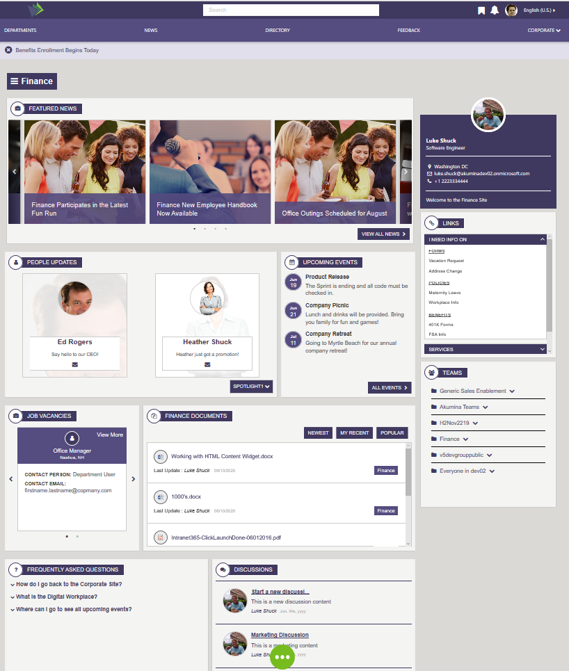
Home – Department Landing Page contains department specific content and access to subpages within the current site.
InternalPage – A dynamic page used to display a detailed internal page view for each of the current site section’s with related news articles.
NewsList – Displays all news articles from a specified “news” SharePoint list, OOTB configured to display the DeptNews_AK.
NewsDetail – Is a dynamic page used to display a detailed page views for each of the current site section’s news articles and announcements.
Calendar – Displays the Calendar widget in the Modern Full view and shows the event for the selected month.
Document Management System (DMS) – Contains document library pages, queried by CAML
Document Viewer (documents) – Contains document library pages, queried by search
EventDetail – Department site specific Calendar Event Detail Page
FAQ – Department site specific Frequently Asked Questions Page
DiscussList – Department site specific Discussion Board List Page
DiscussThread – Department site specific Discussion Board Thread Page, click on a thread on a discussion to add a new thread on this page
DiscussNew – Create New site-specific Discussions
Forms – A dynamic page used to display any form defined in the department site
DeptPhotos – Displays the photos from the department site specific Media Gallery
Home Page
The following Widgets are included on the Department Home Page:
Department Navigation
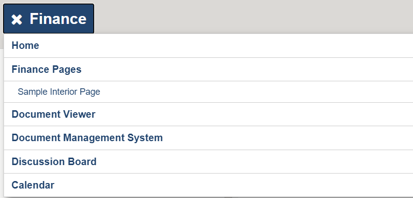
The Department Navigation hamburger menu appears on every page of the Department Sub-site, the widget is set on the department site master page “VirtualMasterPageFoundation-Subsite.html”. The Department Navigation displays the site-specific menu items. The Site title, in this case “Finance”, is managed on the “Department Menu” Content App in the AppManager, the title of the site is set in the “Root Node Title”. Multilingual site titles and menu items are managed in the AppManager by making a Language version of the menu and updating the “Root Node Title” and links appropriately for the new language. This menu supports one level deep of categories. The navigation menu may contain internal and/or external links. Categories can be link able or not. Menu items can be opened in the same window or in a new window (new browser tab). Items in the menu are managed using the Department Menu app for the current subsite located in the AppManager. To learn more about the QuickLinksWidget, click here.
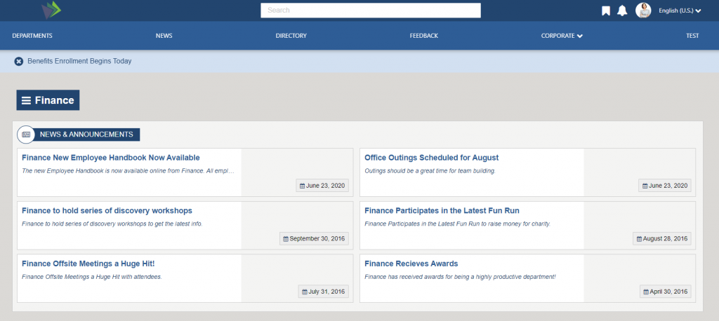
News and Announcements List
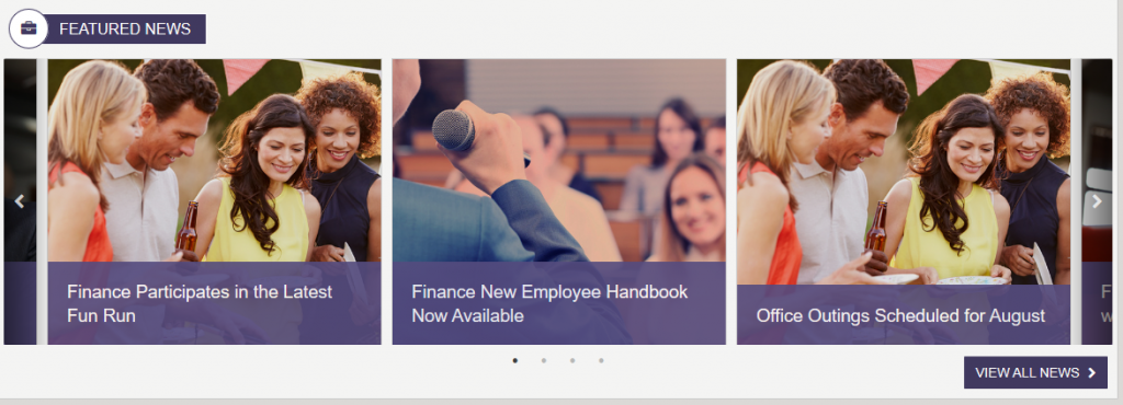
The Featured News displays a slick slider of the news articles in descending order (based upon Start Date) from the DeptNews_AK. The Article image and Announcement titles is displayed. Clicking on an item will direct the user to the dynamic NewsDetail page where the full article will be displayed. The view all news link button will direct users to the NewsList page which contains a full list of all news articles for the current sub site. To learn more about the DepartmentNewsWidget, click here.
People Updates
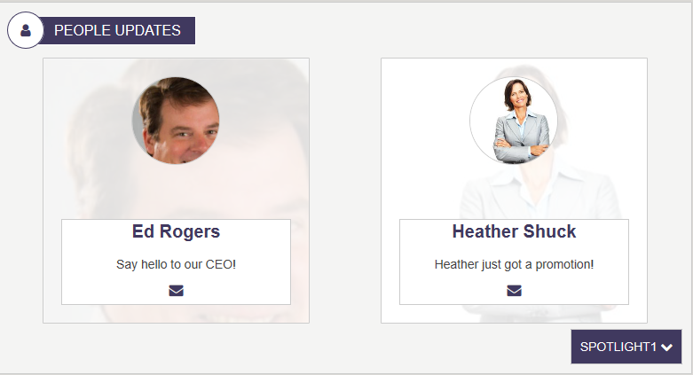
The Employee Spotlight widget displays a profile image, user name, and message. The widget pulls items from the DeptEmployeeSpotlight_AK list. The “SpolightType” which is set to “SPOTLIGHT 1, SPOTLIGHT 2 and SPOTLIGHT 3 OOTB, can be updated to reflect the type of spotlight desired. For example, update the list settings, on DeptEmployeeSpotlight_AK, column “SpotlightType” and set the choice too “Management Team” and “Anniversaries” then add the users, setting their SpotlightType to the new choices. A simple update to the widget property “Spotlight Type”, changing: {“Spotlight1″:”Spotlight1″,”Spotlight2″:”Spotlight2″,”Spotlight3″:”Spotlight3”} to {“Management Team”:”Management Team”,”Anniversaries”:”Anniversaries”}, allows for the desired selector. For multilingual site a language version of the widget instance is created and the the “Spotlight Type” is update to reflect the new desired language, example in Spanish version of the widget instance: {“Management Team”:”Equipo de gestión”,”Anniversaries”:”Aniversarios”} (the choices here are mapped to the Spanish titles displayed on the widget). The order in which the users appear, are based upon the order users appear in the supporting AppManager slider app “Employee Spotlight”. Click on a user in the “People Updates” and the user will navigate to the employee detail page for the selected user. Left and right chevrons appear and allow the end user to scroll through all users in the “People Update”, for the selected SpotlightType.
To learn more about the FoundationEmployeeSpotlightWidget, click here.
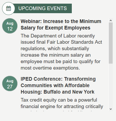
Upcoming Events
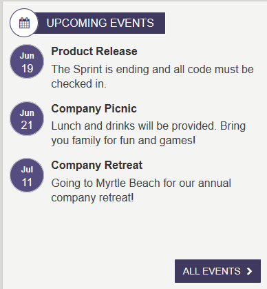
Each sub site will have a SharePoint Calendar (Calendar_AK). The Important Dates Widget will display current events (today’s events) and future events marked “Featured” from the current sub Calendar_AK list. Note: Events that have been scheduled in the past will not be displayed. Events will be displayed in chronological order (the order in which the events will occur). Clicking on an event in the important dates list will bring the user to the event detail page for the selected event.
- All calendar events are managed using the calendar app for the current sub site located in the AppManager. You can use the Calendar app to tag an event as ‘Featured’ so it will be displayed in the Important Dates Widget, as seen above.
- Click on “All Events”, the user will navigate to the department sites calendar page where all events for the department are displayed.
To learn more about the ImportantDatesWidget, click here.
Job Vacancies
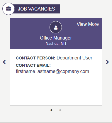
Job vacancies displays a list of job openings with title and location. The widget pulls items from the corresponding Job Vacancies content app. Clicking anywhere on the job tile or the “View More” and the jobs full detail will display.
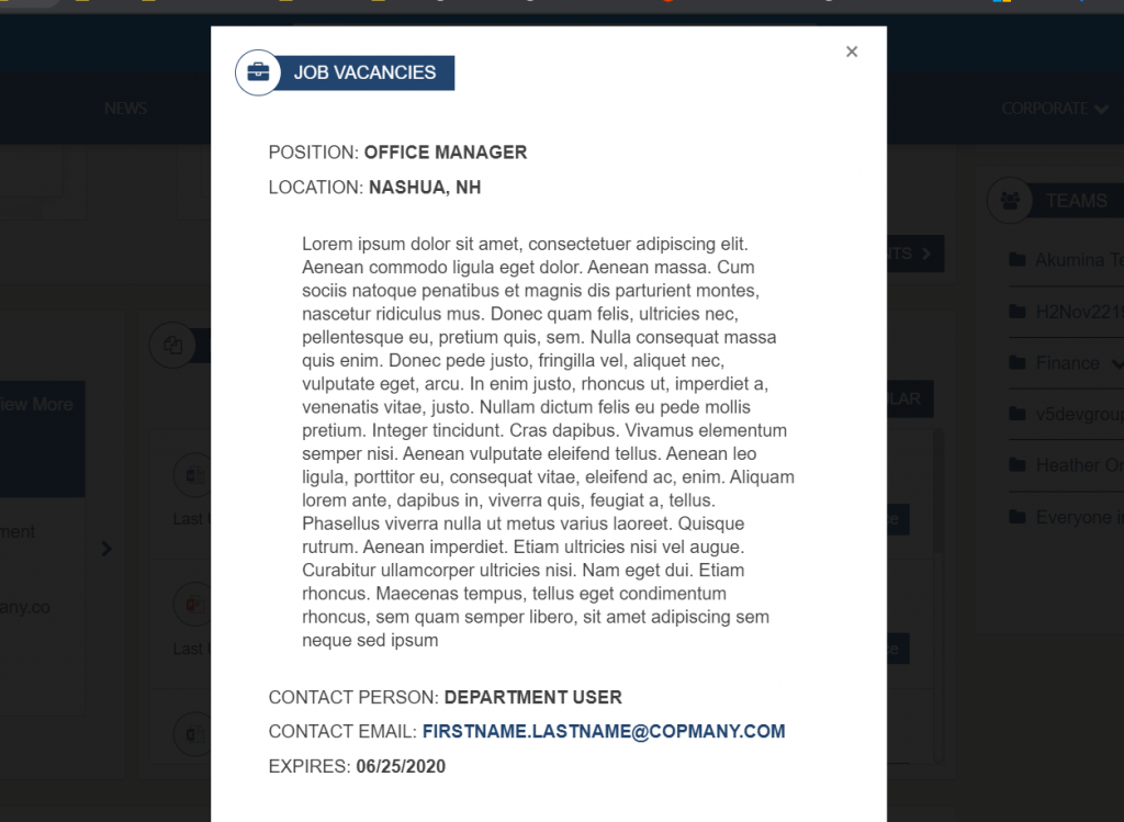
The Body of the Job description is managed in the “Job Vacancies” content App in a ck-editor (WYSIWYG) allowing the content author to added content and styles appropriate for the job description.
Click on the Contact Email address, Outlook will open allowing the user to generate a reply email.
To learn more about the FoundationJobVacanciesWidget, click here.
Department Document Summary List
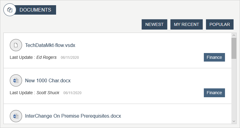
The document summary list is a summary view of documents from the current site’s document library. Documents can be filter by the following categories using the tabbed interface:
- Newest: Recently added by any user
- My Recent: Recently added by current user
- Popular: Determined by number of page views
Documents can be added, edited, and managed directly in the document page. To learn more about the DocumentsSummaryListWidget, click here.
FAQs
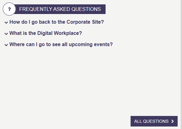
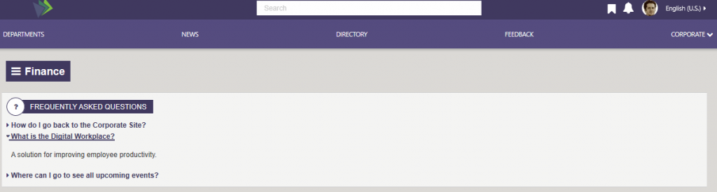
The FAQs on the landing page show a specified number of FAQs (OOTB set to 10 set on widget property viewxml) in an order, based upon the order in which they appear in the supported “FAQ” content slider app in the AppManager. FAQs are managed as Title(question)/Answer pairs. Clicking on an FAQ, the answer will appear, the FAQ appears expanded, click on FAQ again and it will collapse. Selecting “All Questions”, the user will be redirect to the department full list FAQ page. To learn more about the FAQWidget, click here.
Recent Discussion Posts
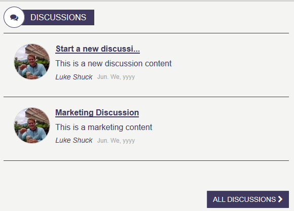
The Discussions Summary on the landing page, displays the five most recently added discussion threads that have been added to the current site Discussions_AK list. Click on the title of a thread and the user will navigate to the selected discussions thread page, where the full thread is displayed and where a user can reply to the thread. Click on “All Discussions’ and the user will navigate to the Discussion listing page where all active discussion threads will be displayed. To learn more about the Discussion Board, click here.
Department Site Owner

The Site Owner displays an image, name, and title of the specified subsite department owner. Contact information and a welcome message can be included. Site Owner can be updated using the Site Owner App in the current subsite AppManager. Values for the selected user will come from people sync data in less overwritten by in the item. Example the user profile phone number will come from the people sync data unless the item “Phone” is filled in. There are cases where the owner may want to display a different email or phone number than their own personal information, for example, they may want a general department phone number displayed. The Site Owner only supports one user update the existing item to update the site owner.
To learn more about the FoundationEmployeeSpotlightWidget, click here.
Teams
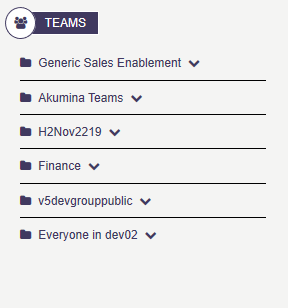
Displays a personalized list of Teams for the current user. This widget allow user to view and access teams and channels that the logged in user belongs too. Specific teams can be targeted on a widget instance using “Target Team” widget property. Example of “Target Team” [“Finance”,”Payroll”], would target this widget for those specific teams. If the logged in user has permissions to those teams and channels, then they will see the Team and channels (in expand mode). If the “Target Team” widget property is set to [] then all teams and channels in which the user has access to will be displayed. Expand a team and click on a channel, will launch the user into the specific team and channel. To learn more about the MyTeamsLinkWidget, click here.
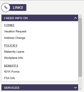
Links
The Department Links displays a set of frequently used Links in a collapsible menu which are specific to the current sub site section. The quicklinks may contain internal and/or external links. Users can also create sub items in the menu that display in a collapsible menu. Items in the menu are managed using the Quicklinks App for the current subsite located in the AppManager. This view of quicklinks support two category levels deep. The OOTB content is managed in AppManagers department site in quicklink content App “Quicklinks”. The data is stored in Quicklinks_AK SharePoint list. To learn more about the QuickLinksWidget, click here.
Department Photos
Displays the photos that have been enabled using the Image Gallery content App. The page is enabled as a slider app with an infinite scroll chevrons all the user to continue to scroll left and right. Clicking on a photo, a lightbox window with the larger image will display. Clicking on “View More”, navigates the user to the department photo gallery page. To learn more about the LatestMediaWidget, click here.
NewsList
On the Department home page, “Featured News”, click on “VIEW ALL NEWS”, the user will navigate to the News listing page.
The Dept News Listing displays all active (based on Start Time and Expires) items in the DeptNews_AK list in descending order based upon “Start Date”. This is an example of a new listing widget (AnnouncemntItemsWidget) where images are not displayed. The widget displays the Announcement Title, an ellipse version of the news items Summary and the Start Date. News articles can be managed using the Department News app via the Akumina AppManager. Click on a News item and the user will navigate to the News Detail page. Manage the news articles in the AppManager, department, content app Department News. To learn more about the AnnouncementItemsWidget, click here.
News Detail
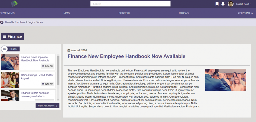
Department News Item Widget (right column)
The Dept News Detail Widget dynamically displays the full details of the currently selected article; title, start date, body, and image. News articles can be managed using the Department News app via the Akumina AppManager. To learn more about the DepartmentNewsItemWidget, click here.
Department News List Widget (left column)
The Department News List Widget displays the four (set on viewxml widget property) news articles from DeptNews_AK (set on widget property) based upon “Start Date” in descending order. Each list item contains an image, and Announcement Title of the current item. Clicking on the item will direct the user to the dynamic NewsDetail page, where the full article will be displayed. Click on “View All News”, will direct the user to the NewsList page which contains a full list of all active news articles for the current sub site. To learn more about the DepartmentNewsListWidget, click here.
Manage the news articles in the AppManager, department, content app Department News.
Calendar
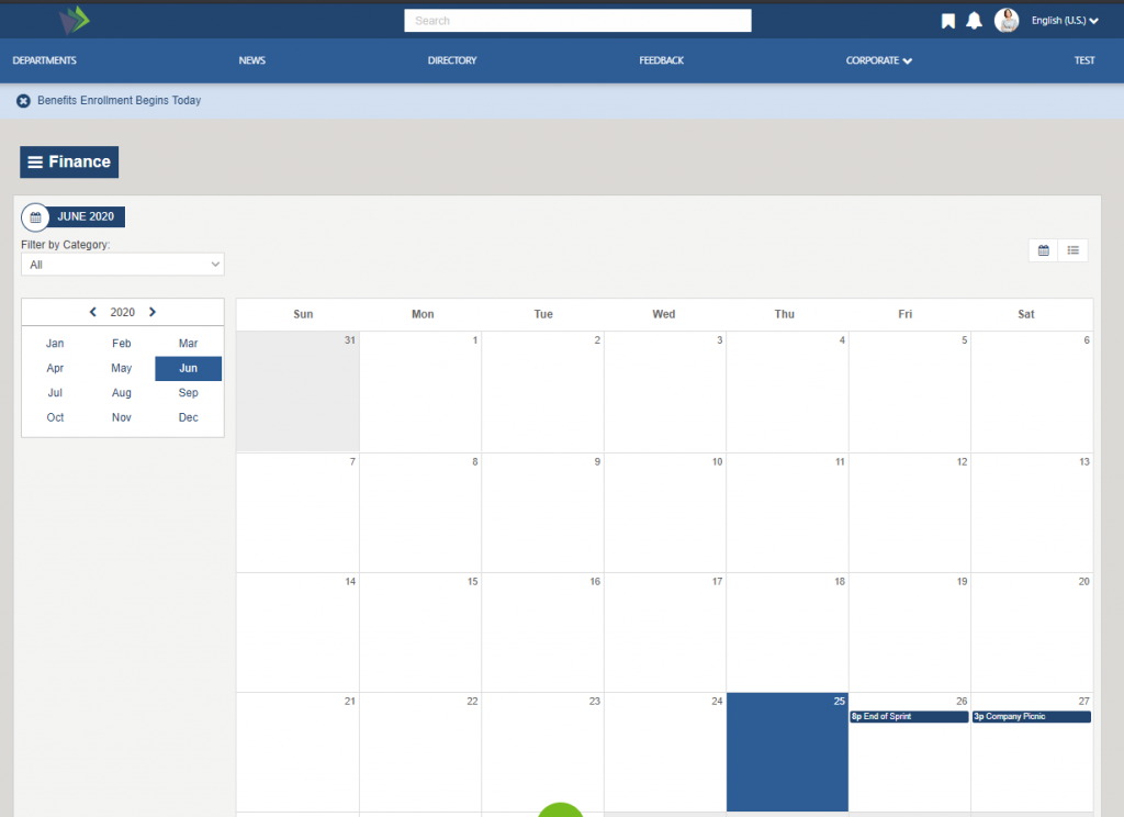
The Calendar page displays events in a tile view or a list view format depending on the user preference (click on the view keys on the page to determine your view). The user can select an event from the calendar, and they will navigate to the event detail page. To learn more about the CalendarWidget, click here.
Event Detail
Event Detail Widget
Click on an event from the Calendar page or from a Important date featured items, and the user will navigate to the Event Detail page. The Event detail is displayed, the user can download the event to their local outlook calendar by clicking on “Download Event”. The “Return to Calendar” link is a configurable widget property and will return the user to the link specified on the property. To learn more about the EventDetailWidget, click here.
FAQ Page
The FAQ Widget displays the full list of FAQ question/answers in the FAQ_AK list. To learn more about the FAQWidget, click here.
Discuss List
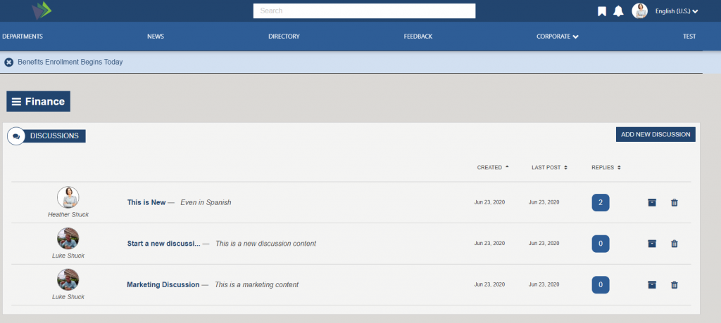
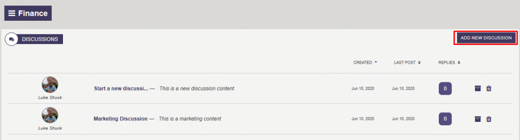
Discussion Board Listing
The Discussion Board Listing displays the discussions that are in the Discussions_AK list. Clicking on the Discussion link will bring you to the DiscussThread page. Clicking Add New Discussion will take you to DiscussNew page and allow you to create a new Discussion. Discussions can be sorted by creation date, last post and number of replies. Users with ownership of discussion can archive or delete their discussion. This widget is not associated with any AppManager app.
Discuss Thread
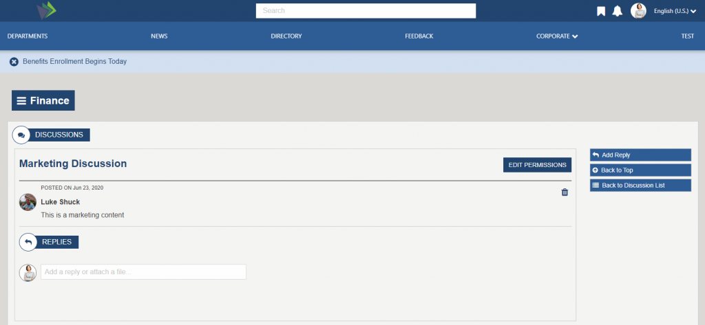
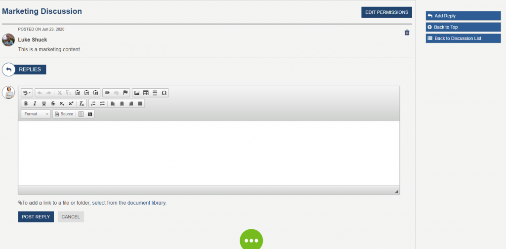
Discussion Thread
Discussion Thread is an item in the Discussion_AK list. Here users may add replies, edit permissions, delete replies, or delete the thread. When a user clicks into the “Add a reply or attach a file”, the WYSIWYG editor will appear, allowing user to add a reply. Click on “select from the document library”, a modal will appear, allowing the user to attach a file link to this discussion thread. Click on “EDIT PERMISSIONS”, a modal will appear, allow the user to update and specify one or more SharePoint security group who have access and able to view this discussion thread. This widget is not associated with any AppManager app.
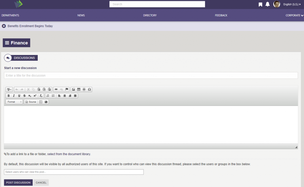
Discuss New
Allows the user to add a new discussion thread, a new item will be added to Discussions_AK. The user enters the Thread title in the “Enter a title for the discussion”, input field. The WYSIWYG editor allow the user to add the detail of the discussions. Click on “select from the document library”, a modal will appear, allowing the user to attach a file link to this discussion thread. By default, all users who have access to the site have access to this discussion. Click on “Select users who can view this post” will allow the user to specify one or more SharePoint security group who have access and able to view this discussion thread. This widget is not associated with any AppManager app.
To learn more about the Discussion Board, click here.
Documents
Document Management System (DMS)
The Document Management System (DMS) is a full document management listing that combines a folder tree view, document list, search filter, refiners and multiple tab views into one easy to use interface. Each of these widgets can be used together or separately in any needed combination to address specific site needs.
The DMS widgets includes a powerful drag/drop mode with a tagging wizard that prompts users to complete any required metadata fields and select whether they want to check-in the documents as part of the upload.
Documents Folder Tree
The Documents Folder widget is an expandable tree navigation, that allows the user to navigate to any folder in the library. Select a folder in the Documents Folder Tree, the contents of the folder will display on the Document Grid.
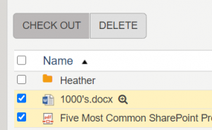
Document Grid
The Document Grid widget displays the folders and files that are found in its document library. The user may create (Office documents), view/open (edit), delete, upload (drag and drop and upload button) and download files.
Click on a folder in the Document Grid and the user will navigate into that folder. Select a specific file and a file menu will appear with additional actions that can be performed on the file.
Note: The More actions tab uses SharePoint OOTB modals. In a multilingual enabled environment, the modals will appear in the SharePoint site configured language.
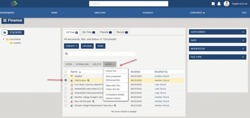
Click more than one file and the file menu will display actions that all selected files can perform.
When using Search on the document grid, the search is only performed on the active folder and data displayed on the grid. The Right column refiners will update the GRID for only the selected folder. Search, tabs (example My Files) and refiners work together to refine data on the Document grid.
Document Refiners
The default document refiners include date, modified by (search for users who appear on the grid), and file type. Additionally, the right column refiners can be configured (via widget properties) to add managed metadata categories to your document library which can be use as refiners. Clicking on an available refiner will refine the current document list on the document grid to show items that match the selected refiner.
To learn more about the Document Management System, click here.
Document Viewer
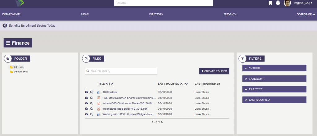
The Document Viewer Widget is a search-based document management solution that combines a folder tree navigator, document list (with search) and filters/refiners into one easy to use interface. Because it is a search-based widget, it has the capacity and performance to search, filter and display libraries with tens of thousands of documents, while still providing the ability to upload (via drag and drop), edit and share documents. The Search allows you to search in a particular folder or the entire library, for a term, that can be found in the document title or document content. On the Folder tree, if “All Files” is selected then search and filters will return documents for the entire library. If a specific Folder is selected in the Folder tree, e.g. “Finance”, then search and filters will be done on the selected folder only. Example if Finance is selected on folder tree then Search and refiners will focus on this folder only. To learn more about the DocumentViewerWidget, click here.
The Document Viewer Widget includes a powerful drag/drop mode with a tagging wizard that prompts users to complete any required metadata fields and select whether they want to check-in the documents as part of the upload.
Documents Folder Tree
The Documents Folder Widget is a expandable tree navigation, that allows the user to navigate to any folder in the library. The content of the folder then displays on the Document Grid.
Document Grid
The Document Grid Widget displays the folders and files that are found in its document library. The user may create folders, view (edit, open, share and follow), add new files via drag/drop and download files. Search, and refiners work together to refine data on the Document grid. There is no AppManager app associated with this widget.
Document Refiners
The default document refiners include date, modified by, and file type. Additionally, any managed metadata categories set on the document library will also display as refiners without any changes to the widget property, the meta data categories are returned from search and displayed. Clicking on an available refiner will refine the current document list to show items that match the selected refiner.
To learn more about the Document Viewer, click here.
Internal Page – inside
In the Department site click on the hamburger menu and select “Sample Interior page”
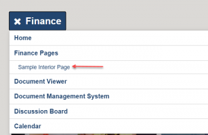
The Internal Page (inside) is a dynamic page that display content from a widget property defined SharePoint list. Each item in the SharePoint list is considered to be a separate page. The page displays the announcement title, publication date, an image (if set on the item) and related content section if populated in the item. Whether Likes and Share display are configurable on the widget instance. In this example there is no image defined with the content, and likes are not configured to display on this widget. To learn more about the InternalPagesWidget, click here.
Forms
Forms are created for each site/department and managed via the AppManager, in the sites Management App area. In the department site case, the Forms Manager has to be added as a Management App via the AppManager’s “Settings” > “Management Settings” and add the “Forms Manager”.
Each site has their own dynamic form page. The Quicklinks content app type, such as the Navigation, have a “Adding Form Link”, for forms added to Quicklinks using the quicklink selector use the dynamically form page to display the form in the appropriate site. The dynamic form page is also used on the AppManager > Management app >Form Manager, where a list of forms are displayed for the site. When an author clicks on “Get Form Link” and copies the link into a new browser tab. The form will display on the sites dynamic form.
Form submitted results are managed and reviewed in the AppManager, under the “Reporting Apps” on the appropriate site, by users set in the sites “Reporting Access Group” for the department site. The “Reporting Access Group” is defined in the AppManager > Settings > Global settings on the department site. To learn more about the FormWidget, click here.
Department Photo Gallery Page
Displays the photos that have been enabled using the Image Gallery content App on this department site. The page is enabled for infinite scroll so will display additional photos as the user scrolls down. Clicking on a photo displays a lightbox window with the larger image. To learn more about the LatestMediaWidget, click here.
FS’20 Sub-site/Department – Akumina AppManager Use
The following topics cover the use of the AppManager for managing content within the Sub-site/Department sites.
Accessing the Akumina AppManager
To access the Akumina AppManager, click the Launch into AppManager button on the Akumina bottom tray. This will launch the Akumina AppManager interface and display the content apps a user has access to for the site/site collection.
Note: Users can select the site they want to manage from the select a site dropdown to access apps for each of the sites they have permission to manage.
Viewing Apps for the Department site
Once in the Akumina AppManager a user can look in the top left corner to see the current site/sub-site they are viewing apps for. To switch the view to another site/sub-site the user can click change, the site selector modal will appear where the user can search or simply scroll and select the appropriate department site when they click OK.
Department Site Content Apps
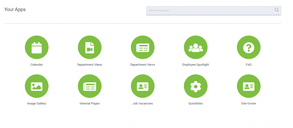
Below are the apps which are included in each newly deployed department sub site.
- Calendar: Content App to add events to Calendar_AK list. Added events will be seen on Calendar page, Event Detail page for selected event, and landing page of department site if marked as featured.
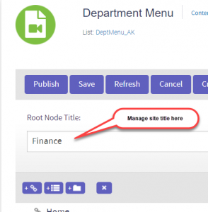
- Department Menu: Content App to add links to the DeptMenu_AK list. Added links will be seen on EVERY page on department site. The department title, e.g. Finance comes from this list set in the “Root Node Title”.
- Department News: Content App to add to DeptNews_AK list. Added News items will be seen on the landing page of the department site, News Listing page, and News Detail page for selected article.
- Employee Spotlight: Content App displays a profile image, user name, title and message. The items are saved in DeptEmployeeSpotlight_AK list which allows for predefined selectable values for filtering (ex: New Team Builders, HR Dept, etc.) and determines the display order sequence.
- FAQs: Content App to add to FAQ_AK list. Added FAQs will be seen on the landing page of the department site and on the FAQ page for the current site.
- Image Gallery: Content App Content App to choose which images from an existing image library to display in the Department Media Gallery.
- Internal Pages: Content App to add dynamic pages to create consistency in internal page presentation. The pages are saved in InternalPages_AK list.
- Job Vacancies: Content App to add job openings to DeptJobVacancies_AK list.
- Quicklinks: Content App to add links to the Quicklinks_AK list. Added links will be seen on the landing page of the department site.
- Site Owner: Content App to add a site owner to the SiteOwner_AK list. Site owner, with optional message and image, will be displayed on the landing page of the department site.
For additional information on content apps, please reference Using the Foundation Site (FS’20) Content Apps (release 4.8 and above)