Foundation Employee Spotlight Widget
Purpose
Recognize and engage employees with profile cards that highlight their success, anniversaries, achievements, or just to provide their contact information on a “Site Owner” view

Features
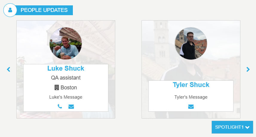
- Displays a profile image, user name, title and message.
- Selection of the items to display is determined by a predefined selectable value for filtering in the list
- Display order is determined by the sequence specified in the list
- Unlimited number of items to display with chevrons for cycling through
- Number of items to display per page can be selected in the widget instance
- Item is hyperlinked to the dynamic display page for the full user profile
- The Employee Spotlight widget displays a profile image, user name, and message. The widget pulls items from the DeptEmployeeSpotlight_AK list OOTB (the supported list is defined on the widget property). The SharePoint list column “SpolightType” which is set to “SPOTLIGHT 1, SPOTLIGHT 2 and SPOTLIGHT 3 OOTB, can be updated on the list definition to reflect the type of spotlight desired. For example, update the list settings, on DeptEmployeeSpotlight_AK, column “SpotlightType” and set the choice too “Management Team” and “Anniversaries” then add the users, setting their SpotlightType to the new choices. A simple update to the widget property “Spotlight Type”, changing: {“Spotlight1″:”Spotlight1″,”Spotlight2″:”Spotlight2″,”Spotlight3″:”Spotlight3”} to {“Management Team”:”Management Team”,”Anniversaries”:”Anniversaries”}, allows for the desired labels to display on the dropdown selector. For multilingual site a language version of the widget instance is created via the “Widget Manager” and the “Spotlight Type” (widget property) is update to reflect the new desired language. Example, in the Spanish version of the widget instance the property “Spotlight Type” is set to: {“Management Team”:”Equipo de gestión”,”Anniversaries”:”Aniversarios”}, the SpotlightType choices option in the SharePoint list e.g. “Management Team” is mapped to a displayed label on the widget in this case “Equipo de gestión”. The order in which the users appear, are based upon the order users appear in the supporting AppManager slider app e.g. “Employee Spotlight”. Click on a user in the “People Updates” and the user will navigate to the employee detail page for the selected user. Left and right chevrons appear and allow the end user to scroll through all users in the “People Update”, for the selected SpotlightType.
Details
- Widget Name: FoundationEmployeeSpotlightWidget
- Available With: Release 4.5 to Release 5.0
- Content App Type: Slider (Working With Slider Type Content Apps)
- Content Type: N/A
- Content App Name: Employee Spotlight
- List Name: EmployeeSpotlight_AK
- Recommended Images Sizes: N/A
- Dependencies: People Sync, Azure Active Directory, SharePoint User Profiles
Content
| Title | Title that displays in the content app item list |
| Featured Person | A People Picker, allows the content author to select a user within the site to highlight. |
| ImageUrl | (Optional) Allows you to upload an image if the user doesn’t have a profile image or you would like to override the user image with a stock image. |
| DisplayMessage | (Optional) Message that will display with the featured person if set |
| Job Title | (Optional) Displays employees job title under their name, Used to override the job title from active directory or set a job title if the user does not have one defined in active directory. |
| (Optional) Mail address that will be displayed with the user, overwrites email address of user if they have one in azure. | |
| OfficeLocation | (Optional) Office location that displays with the user, overwrites OfficeLocation of user if they have one in azure |
| Phone | (Optional) Phone number that will display with the user, overwrites phone number if user has one in azure |
| SpotlightType | Determines the Spotlight category that this user will appear under on the widget.
This column is not used and hidden on the content app definition when the widget is being used for the “Site Owner”
|
Properties
| Select List Columns | The data fields (columns) from the SharePoint list that the widget should retrieve for use in this instance. |
| Cache Interval | Sets the time, in seconds, that the data should be saved in the local browser cache of the current user.
Whole Number = Cache for specific time, in minutes |
| List Name | Name of the SharePoint list that contains the data to be displayed for this widget instance. |
| Items/Page | How many employee item cards will display on in the widget before chevron are introduced to cycle through the items |
| Filter | N/A (used for widget expansion) |
| Function to call before binding the UI events | OOTB -Blank (used for widget expansion): Name of the function called after the UI has been rendered to the screen |
| Spotlight Type | Displays the employees highlighted for the spotlight type that’s active |
| Site Collection URL | Specifies the site collection URL for a central and delivery site where the supporting SharePoint list resides. |
| List is on Root Site | When checked, the widget references the list on root site. |
| Site Owner | Only check this if you want this instance to be a “Site Owner” version which only highlights one user |
Views
View Name: Employee Spotlight Slider Card
View Description: Displays Employees in a slider card view with a spotlight picker which allow the user to change the categories of users. Using the Category selector the end user can switch to categories of users begin highlighted for “New Employees” or “Anniversaries”.
View Preview:
View Name: Site Owner
View Description: Displays the first and only user defined in the supported SharePoint list. The Widget property “Site Owner” must be selected along with this view. This allows you to highlight one user on a page.
View Preview: