Banner Widget
Purpose
Call attention to important information that allows you to quickly relay your message and drive your audience directly to the content you want them to engage with.
Features
-
- Image and text control
- Supports slide and fade transitions
- Easy ordering via drag and drop and active/inactive of individual banner slides
- Dynamically adjusts to accommodate image size
- Items displayed honor user’s SharePoint permissions
- Mobile-ready via Responsive Web Design
Details
-
- Widget Name: BannerWidget
- Available With: Release 4.0 and Above
- Content App Type: Slider
- Content Type: AkuminaBanner
- Content App Name: N/A Out of the Box
- List Name: N/A Out of the Box
- Recommended Images Sizes: N/A
- Dependencies: SharePoint
Content
| Title | Title that will display in the Content App list |
| Banner Heading | H1 heading that will display over of the banner image |
| Banner Sub-Heading | H2 that will display over the banner image |
| Banner Link Text | Text that live inside a clickable button on top of the banner image |
| Banner Link Hover Text | Text that displays when you hover over the BannerLinkText button |
| Web Address (URL) | URL that a user will be taken to when they click on the button |
| Link Title | Displays the URL to the user when they hover over the button |
| Banner Link Target | Opens the URL in the current window or in a new window |
| Banner Image | Banner image that will display for your audience |
| Banner Image Alt Text | Text that will display if the image can’t load |
| Banner Active | Banner will display if checked, doesn’t display if unchecked |
| Banner Item Order | Numerical order in which you want your banners to display if there is more than one
|
| Expires | Date and time when your banner will expire and no longer display |
Properties
| List Name | Name of the SharePoint list that contains the data to be displayed for this banner widget instance | |
| Infinite Loop | Automatically cycles the content. Values are “true” and “false” | |
| Autoplay | Causes the banner to automatically start playing on page access. Values are “true” and “false” | |
| Show Navigation | Enable the display of the slide navigation selector (ellipsis). Values are “true” and “false”
|
|
| Transition Effect | Transition between slides.
Values are “horizontal” or “fade”
|
|
| Slide Duration (ms) | The amount of time spent on each slide before progressing. Time is in milliseconds. | |
| Text Color | Text color themes. Values are “white“, “black”, “grey” | |
| Text Location | Location on the slide for the text block.
Values are: · Top left, top center, top_right · Middle left, middle center, middle right · Bottom left, bottom center, bottom_right.
|
|
| Text Alignment | Alignment of the text displayed in the set location. Values are “left”, “center” and “right” | |
| Max H1 Characters | Maximum number of characters that the H1 title will display | |
| Max H2 Characters | Maximum number of characters that the H2 subtitle will display | |
| Max Button Characters | Maximum number of characters that the button will display | |
| Additional selected list columns | Additional data fields (columns) from the SharePoint list that the widget should retrieve for use in this instance outside of the fields specific to this widget’s content type.
For this example, the additionalselectfields = ID,AnnouncementTitle,Image,Start_x0020_Date,Body,Expires |
|
| Function to call after fetching data |
|
|
| Function to call before binding the UI events |
|
Views
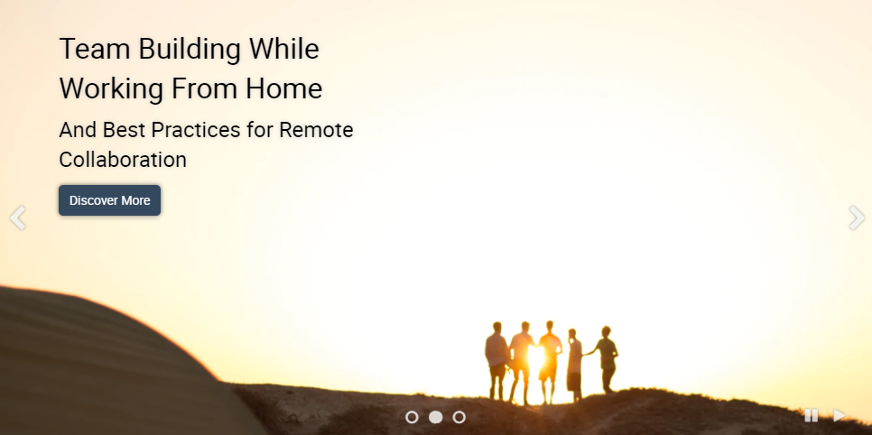
View Name: Default
View Description: Responsive carousel slider that scrolls through list content
View Preview: