Latest Media Widget
Purpose
To highlight the latest images and/or videos that have been added to the gallery
Features
-
- Provides a listing of images which have been enabled for display in the Gallery using the Image Gallery
- Clicking on an image will launch a modal window viewer for that item
- Supports lazy load of images as the user scrolls the browser window to optimize performance
- Provides both a summary view of featured items, and a gallery view which can display all items
Details
-
- Widget Name: LatestMediaWidget
- Available With: Release 4.1 and Above
- Content App Type: ImageGallery
- Content Type: AkuminaImageGallery
- Content App Name: Image Gallery
- List Name: ImageGallery_AK
- Recommended Images Sizes: N/A
- Dependencies: SharePoint library where images are stored, ImageGallery_AK is a list of active images, these images becoming active is controlled on the ImageGallery Content App. The SharePoint list associated with this widget MUST be placed in the Language neutral list via Site Creator on the central site, by default ImageCaller_AK is already added to the language neutral list.
Content
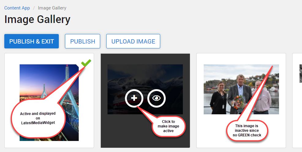
The images that are displayed on the LatestMediaWidget are controlled and managed via an ImageGallery Content App. Images that are marked Active (showing a green check mark on the image) in the ImageGallery app will appear on the LatestMediaWidget.
Buttons
- PUBLISH & EXIT: Publishes the images to the supporting list example ImageGallery_AK and returns the author to the Content App landing page
- PUBLISH: Publishes the images to the supporting list example ImageGallery_AK, and leaves the author on the page
Images will not be added or removed from the Gallery until all changes have been completed using the buttons PUBISH or PUBISH & EXIT.
- UPLOAD IMAGE: Click on “UPLOAD IMAGE” for the image picker to appear and add images to the library. At the time of the UPLOAD the check box “Add Image to Gallery” can be checked to add the image to the Gallery, a green check mark will appear on the image as it is added. The Image can be added to the LatestMediaWidget at a later time by selecting the + when moussing over the image.
Mouse Over Actions and meanings
 |
|
|
 |
After an image has been added to the Gallery, mouse over the image, this symbol will appear, when selected the image will be removed from the LatestMediaWidget or the Gallery. | |
 |
If an image is not in the Gallery, then upon mouse over, this symbol will appear when selected will add the image to the gallery | |
 |
Mouse over any image, select this icon a modal will appear displaying the selected image. |
Properties
| List is on Root Site |
|
|
| Selected List Columns | Columns in the SharePoint list that the widget is utilizing | |
| List Name | Name of the SharePoint list that contains the data to be displayed for this widget instance. This list must be place in the language neutral list on the central site via site creator (in a central and delivery site configuration). | |
| Function to call after fetching data | OOTB -Blank (used for widget expansion): Name of the function called after data has been fetched by the widget. | |
| viewxml | XML used for the widget view | |
| Cache Interval | Sets the time, in seconds, that the data should be saved in the local browser cache of the current user.
· 0 = Do not cache the data for this widget · -1 = Use the default caching strategy set in the Digital Workplace configuration Whole Number = Cache for specific time, in minutes |
|
| Enable Paging | If false, the widget will not display paging controls
If true, the widget will display paging controls (if implemented by developer in widget) |
|
| Items/Page | Sets the number of items to display on each page IF paging is enabled. | |
| Media | Currently Photo is only supported in modern sites. Older classic SharePoint sites could use Media=video, where we displayed the old office videos (this has been grandfathered out by microsoft, replaced with streams). | |
| Selected Content Type | This depends on what type of Media you are choosing to display | |
| Function to call before binding the UI events | OOTB -Blank (used for widget expansion): Name of the function called after the UI has been rendered to the screen | |
| Site Collection URL | Site collection URL where the SharePoint list defined in “List Name” can be found. | |
| View All Title | Title of the View All button | |
| View All Link | Link for the View All button |
Views
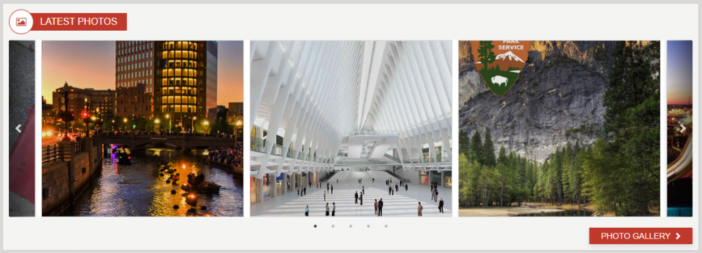
View Name: Photo Slider Card
View Description: Displays a horizontal slide of the most recent photos in a responsive layout
View Preview:
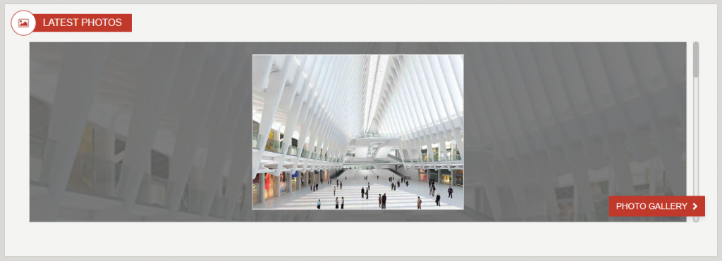
View Name: Photo Slider
View Description: Displays the most recent photos in a stacked and responsive layout with the main image in full view in the foreground
View Preview: